备注
Go to the end 下载完整的示例代码。或者通过浏览器中的MysterLite或Binder运行此示例
比较不同缩放器对数据的影响与离群值#
特征0(街区的平均收入)和特征5(平均房屋入住率) 加州住房数据集 具有非常不同的规模并包含一些非常大的异常值。这两个特征导致数据可视化困难,更重要的是,它们可能会降低许多机器学习算法的预测性能。未缩放的数据还可能减慢甚至阻止许多基于梯度的估计的收敛。
Indeed many estimators are designed with the assumption that each feature takes values close to zero or more importantly that all features vary on comparable scales. In particular, metric-based and gradient-based estimators often assume approximately standardized data (centered features with unit variances). A notable exception are decision tree-based estimators that are robust to arbitrary scaling of the data.
此示例使用不同的缩放器、转换器和规范器将数据置于预定义的范围内。
缩放器是线性(或者更准确地说是仿射)变换器,并且在估计用于移动和缩放每个特征的参数的方式方面彼此不同。
QuantileTransformer 提供非线性转换,其中边缘异常值和内值之间的距离缩小。 PowerTransformer 提供非线性转换,其中数据被映射到正态分布,以稳定方差并最大限度地减少偏度。
与前面的变换不同,归一化是指每个样本的变换,而不是每个特征的变换。
下面的代码有点冗长,可以直接跳到分析中去。 results.
# Authors: The scikit-learn developers
# SPDX-License-Identifier: BSD-3-Clause

import matplotlib as mpl
import numpy as np
from matplotlib import cm
from matplotlib import pyplot as plt

from sklearn.datasets import fetch_california_housing
from sklearn.preprocessing import (
    MaxAbsScaler,
    MinMaxScaler,
    Normalizer,
    PowerTransformer,
    QuantileTransformer,
    RobustScaler,
    StandardScaler,
    minmax_scale,
)

dataset = fetch_california_housing()
X_full, y_full = dataset.data, dataset.target
feature_names = dataset.feature_names

feature_mapping = {
    "MedInc": "Median income in block",
    "HouseAge": "Median house age in block",
    "AveRooms": "Average number of rooms",
    "AveBedrms": "Average number of bedrooms",
    "Population": "Block population",
    "AveOccup": "Average house occupancy",
    "Latitude": "House block latitude",
    "Longitude": "House block longitude",
}

# Take only 2 features to make visualization easier
# Feature MedInc has a long tail distribution.
# Feature AveOccup has a few but very large outliers.
features = ["MedInc", "AveOccup"]
features_idx = [feature_names.index(feature) for feature in features]
X = X_full[:, features_idx]
distributions = [
    ("Unscaled data", X),
    ("Data after standard scaling", StandardScaler().fit_transform(X)),
    ("Data after min-max scaling", MinMaxScaler().fit_transform(X)),
    ("Data after max-abs scaling", MaxAbsScaler().fit_transform(X)),
    (
        "Data after robust scaling",
        RobustScaler(quantile_range=(25, 75)).fit_transform(X),
    ),
    (
        "Data after power transformation (Yeo-Johnson)",
        PowerTransformer(method="yeo-johnson").fit_transform(X),
    ),
    (
        "Data after power transformation (Box-Cox)",
        PowerTransformer(method="box-cox").fit_transform(X),
    ),
    (
        "Data after quantile transformation (uniform pdf)",
        QuantileTransformer(
            output_distribution="uniform", random_state=42
        ).fit_transform(X),
    ),
    (
        "Data after quantile transformation (gaussian pdf)",
        QuantileTransformer(
            output_distribution="normal", random_state=42
        ).fit_transform(X),
    ),
    ("Data after sample-wise L2 normalizing", Normalizer().fit_transform(X)),
]

# scale the output between 0 and 1 for the colorbar
y = minmax_scale(y_full)

# plasma does not exist in matplotlib < 1.5
cmap = getattr(cm, "plasma_r", cm.hot_r)


def create_axes(title, figsize=(16, 6)):
    fig = plt.figure(figsize=figsize)
    fig.suptitle(title)

    # define the axis for the first plot
    left, width = 0.1, 0.22
    bottom, height = 0.1, 0.7
    bottom_h = height + 0.15
    left_h = left + width + 0.02

    rect_scatter = [left, bottom, width, height]
    rect_histx = [left, bottom_h, width, 0.1]
    rect_histy = [left_h, bottom, 0.05, height]

    ax_scatter = plt.axes(rect_scatter)
    ax_histx = plt.axes(rect_histx)
    ax_histy = plt.axes(rect_histy)

    # define the axis for the zoomed-in plot
    left = width + left + 0.2
    left_h = left + width + 0.02

    rect_scatter = [left, bottom, width, height]
    rect_histx = [left, bottom_h, width, 0.1]
    rect_histy = [left_h, bottom, 0.05, height]

    ax_scatter_zoom = plt.axes(rect_scatter)
    ax_histx_zoom = plt.axes(rect_histx)
    ax_histy_zoom = plt.axes(rect_histy)

    # define the axis for the colorbar
    left, width = width + left + 0.13, 0.01

    rect_colorbar = [left, bottom, width, height]
    ax_colorbar = plt.axes(rect_colorbar)

    return (
        (ax_scatter, ax_histy, ax_histx),
        (ax_scatter_zoom, ax_histy_zoom, ax_histx_zoom),
        ax_colorbar,
    )


def plot_distribution(axes, X, y, hist_nbins=50, title="", x0_label="", x1_label=""):
    ax, hist_X1, hist_X0 = axes

    ax.set_title(title)
    ax.set_xlabel(x0_label)
    ax.set_ylabel(x1_label)

    # The scatter plot
    colors = cmap(y)
    ax.scatter(X[:, 0], X[:, 1], alpha=0.5, marker="o", s=5, lw=0, c=colors)

    # Removing the top and the right spine for aesthetics
    # make nice axis layout
    ax.spines["top"].set_visible(False)
    ax.spines["right"].set_visible(False)
    ax.get_xaxis().tick_bottom()
    ax.get_yaxis().tick_left()
    ax.spines["left"].set_position(("outward", 10))
    ax.spines["bottom"].set_position(("outward", 10))

    # Histogram for axis X1 (feature 5)
    hist_X1.set_ylim(ax.get_ylim())
    hist_X1.hist(
        X[:, 1], bins=hist_nbins, orientation="horizontal", color="grey", ec="grey"
    )
    hist_X1.axis("off")

    # Histogram for axis X0 (feature 0)
    hist_X0.set_xlim(ax.get_xlim())
    hist_X0.hist(
        X[:, 0], bins=hist_nbins, orientation="vertical", color="grey", ec="grey"
    )
    hist_X0.axis("off")
将为每个定标器/归一化器/Transformer显示两个图。左图将显示完整数据集的散点图,而右图将排除仅考虑99%的数据集的极端值,不包括边缘离群值。此外,每个要素的边缘分布将显示在散点图的两侧。
def make_plot(item_idx):
    title, X = distributions[item_idx]
    ax_zoom_out, ax_zoom_in, ax_colorbar = create_axes(title)
    axarr = (ax_zoom_out, ax_zoom_in)
    plot_distribution(
        axarr[0],
        X,
        y,
        hist_nbins=200,
        x0_label=feature_mapping[features[0]],
        x1_label=feature_mapping[features[1]],
        title="Full data",
    )

    # zoom-in
    zoom_in_percentile_range = (0, 99)
    cutoffs_X0 = np.percentile(X[:, 0], zoom_in_percentile_range)
    cutoffs_X1 = np.percentile(X[:, 1], zoom_in_percentile_range)

    non_outliers_mask = np.all(X > [cutoffs_X0[0], cutoffs_X1[0]], axis=1) & np.all(
        X < [cutoffs_X0[1], cutoffs_X1[1]], axis=1
    )
    plot_distribution(
        axarr[1],
        X[non_outliers_mask],
        y[non_outliers_mask],
        hist_nbins=50,
        x0_label=feature_mapping[features[0]],
        x1_label=feature_mapping[features[1]],
        title="Zoom-in",
    )

    norm = mpl.colors.Normalize(y_full.min(), y_full.max())
    mpl.colorbar.ColorbarBase(
        ax_colorbar,
        cmap=cmap,
        norm=norm,
        orientation="vertical",
        label="Color mapping for values of y",
    )
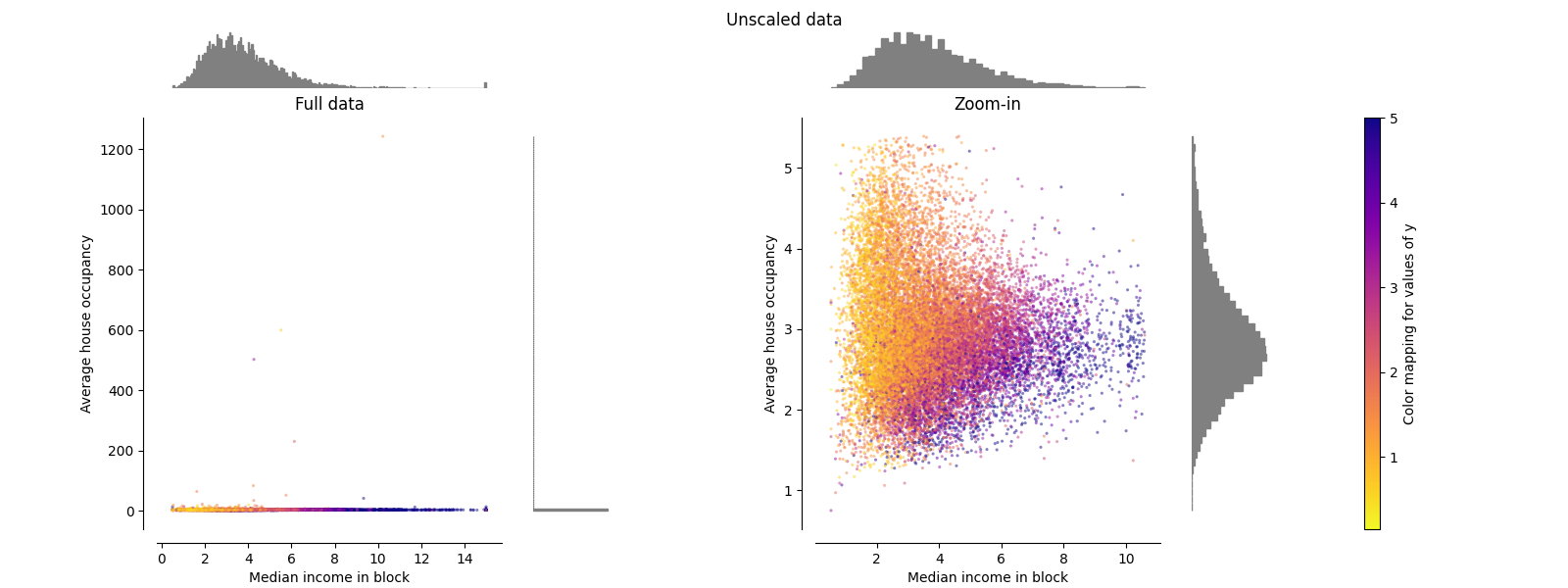
原始数据#
每次转换都会绘制,显示两个转换后的特征,左侧图显示整个数据集,右侧图放大显示不含边缘离群值的数据集。绝大多数样本都被压缩到特定范围, [0, 10] 对于中等收入和 [0, 6] 对于平均房屋入住率。请注意,存在一些边缘异常值(某些街区的平均入住率超过1200人)。因此,根据应用程序的不同,特定的预处理可能非常有益。在下文中,我们将介绍这些预处理方法在存在边缘异常值的情况下的一些见解和行为。
make_plot(0)
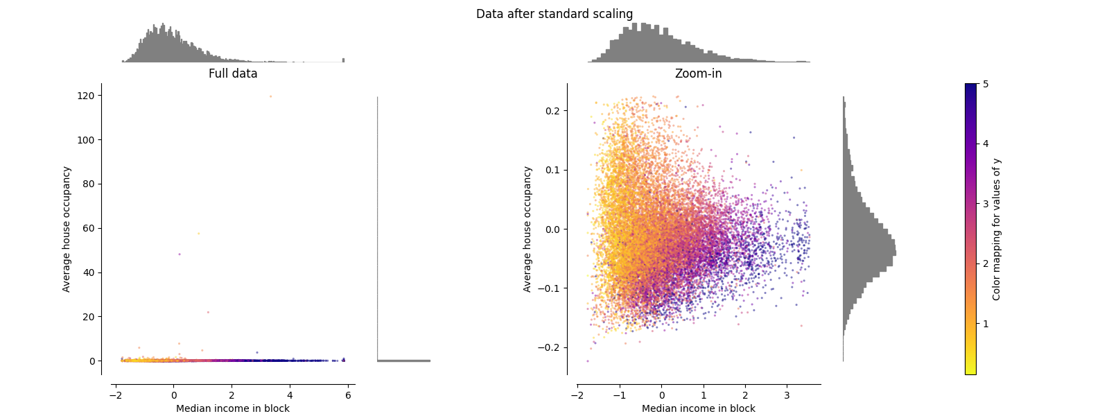
StandardScaler#
StandardScaler 删除平均值并将数据缩放为单位方差。缩放缩小了特征值的范围,如下图所示。然而,离群值在计算经验平均值和标准差时会产生影响。特别注意的是,由于每个要素上的异常值具有不同的幅度,因此每个要素上的转换数据的分布非常不同:大多数数据位于 [-2, 4] 转换后的中位数收入特征的范围,而相同的数据则被挤压在较小的范围内 [-0.2, 0.2] 转换后的平均房屋占有率的范围。
StandardScaler 因此,在存在异常值的情况下无法保证平衡的特征尺度。
make_plot(1)
MinMaxScaler#
MinMaxScaler 重新缩放数据集,使所有要素值都在范围内 [0, 1] 如下面右侧面板所示。然而,这种缩放将所有内点压缩到狭窄范围内 [0, 0.005] 对于转变后的平均房屋占用率。
两 StandardScaler 和 MinMaxScaler 对异常值的存在非常敏感。
make_plot(2)

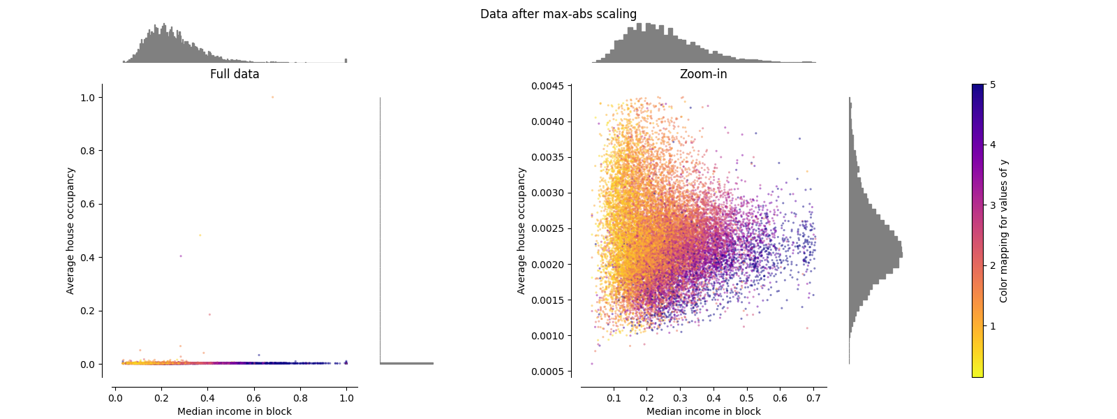
MaxAbsScaler#
MaxAbsScaler 类似于 MinMaxScaler 不同的是,这些值根据是否存在负值或正值而映射到多个范围。如果仅存在正值,则范围为 [0, 1] .如果仅存在负值,则范围为 [-1, 0] .如果负值和正值都存在,则范围为 [-1, 1] .仅根据积极数据,两者 MinMaxScaler 和 MaxAbsScaler 行为类似。 MaxAbsScaler 因此也会受到大异常值的存在的影响。
make_plot(3)
RobustScaler#
与之前的缩放器不同, RobustScaler 基于百分位数,因此不受少数非常大的边缘异常值的影响。因此,转换后的要素值的结果范围大于之前的缩放器,更重要的是,大致相似:对于这两个要素,大多数转换后的值都位于 [-2, 3] 如放大图中所示的范围。请注意,异常值本身仍然存在于转换后的数据中。如果需要单独的离群值修剪,则需要非线性变换(见下文)。
make_plot(4)

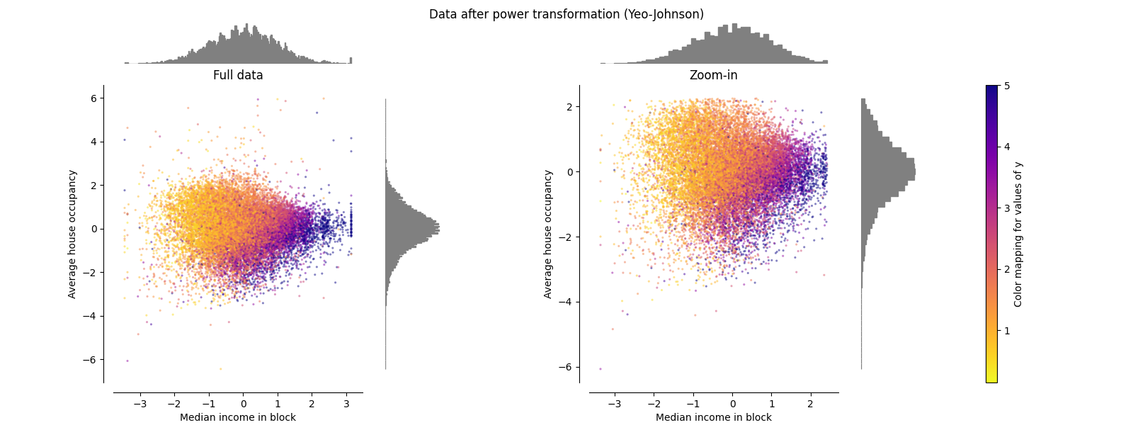
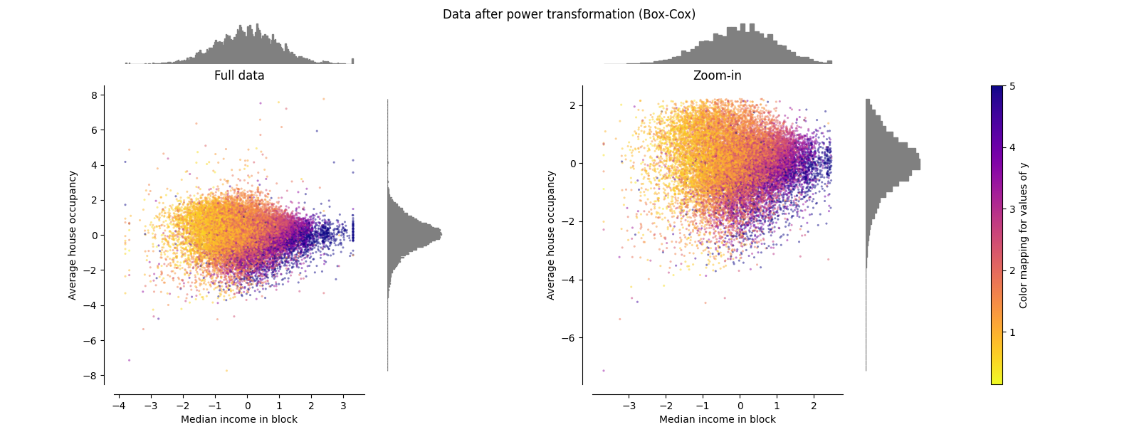
PowerTransformer#
PowerTransformer 对每个特征应用功率变换,使数据更加类似高斯,以稳定方差并最大限度地减少偏度。目前支持Yeo-Johnson和Box-Cox变换,并且在这两种方法中通过最大似然估计来确定最佳缩放因子。默认情况下, PowerTransformer 应用零均值、单位方差正规化。请注意,Box-Cox仅适用于严格正数据。收入和平均房屋占有率恰好严格为正值,但如果存在负值,则首选Yeo-Johnson转型的方法。
make_plot(5)
make_plot(6)
QuantileTransformer(均匀输出)#
QuantileTransformer 应用非线性变换,使得每个特征的概率密度函数将被映射到均匀或高斯分布。在这种情况下,所有数据(包括离群值)都将映射到范围为 [0, 1] 使异常值与内部值无法区分。
RobustScaler 和 QuantileTransformer 从某种意义上说,在训练集中添加或删除异常值将产生大致相同的转换。但出乎 RobustScaler , QuantileTransformer 还将通过将任何异常值设置为先验定义的范围边界(0和1)来自动折叠它们。这可能会导致极端值的饱和伪影。
make_plot(7)

QuantileTransformer(高斯输出)#
要映射到高斯分布,请设置参数 output_distribution='normal' .
make_plot(8)

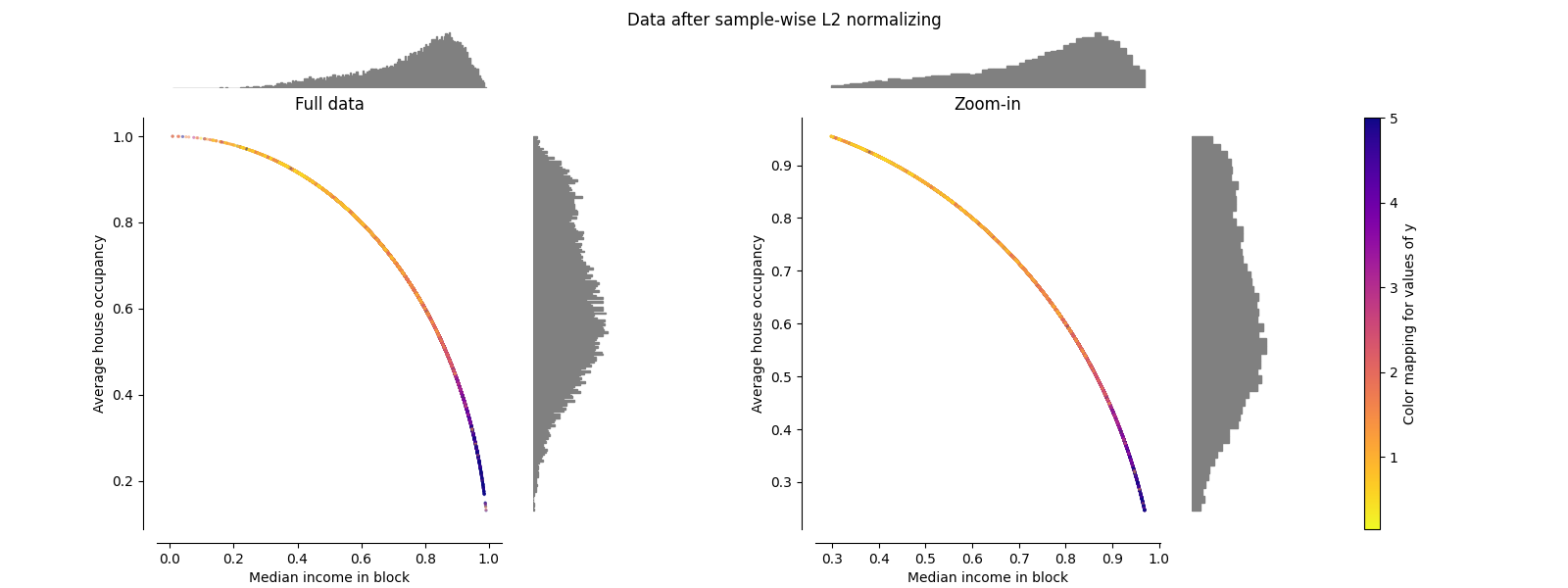
归一化器#
的 Normalizer 重新缩放每个样本的载体,使其具有单位规范,与样本的分布无关。从下面的两张图中可以看出,所有样本都映射到单位圆上。在我们的示例中,两个选定的特征只有正值;因此转换后的数据仅位于正象限中。如果一些原始特征具有积极和消极的价值,情况就不会如此。
make_plot(9)

plt.show()
Total running time of the script: (0 minutes 6.733 seconds)
相关实例

Gallery generated by Sphinx-Gallery <https://sphinx-gallery.github.io> _