备注
Go to the end 下载完整的示例代码。或者通过浏览器中的MysterLite或Binder运行此示例
具有不同指标的聚集性集群#
演示不同指标对分层集群的影响。
该示例旨在显示选择不同指标的影响。它应用于可以被视为多维载体的波形。事实上,指标之间的差异通常在高维度中更加明显(特别是对于欧几里得和城市区块)。
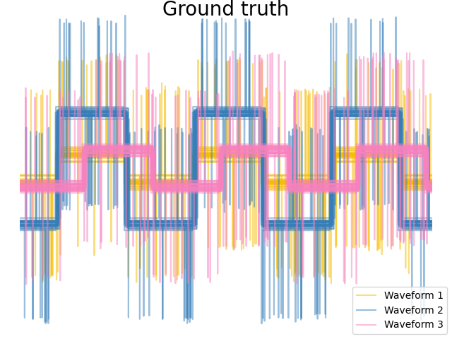
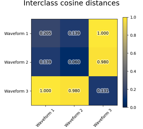
我们从三组波形中生成数据。其中两个波(波1和波2)彼此成比例。cos距离对于数据的缩放不改变,因此无法区分这两个波形。因此,即使没有噪音,使用此距离进行聚集也不会分离出波1和2。
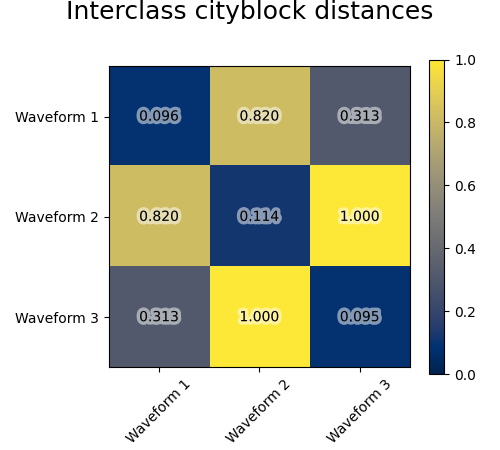
我们将观察噪音添加到这些波形中。我们生成非常稀疏的噪音:只有6%的时间点包含噪音。因此,该噪音的l1规范(即“cityblack”距离)远小于其l2规范(“欧几里得”距离)。这可以在类间距离矩阵上看出:代表类分布的对角线上的值对于欧几里得距离来说比城市街区距离要大得多。
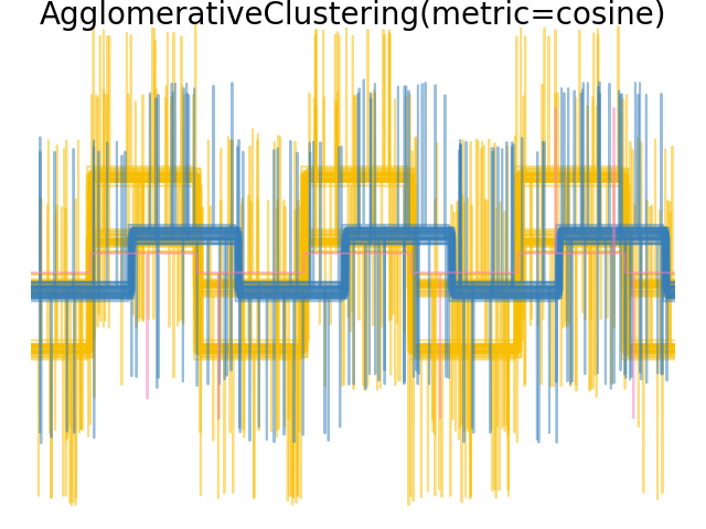
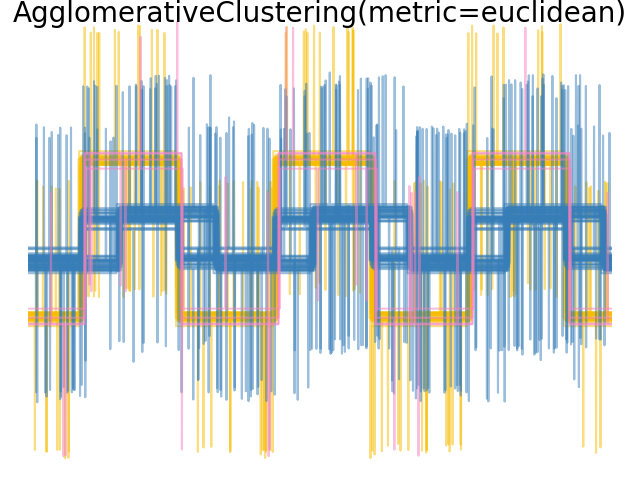
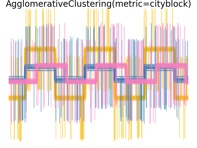
当我们对数据应用集群时,我们发现集群反映了距离矩阵中的内容。事实上,对于欧几里得距离来说,由于噪音,类别分离得很差,因此集群不会分离波。对于城市街区距离,分离良好,并且恢复了波类。最后,所有波1和2处的cos距离均不分离,因此集群将它们置于同一集群中。

# Authors: The scikit-learn developers
# SPDX-License-Identifier: BSD-3-Clause

import matplotlib.patheffects as PathEffects
import matplotlib.pyplot as plt
import numpy as np

from sklearn.cluster import AgglomerativeClustering
from sklearn.metrics import pairwise_distances

np.random.seed(0)

# Generate waveform data
n_features = 2000
t = np.pi * np.linspace(0, 1, n_features)


def sqr(x):
    return np.sign(np.cos(x))


X = list()
y = list()
for i, (phi, a) in enumerate([(0.5, 0.15), (0.5, 0.6), (0.3, 0.2)]):
    for _ in range(30):
        phase_noise = 0.01 * np.random.normal()
        amplitude_noise = 0.04 * np.random.normal()
        additional_noise = 1 - 2 * np.random.rand(n_features)
        # Make the noise sparse
        additional_noise[np.abs(additional_noise) < 0.997] = 0

        X.append(
            12
            * (
                (a + amplitude_noise) * (sqr(6 * (t + phi + phase_noise)))
                + additional_noise
            )
        )
        y.append(i)

X = np.array(X)
y = np.array(y)

n_clusters = 3

labels = ("Waveform 1", "Waveform 2", "Waveform 3")

colors = ["#f7bd01", "#377eb8", "#f781bf"]

# Plot the ground-truth labelling
plt.figure()
plt.axes([0, 0, 1, 1])
for l, color, n in zip(range(n_clusters), colors, labels):
    lines = plt.plot(X[y == l].T, c=color, alpha=0.5)
    lines[0].set_label(n)

plt.legend(loc="best")

plt.axis("tight")
plt.axis("off")
plt.suptitle("Ground truth", size=20, y=1)


# Plot the distances
for index, metric in enumerate(["cosine", "euclidean", "cityblock"]):
    avg_dist = np.zeros((n_clusters, n_clusters))
    plt.figure(figsize=(5, 4.5))
    for i in range(n_clusters):
        for j in range(n_clusters):
            avg_dist[i, j] = pairwise_distances(
                X[y == i], X[y == j], metric=metric
            ).mean()
    avg_dist /= avg_dist.max()
    for i in range(n_clusters):
        for j in range(n_clusters):
            t = plt.text(
                i,
                j,
                "%5.3f" % avg_dist[i, j],
                verticalalignment="center",
                horizontalalignment="center",
            )
            t.set_path_effects(
                [PathEffects.withStroke(linewidth=5, foreground="w", alpha=0.5)]
            )

    plt.imshow(avg_dist, interpolation="nearest", cmap="cividis", vmin=0)
    plt.xticks(range(n_clusters), labels, rotation=45)
    plt.yticks(range(n_clusters), labels)
    plt.colorbar()
    plt.suptitle("Interclass %s distances" % metric, size=18, y=1)
    plt.tight_layout()


# Plot clustering results
for index, metric in enumerate(["cosine", "euclidean", "cityblock"]):
    model = AgglomerativeClustering(
        n_clusters=n_clusters, linkage="average", metric=metric
    )
    model.fit(X)
    plt.figure()
    plt.axes([0, 0, 1, 1])
    for l, color in zip(np.arange(model.n_clusters), colors):
        plt.plot(X[model.labels_ == l].T, c=color, alpha=0.5)
    plt.axis("tight")
    plt.axis("off")
    plt.suptitle("AgglomerativeClustering(metric=%s)" % metric, size=20, y=1)


plt.show()
Total running time of the script: (0分0.922秒)
相关实例
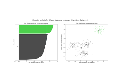
Selecting the number of clusters with silhouette analysis on KMeans clustering
Gallery generated by Sphinx-Gallery <https://sphinx-gallery.github.io> _