PredictionErrorDisplay#
- class sklearn.metrics.PredictionErrorDisplay(*, y_true, y_pred)[源代码]#
回归模型预测误差的可视化。
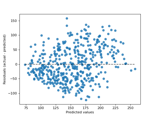
该工具可以使用散点图显示“残余与预测”或“实际与预测”,以定性评估回归量的行为,最好是在已发布的数据点上。
详细信息请参见
from_estimator或from_predictions创建可视化工具。所有参数都存储为属性。有关的一般信息
scikit-learn可视化工具,请参阅 Visualization Guide .有关解释这些图的详细信息,请参阅 Model Evaluation Guide .Added in version 1.2.
- 参数:
- y_true形状的nd数组(n_samples,)
真正的价值观。
- y_pred形状的nd数组(n_samples,)
预测值。
- 属性:
- line_matplotlib艺术家
Optimal line representing
y_true == y_pred. Therefore, it is a diagonal line forkind="predictions"and a horizontal line forkind="residuals".- errors_lines_matplotlib艺术家或无
残留线。如果
with_errors=False,然后设置为None.- scatter_matplotlib艺术家
分散数据点。
- ax_matplotlib轴
具有不同matplotlib轴的轴。
- figure_matplotlib图
包含散点和线的图形。
参见
PredictionErrorDisplay.from_estimator给定估计器和一些数据的预测误差可视化。
PredictionErrorDisplay.from_predictionsPrediction error visualization given the true and predicted targets.
示例
>>> import matplotlib.pyplot as plt
>>> from sklearn.datasets import load_diabetes
>>> from sklearn.linear_model import Ridge
>>> from sklearn.metrics import PredictionErrorDisplay
>>> X, y = load_diabetes(return_X_y=True)
>>> ridge = Ridge().fit(X, y)
>>> y_pred = ridge.predict(X)
>>> display = PredictionErrorDisplay(y_true=y, y_pred=y_pred)
>>> display.plot()
<...>
>>> plt.show()

- classmethod from_estimator(estimator, X, y, *, kind='residual_vs_predicted', subsample=1000, random_state=None, ax=None, scatter_kwargs=None, line_kwargs=None)[源代码]#
给出回归量和一些数据,绘制预测误差。
有关的一般信息
scikit-learn可视化工具,请参阅 Visualization Guide .有关解释这些图的详细信息,请参阅 Model Evaluation Guide .Added in version 1.2.
- 参数:
- estimator估计器实例
装配回归器或装配
Pipeline其中最后的估计量是回归量。- X形状(n_samples,n_features)的{类数组,稀疏矩阵}
输入值。
- y形状类似阵列(n_samples,)
目标值。
- kind{“actual_vs_predicted”,“residual_vs_predicted”}, 默认=“resident_vs_predicted”
要绘制的打印类型:
“actual_vs_predicted”绘制了观察值(y轴)与预测值(x轴)。
“resident_vs_predicted”绘制了残余,即观察值和预测值之间的差(y轴)与预测值(x轴)。
- subsamplefloat、int或无,默认=1_000
对样本进行采样以显示在散点图上。如果
float,它应该介于0和1之间,并代表原始数据集的比例。如果int,它代表散点图上显示的样本数量。如果None,不会应用二次抽样。默认情况下,将显示1000个或更少的样本。- random_stateint或RandomState,默认=无
控制随机性
subsample不None.看到 Glossary 有关详细信息- axmatplotlib轴,默认=无
轴反对绘图。如果
None,创建新图形和轴。- scatter_kwargsdict,默认=无
关键词传递给
matplotlib.pyplot.scatter电话- line_kwargsdict,默认=无
Dictionary with keyword passed to the
matplotlib.pyplot.plotcall to draw the optimal line.
- 返回:
- display :
PredictionErrorDisplayPredictionErrorDisplay 存储计算值的对象。
- display :
参见
PredictionErrorDisplay回归的预测误差可视化。
PredictionErrorDisplay.from_predictionsPrediction error visualization given the true and predicted targets.
示例
>>> import matplotlib.pyplot as plt
>>> from sklearn.datasets import load_diabetes
>>> from sklearn.linear_model import Ridge
>>> from sklearn.metrics import PredictionErrorDisplay
>>> X, y = load_diabetes(return_X_y=True)
>>> ridge = Ridge().fit(X, y)
>>> disp = PredictionErrorDisplay.from_estimator(ridge, X, y)
>>> plt.show()

- classmethod from_predictions(y_true, y_pred, *, kind='residual_vs_predicted', subsample=1000, random_state=None, ax=None, scatter_kwargs=None, line_kwargs=None)[源代码]#
给定真实目标和预测目标绘制预测误差。
有关的一般信息
scikit-learn可视化工具,请参阅 Visualization Guide .有关解释这些图的详细信息,请参阅 Model Evaluation Guide .Added in version 1.2.
- 参数:
- y_true形状类似阵列(n_samples,)
真正的目标值。
- y_pred形状类似阵列(n_samples,)
预测目标值。
- kind{“actual_vs_predicted”,“residual_vs_predicted”}, 默认=“resident_vs_predicted”
要绘制的打印类型:
“actual_vs_predicted”绘制了观察值(y轴)与预测值(x轴)。
“resident_vs_predicted”绘制了残余,即观察值和预测值之间的差(y轴)与预测值(x轴)。
- subsamplefloat、int或无,默认=1_000
对样本进行采样以显示在散点图上。如果
float,它应该介于0和1之间,并代表原始数据集的比例。如果int,它代表散点图上显示的样本数量。如果None,不会应用二次抽样。默认情况下,将显示1000个或更少的样本。- random_stateint或RandomState,默认=无
控制随机性
subsample不None.看到 Glossary 有关详细信息- axmatplotlib轴,默认=无
轴反对绘图。如果
None,创建新图形和轴。- scatter_kwargsdict,默认=无
关键词传递给
matplotlib.pyplot.scatter电话- line_kwargsdict,默认=无
Dictionary with keyword passed to the
matplotlib.pyplot.plotcall to draw the optimal line.
- 返回:
- display :
PredictionErrorDisplayPredictionErrorDisplay 存储计算值的对象。
- display :
参见
PredictionErrorDisplay回归的预测误差可视化。
PredictionErrorDisplay.from_estimator给定估计器和一些数据的预测误差可视化。
示例
>>> import matplotlib.pyplot as plt
>>> from sklearn.datasets import load_diabetes
>>> from sklearn.linear_model import Ridge
>>> from sklearn.metrics import PredictionErrorDisplay
>>> X, y = load_diabetes(return_X_y=True)
>>> ridge = Ridge().fit(X, y)
>>> y_pred = ridge.predict(X)
>>> disp = PredictionErrorDisplay.from_predictions(y_true=y, y_pred=y_pred)
>>> plt.show()
- plot(ax=None, *, kind='residual_vs_predicted', scatter_kwargs=None, line_kwargs=None)[源代码]#
情节可视化。
额外的关键字参数将传递给matplotlib的
plot.- 参数:
- axmatplotlib轴,默认=无
轴反对绘图。如果
None,创建新图形和轴。- kind{“actual_vs_predicted”,“residual_vs_predicted”}, 默认=“resident_vs_predicted”
要绘制的打印类型:
“actual_vs_predicted”绘制了观察值(y轴)与预测值(x轴)。
“resident_vs_predicted”绘制了残余,即观察值和预测值之间的差(y轴)与预测值(x轴)。
- scatter_kwargsdict,默认=无
关键词传递给
matplotlib.pyplot.scatter电话- line_kwargsdict,默认=无
Dictionary with keyword passed to the
matplotlib.pyplot.plotcall to draw the optimal line.
- 返回:
- display :
PredictionErrorDisplayPredictionErrorDisplay 存储计算值的对象。
- display :