>>> from env_helper import info; info()
页面更新时间: 2024-01-06 20:46:58
运行环境:
    Linux发行版本: Debian GNU/Linux 12 (bookworm)
    操作系统内核: Linux-6.1.0-16-amd64-x86_64-with-glibc2.36
    Python版本: 3.11.2
5.11. 构建结构化的多地块网格
在浏览多维数据时,一种有用的方法是在数据集的不同子集上绘制同一图的多个实例。 这种技术有时被称为“格子”或“格子”绘图,它与“小倍数”的概念有关。 它允许查看者快速提取有关复杂数据集的大量信息。 Matplotlib 为制作多轴图形提供了良好的支持; Seaborn 在此基础上构建,将绘图的结构直接链接到数据集的结构。
图窗级函数构建在本章本章中讨论的对象之上。在大多数情况下,您将需要使用这些函数。他们负责一些重要的簿记工作,这些簿记会同步每个网格中的多个图。本章介绍基础对象的工作原理,这可能对高级应用程序有用。
5.11.1. 条件小倍数
当您希望可视化变量的分布或数据集子集内多个变量之间的关系时,
FacetGrid 类非常有用。 一个 FacetGrid
可以绘制多达三个维度:row、col、hue。
前两个与得到的轴数组有明显的对应关系;把色调变量看作是沿着深度轴的第三个维度,其中不同的层次用不同的颜色绘制。
relplot()、displot()、catplot() 和 lmplot()
中的每一个都在内部使用这个对象,并
且当它们完成时返回该对象,以便它可以用于进一步的调整。
通过初始化带有数据框和变量名的FacetGrid对象来使用该类,这些变量名将构成网格的行、列或色调维度。这些变量应该是分类的或离散的,然后变量的每个级别上的数据将用于沿该轴的一个面。例如,假设我们想要检查tips数据集中午餐和晚餐之间的差异:
>>> import seaborn as sns
>>>
>>> tips = sns.load_dataset("tips",data_home='seaborn-data',cache=True)
>>> g = sns.FacetGrid(tips, col="time")
像这样初始化网格会设置 matplotlib 图形和轴,但不会在它们上绘制任何内容。
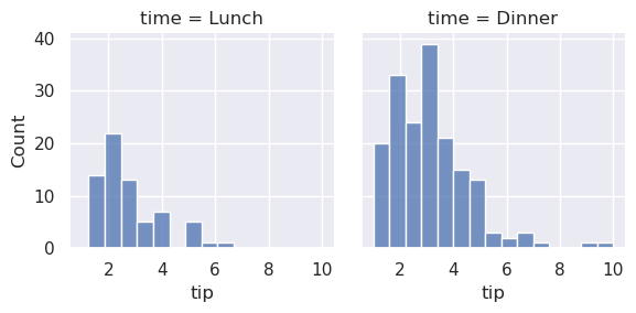
在此网格上可视化数据的主要方法是使用FacetGrid.map()方法。为它提供绘图函数和要绘制的数据帧中变量的名称。让我们使用直方图看一下每个子集中的提示分布:
>>> g = sns.FacetGrid(tips, col="time")
>>> g.map(sns.histplot, "tip")
<seaborn.axisgrid.FacetGrid at 0x7f000f239810>
此功能将绘制图形并注释轴,希望一步生成完成的绘图。要制作关系图,只需传递多个变量名称即可。您还可以提供关键字参数,这些参数将传递给绘图函数:
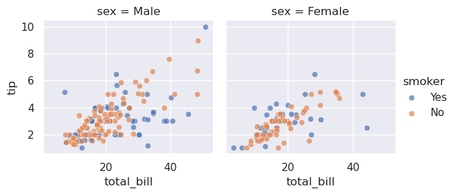
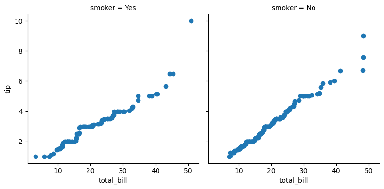
>>> g = sns.FacetGrid(tips, col="sex", hue="smoker")
>>> g.map(sns.scatterplot, "total_bill", "tip", alpha=.7)
>>> g.add_legend()
<seaborn.axisgrid.FacetGrid at 0x7effca5b6b90>
有几个选项可用于控制网格的外观,这些选项可以传递给类构造函数。
>>> g = sns.FacetGrid(tips, row="smoker", col="time", margin_titles=True)
>>> g.map(sns.regplot, "size", "total_bill", color=".3", fit_reg=False, x_jitter=.1)
<seaborn.axisgrid.FacetGrid at 0x7effd2a50550>
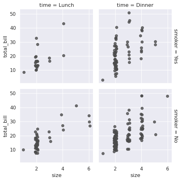
请注意,matplotlib API
并未正式支持margin_titles功能,并且可能并非在所有情况下都能正常工作。特别是,它目前不能与位于情节之外的图例一起使用。
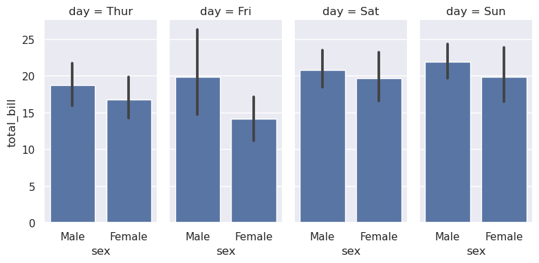
图形的大小是通过提供每个刻面的高度以及纵横比来设置的:
>>> g = sns.FacetGrid(tips, col="day", height=4, aspect=.5)
>>> g.map(sns.barplot, "sex", "total_bill", order=["Male", "Female"])
<seaborn.axisgrid.FacetGrid at 0x7effd28bff90>
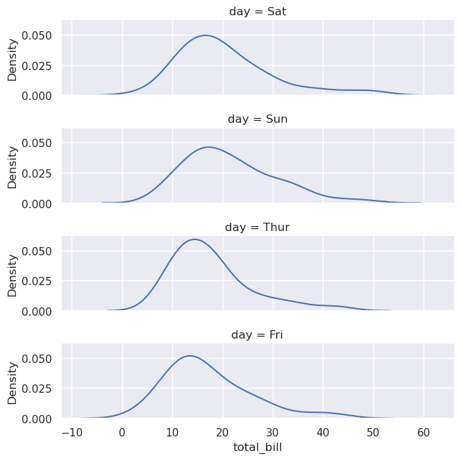
facet的默认顺序来自DataFrame中的信息。如果用于定义facet的变量具有分类类型,则使用类别的顺序。否则,facet将按照类别级别的出现顺序排列。但是,可以使用适当的*_order参数指定任何facet维度的排序:
>>> ordered_days = tips.day.value_counts().index
>>> g = sns.FacetGrid(tips, row="day", row_order=ordered_days,
>>>                   height=1.7, aspect=4,)
>>> g.map(sns.kdeplot, "total_bill")
<seaborn.axisgrid.FacetGrid at 0x7effca53ae50>
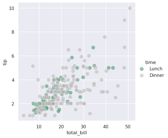
可以提供任何海运调色板(即,可以传递给color_palette()的东西)。你也可以使用字典将hue变量中的值的名称映射为有效的matplotlib颜色:
>>> pal = dict(Lunch="seagreen", Dinner=".7")
>>> g = sns.FacetGrid(tips, hue="time", palette=pal, height=5)
>>> g.map(sns.scatterplot, "total_bill", "tip", s=100, alpha=.5)
>>> g.add_legend()
<seaborn.axisgrid.FacetGrid at 0x7effc9e80f10>
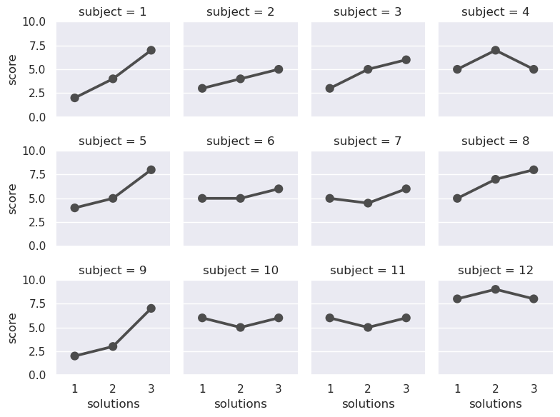
如果一个变量有多个级别,则可以沿列绘制它,但“换行”它们,以便它们跨越多行。执行此操作时,不能使用row变量。
>>> attend = sns.load_dataset("attention").query("subject <= 12")
>>> g = sns.FacetGrid(attend, col="subject", col_wrap=4, height=2, ylim=(0, 10))
>>> g.map(sns.pointplot, "solutions", "score", order=[1, 2, 3], color=".3", errorbar=None)
<seaborn.axisgrid.FacetGrid at 0x7effc818af90>
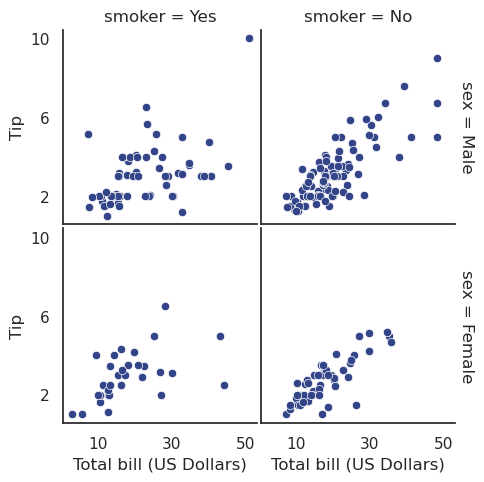
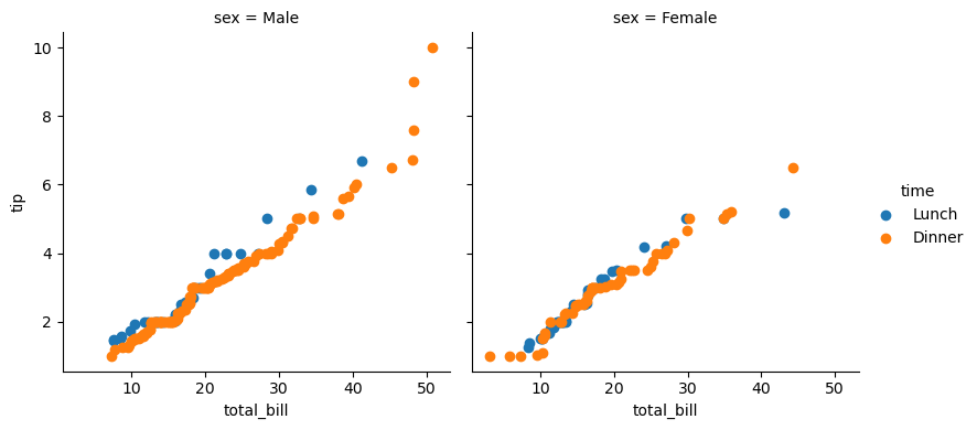
一旦您使用FacetGrid.map()(可以多次调用)绘制了一个图,您可能想要调整图的某些方面。在FacetGrid对象上还有许多方法可以在更高的抽象层次上操作图形。最通用的方法是FacetGrid.set(),还有其他更专门的方法,如FacetGrid.set_axis_labels(),它们考虑到内部facet没有轴标签这一事实。例如:
>>> with sns.axes_style("white"):
>>>     g = sns.FacetGrid(tips, row="sex", col="smoker", margin_titles=True, height=2.5)
>>> g.map(sns.scatterplot, "total_bill", "tip", color="#334488")
>>> g.set_axis_labels("Total bill (US Dollars)", "Tip")
>>> g.set(xticks=[10, 30, 50], yticks=[2, 6, 10])
>>> g.figure.subplots_adjust(wspace=.02, hspace=.02)
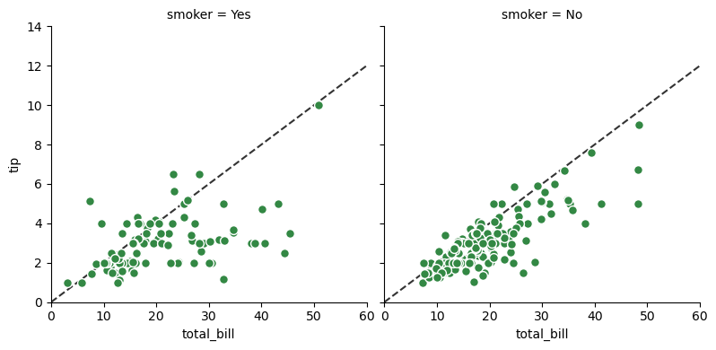
对于更多的定制,您可以直接使用底层的matplotlib
Figure和Axes对象,它们分别作为成员属性存储在Figure和axes_dict中。在制作没有行或列切面的图形时,还可以使用ax属性直接访问单个轴。
>>> import matplotlib.pyplot as plt
>>> g = sns.FacetGrid(tips, col="smoker", margin_titles=True, height=4)
>>> g.map(plt.scatter, "total_bill", "tip", color="#338844", edgecolor="white", s=50, lw=1)
>>> for ax in g.axes_dict.values():
>>>     ax.axline((0, 0), slope=.2, c=".2", ls="--", zorder=0)
>>> g.set(xlim=(0, 60), ylim=(0, 14))
<seaborn.axisgrid.FacetGrid at 0x7f1128803490>
5.11.2. 使用自定义函数
在使用FacetGrid时,您不限于现有的matplotlib和seaborn函数。然而,要正常工作,你使用的任何函数都必须遵循一些规则:
它必须绘制到“当前活动的”matplotlib
Axes上。对于matplotlib中的函数也是如此。matplotlib.pyplot名称空间中的函数也是如此,如果您想直接使用其方法,可以调用matplotlib.pyplot.gca()来获取对当前axis的引用。它必须接受它在位置参数中绘制的数据。在内部,
FacetGrid将为传递给FacetGrid.map()的每个命名位置参数传递Series数据。它必须能够接受
color和label关键字参数,并且,理想情况下,它将使用它们做一些有用的事情。在大多数情况下,最简单的方法是捕获**kwargs的通用字典并将其传递给底层绘图函数。
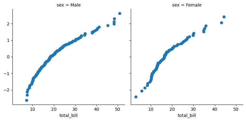
让我们看一下您可以绘制的函数的最小示例。此函数将只为每个方面获取单个数据向量:
>>> from scipy import stats
>>> def quantile_plot(x, **kwargs):
>>>     quantiles, xr = stats.probplot(x, fit=False)
>>>     plt.scatter(xr, quantiles, **kwargs)
>>>
>>> g = sns.FacetGrid(tips, col="sex", height=4)
>>> g.map(quantile_plot, "total_bill")
<seaborn.axisgrid.FacetGrid at 0x7f11288324d0>
如果我们想制作一个二元图,你应该编写函数,使其首先接受 x 轴变量,然后接受 y 轴变量:
>>> def qqplot(x, y, **kwargs):
>>>     _, xr = stats.probplot(x, fit=False)
>>>     _, yr = stats.probplot(y, fit=False)
>>>     plt.scatter(xr, yr, **kwargs)
>>>
>>> g = sns.FacetGrid(tips, col="smoker", height=4)
>>> g.map(qqplot, "total_bill", "tip")
<seaborn.axisgrid.FacetGrid at 0x7f1127f0f650>
因为matplotlib.pyplot.scatter()接受color和label关键字参数,并对它们进行正确的处理,所以我们可以毫无困难地添加一个色调面:
>>> g = sns.FacetGrid(tips, hue="time", col="sex", height=4)
>>> g.map(qqplot, "total_bill", "tip")
>>> g.add_legend()
<seaborn.axisgrid.FacetGrid at 0x7f1127f6ea90>
但是,有时您会希望使用color和label关键字参数映射一个不按预期方式工作的函数。在这种情况下,您需要显式地捕获它们并在自定义函数的逻辑中处理它们。例如,这种方法将允许使用映射matplotlib.pyplot.hexbin(),否则它不能很好地与FacetGrid
API一起使用:
>>> def hexbin(x, y, color, **kwargs):
>>> cmap = sns.light_palette(color, as_cmap=True)
>>> plt.hexbin(x, y, gridsize=15, cmap=cmap, **kwargs)
>>>
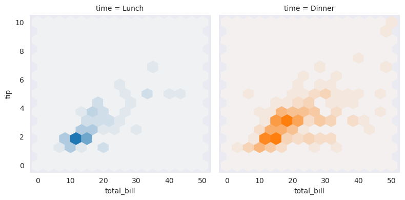
>>> with sns.axes_style("dark"):
>>> g = sns.FacetGrid(tips, hue="time", col="time", height=4)
>>> g.map(hexbin, "total_bill", "tip", extent=[0, 50, 0, 10]);
5.11.3. 绘制成对数据关系
PairGrid还允许您使用相同的图类型快速绘制小子图的网格,以可视化每个子图中的数据。在PairGrid中,每一行和每一列都被分配给一个不同的变量,因此结果图显示了数据集中的每一个成对关系。这种风格的图有时被称为“散点图矩阵”,因为这是显示每个关系的最常见方式,但PairGrid并不局限于散点图。
理解FacetGrid和PairGrid之间的区别是很重要的。在前者中,每个方面都显示了以不同水平的其他变量为条件的相同关系。在后一种情况下,每个图都显示了不同的关系(尽管上下三角形将具有镜像图)。使用PairGrid可以为您提供数据集中有趣关系的非常快速,非常高级的摘要。
该类的基本用法与FacetGrid非常相似。首先初始化网格,然后将绘图函数传递给map方法,并在每个子图上调用它。还有一个配套函数,pairplot(),它牺牲了一些灵活性来实现更快的绘图。
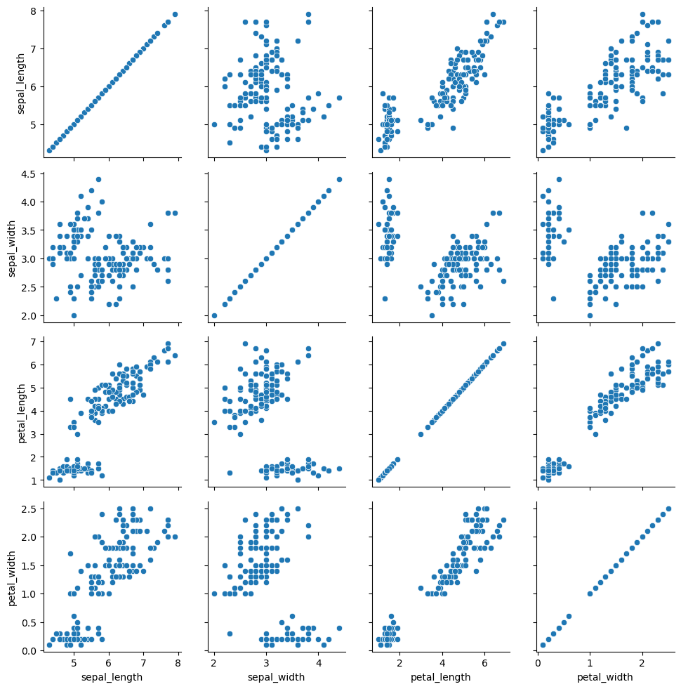
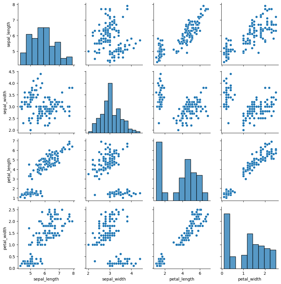
>>> iris = sns.load_dataset("iris")
>>> g = sns.PairGrid(iris)
>>> g.map(sns.scatterplot)
<seaborn.axisgrid.PairGrid at 0x7f1127f724d0>
可以在对角线上绘制不同的函数,以显示每列中变量的单变量分布。请注意,轴刻度与此图的计数轴或密度轴不对应。
>>> g = sns.PairGrid(iris)
>>> g.map_diag(sns.histplot)
>>> g.map_offdiag(sns.scatterplot)
<seaborn.axisgrid.PairGrid at 0x7f1128660a10>
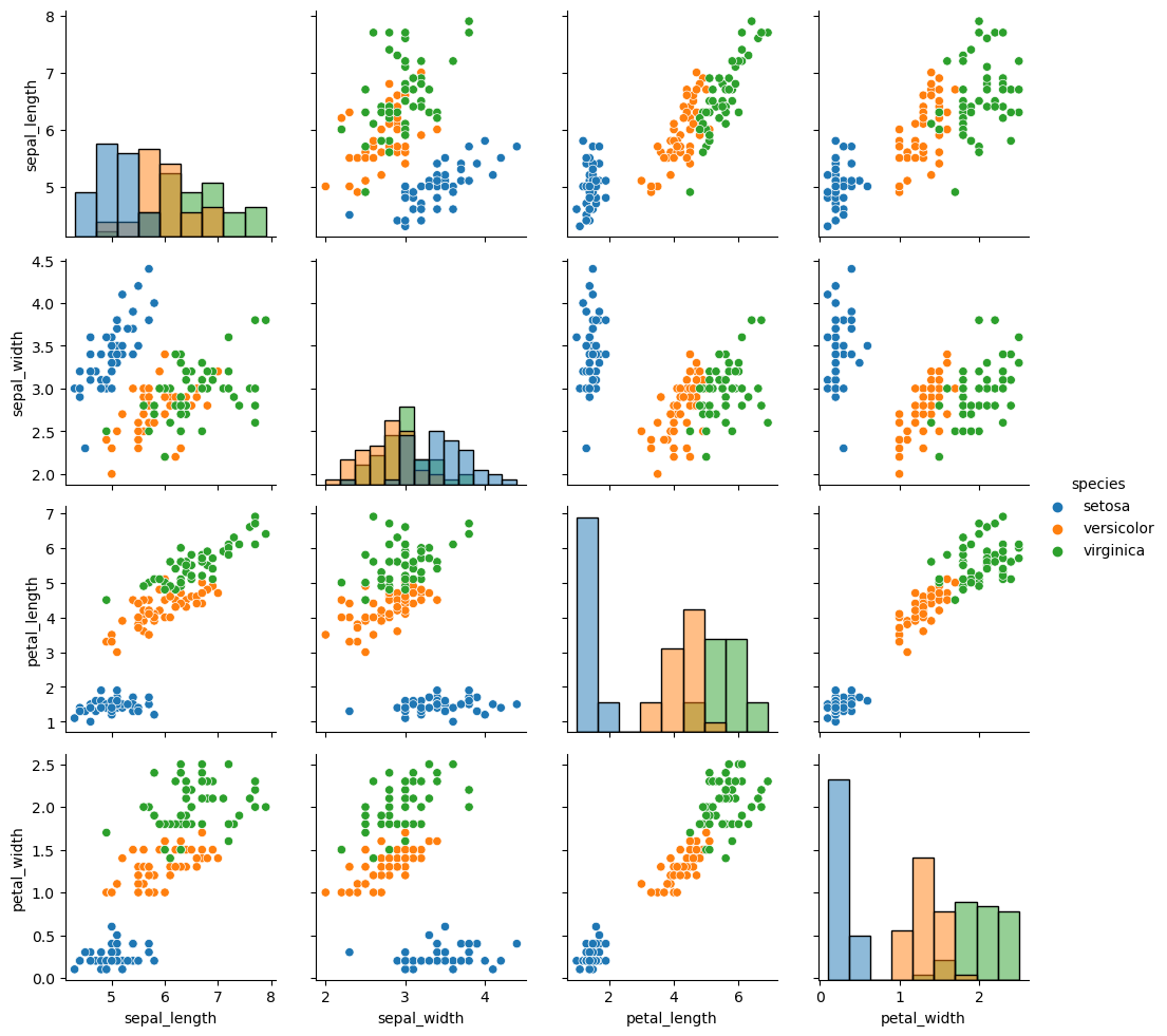
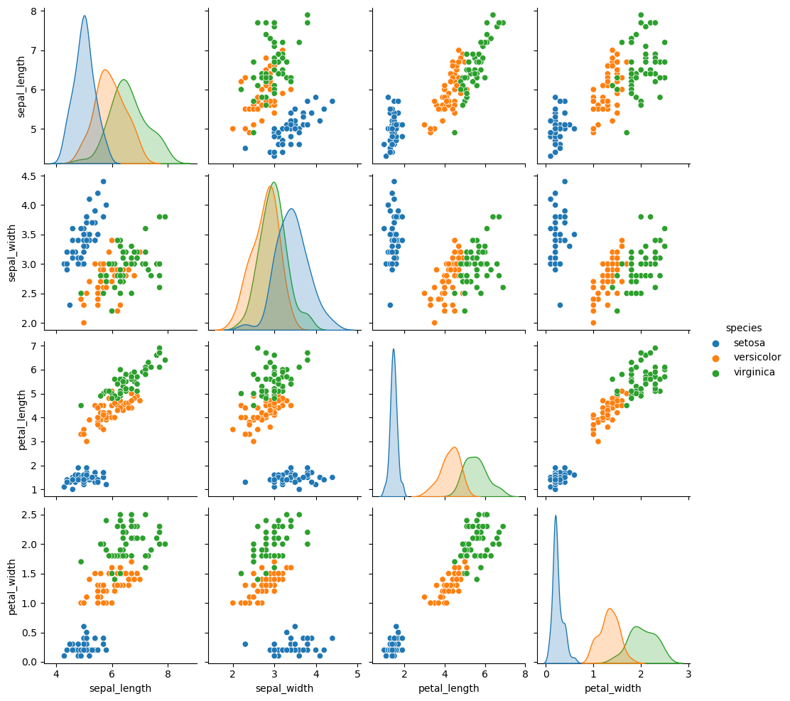
使用此图的一种非常常见的方法是通过单独的分类变量为观测值着色。例如,鸢尾花数据集对三种不同种类的鸢尾花各有四个测量值,因此您可以看到它们的不同之处。
>>> g = sns.PairGrid(iris, hue="species")
>>> g.map_diag(sns.histplot)
>>> g.map_offdiag(sns.scatterplot)
>>> g.add_legend()
<seaborn.axisgrid.PairGrid at 0x7f1127f70810>
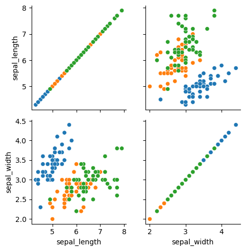
默认情况下,使用数据集中的每个数值列,但如果需要,可以专注于特定关系。
>>> g = sns.PairGrid(iris, vars=["sepal_length", "sepal_width"], hue="species")
>>> g.map(sns.scatterplot)
<seaborn.axisgrid.PairGrid at 0x7f11244a0750>
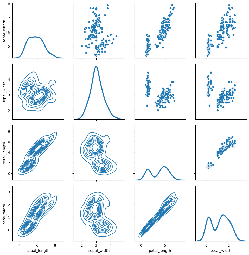
也可以在上三角形和下三角形中使用不同的函数来强调关系的不同方面。
>>> g = sns.PairGrid(iris)
>>> g.map_upper(sns.scatterplot)
>>> g.map_lower(sns.kdeplot)
>>> g.map_diag(sns.kdeplot, lw=3, legend=False)
<seaborn.axisgrid.PairGrid at 0x7f1124403550>
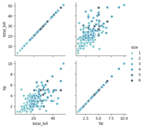
对角线上具有恒等关系的方形网格实际上只是一个特例,您可以在行和列中使用不同的变量进行绘图。
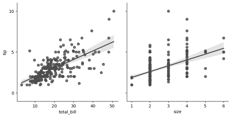
>>> g = sns.PairGrid(tips, y_vars=["tip"], x_vars=["total_bill", "size"], height=4)
>>> g.map(sns.regplot, color=".3")
>>> g.set(ylim=(-1, 11), yticks=[0, 5, 10])
<seaborn.axisgrid.PairGrid at 0x7f111f56d990>
当然,美学属性是可配置的。例如,您可以使用不同的调色板(例如,显示hue变量的顺序)并将关键字参数传递到绘图函数中。
>>> g = sns.PairGrid(tips, hue="size", palette="GnBu_d")
>>> g.map(plt.scatter, s=50, edgecolor="white")
>>> g.add_legend()
<seaborn.axisgrid.PairGrid at 0x7f111f3bde50>
PairGrid是灵活的,但要快速查看数据集,使用pairplot()可能更容易。该函数默认使用散点图和直方图,不过还会添加一些其他类型的散点图(目前,您还可以在非对角线上绘制回归图,在对角线上绘制kde)。
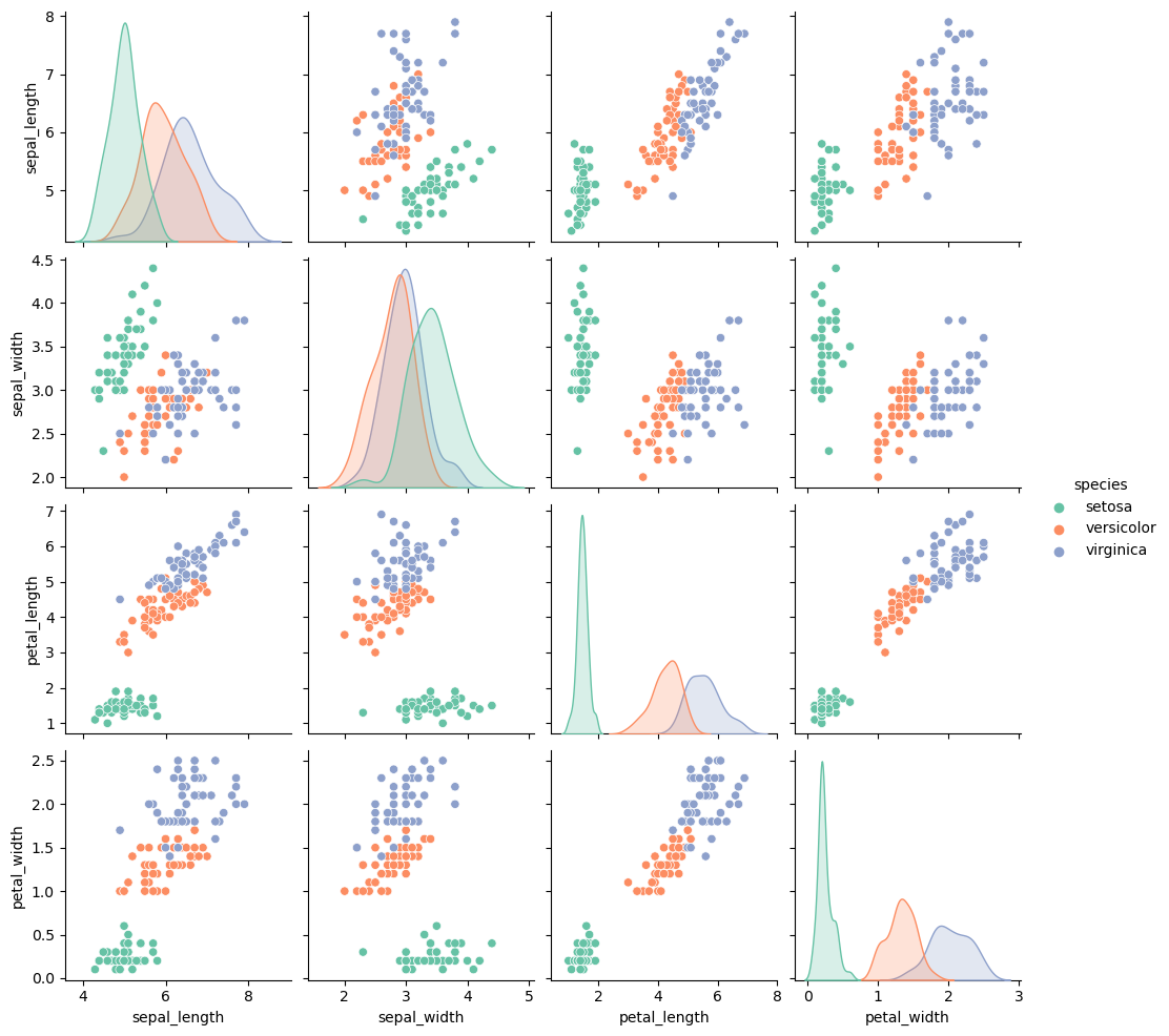
>>> sns.pairplot(iris, hue="species", height=2.5)
<seaborn.axisgrid.PairGrid at 0x7f111f11e4d0>
您还可以使用关键字参数控制绘图的美感,并返回PairGrid实例进行进一步调整。
>>> g = sns.pairplot(iris, hue="species", palette="Set2", diag_kind="kde", height=2.5)