>>> from env_helper import info; info()
页面更新时间: 2024-03-04 14:11:34
运行环境:
    Linux发行版本: Debian GNU/Linux 12 (bookworm)
    操作系统内核: Linux-6.1.0-18-amd64-x86_64-with-glibc2.36
    Python版本: 3.11.2
11.2. 地图工具
GeoPandas提供了一个用于制作地图的高级接口 Matplotlib 库。
其地图绘制功能与GeoSeries或GeoDataFrame使用 plot()
方法一样便于操作。
一些示例数据:
>>> %matplotlib inline
>>> import geopandas as gpd
>>> world = gpd.read_file(gpd.datasets.get_path('naturalearth_lowres'))
>>>
>>> cities = gpd.read_file(gpd.datasets.get_path('naturalearth_cities'))
查看数据。
>>> world.head()
| pop_est | continent | name | iso_a3 | gdp_md_est | geometry | |
|---|---|---|---|---|---|---|
| 0 | 889953.0 | Oceania | Fiji | FJI | 5496 | MULTIPOLYGON (((180.00000 -16.06713, 180.00000... |
| 1 | 58005463.0 | Africa | Tanzania | TZA | 63177 | POLYGON ((33.90371 -0.95000, 34.07262 -1.05982... |
| 2 | 603253.0 | Africa | W. Sahara | ESH | 907 | POLYGON ((-8.66559 27.65643, -8.66512 27.58948... |
| 3 | 37589262.0 | North America | Canada | CAN | 1736425 | MULTIPOLYGON (((-122.84000 49.00000, -122.9742... |
| 4 | 328239523.0 | North America | United States of America | USA | 21433226 | MULTIPOLYGON (((-122.84000 49.00000, -120.0000... |
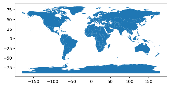
我们现在可以绘制这些GeoDataFrames:
>>> world.plot();
注意,一般来说,任何可以输出到 Matplotlib 中 pyplot
的选项(或者适用于行的样式选项)都可以输出给 plot() 方法。
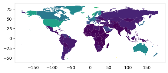
11.2.1. Chloropleth地图
Geopandas 创建 Chloropleth
地图比较简单(每个形状颜色对应于相关联变量值的地图)。 只需使用
plot() 命令,将列参数设置为要用于分配颜色值的列即可。
>>> # Plot by GDP per capta
>>> world = world[(world.pop_est>0) & (world.name!="Antarctica")]
>>>
>>> world['gdp_per_cap'] = world.gdp_md_est / world.pop_est
>>>
>>> world.plot(column='gdp_per_cap');
/usr/lib/python3/dist-packages/geopandas/geodataframe.py:1443: SettingWithCopyWarning:
A value is trying to be set on a copy of a slice from a DataFrame.
Try using .loc[row_indexer,col_indexer] = value instead

See the caveats in the documentation: https://pandas.pydata.org/pandas-docs/stable/user_guide/indexing.html#returning-a-view-versus-a-copy
  super().__setitem__(key, value)
选择颜色。 还可以使用cmap选项修改plot颜色(有关色彩图的完整列表,请参阅matplotlib网站):
>>> world.plot(column='gdp_per_cap', cmap='OrRd');

颜色映射的缩放方式也可以使用scheme选项(如果你已经安装了pysal,可以通过conda
install pysal来实现)。 默认情况下,scheme设置为 equal_intervals
,但也可以调整为任何其他pysal选项,如“分位数”,“百分位数”等。
另外在制图方面可以安装 Python 的
mapclassify,以支持更多的制图方式。
pip install mapclassify
使用如下方式:
world.plot(column='gdp_per_cap', cmap='OrRd', scheme='quantiles');
11.2.2. 地图图层
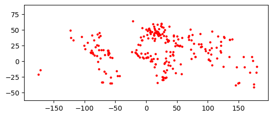
在合并地图之前,请一定要确保它们的共享公用CRS(以便它们对齐)。
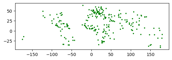
>>> # Look at capitals
>>> # Note use of standard `pyplot` line style options
>>> cities.plot(marker='*', color='green', markersize=5);
>>>
>>> # Check crs
>>> cities = cities.to_crs(world.crs)
>>>
>>> # Now we can overlay over country outlines
>>> # And yes, there are lots of island capitals
>>> # apparently in the middle of the ocean!
方法1
>>> base = world.plot(color='white')
>>> cities.plot(ax=base, marker='o', color='red', markersize=5);
使用matplotlib对象
>>> import matplotlib.pyplot as plt
>>>
>>> fig, ax = plt.subplots()
>>>
>>> # set aspect to equal. This is done automatically
>>> # when using *geopandas* plot on it's own, but not when
>>> # working with pyplot directly.
>>>
>>> ax.set_aspect('equal')
>>> world.plot(ax=ax, color='white')
>>> cities.plot(ax=ax, marker='o', color='red', markersize=5)
<AxesSubplot: >

>>> fig, ax = plt.subplots()
>>>
>>> # set aspect to equal. This is done automatically
>>> # when using *geopandas* plot on it's own, but not when
>>> # working with pyplot directly.
>>>
>>> ax.set_aspect('equal')
>>>
>>> world.plot(ax=ax, color='white')
>>>
>>> cities.plot(ax=ax, marker='o', color='red', markersize=5)
>>>
>>> plt.show()
