>>> from env_helper import info; info();
页面更新时间: 2024-04-10 15:02:19
运行环境:
    Linux发行版本: Debian GNU/Linux 12 (bookworm)
    操作系统内核: Linux-6.1.0-18-amd64-x86_64-with-glibc2.36
    Python版本: 3.11.2
10.1. Cartopy 介绍
Cartopy是一个Python包,用于地理空间数据处理,以便生成地图和其他地理空间数据分析。 Cartopy利用了强大的PROJ.4、NumPy和Shapely库,并在Matplotlib之上构建了一个编程接口,用于创建发布高质量的地图。
Cartopy的主要特点是面向对象的投影定义,以及在投影之间转换点、线、向量、多边形和图像的能力。 Cartopy 对于大尺度/小比例尺数据特别有用,在这些数据中,球面数据的笛卡尔假设通常会被打破。 如果你曾经经历过极点的奇点或日期线的截止点,你很可能会欣赏 Cartopy 的独特功能!
10.1.1. 简单地图
使用 Cartopy 创建基本地图非常简单,只需告诉Matplotlib使用的某种地图投影,然后在轴上添加一些海岸线:
>>> import cartopy.crs as ccrs
>>> import matplotlib.pyplot as plt
>>>
>>> ax = plt.axes(projection=ccrs.PlateCarree())
>>> ax.coastlines()
<cartopy.mpl.feature_artist.FeatureArtist at 0x7fc76fab92d0>
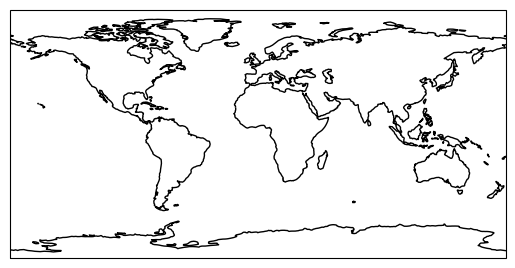
在Jupyter交互环境中,上面代码运行会展示出来地图。
如果要保存图形,请使用 Matplotlib 的 savefig() 函数。:
>>> plt.savefig('coastlines.pdf')
<Figure size 640x480 with 0 Axes>
或者使用不同的文件格式:
>>> plt.savefig('coastlines.png')
<Figure size 640x480 with 0 Axes>
在其它的交互环境中,一般需要运行下面的语句来显示地图图形:
>>> plt.show()
10.1.2. 设置地图投影
与Matplotlib一起使用的可用投影的列表可以在Cartopy投影列表页上找到。 代码
plt.axes(projection=ccrs.PlateCarree())
建立了一个GeoAxes实例,该实例公开了各种其他与地图相关的方法。
在前面的例子中,我们使用了 coolides() 方法将海岸线添加到地图中;
这里使用 stock_img() 方法将参考底图图像添加到地图:
>>> import cartopy.crs as ccrs
>>> import matplotlib.pyplot as plt
>>>
>>> ax = plt.axes(projection=ccrs.Mollweide())
>>> ax.stock_img()
>>> ax.coastlines()
>>> # plt.show()
<cartopy.mpl.feature_artist.FeatureArtist at 0x7fc765872010>
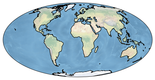
上面的代码设置了不同的投影,并创建一个覆盖有海岸线的图像底图地图。
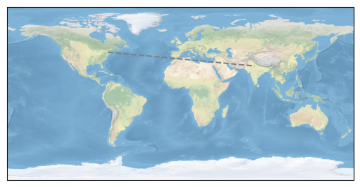
10.1.3. 向地图添加数据
一旦你有了你想要的地图,数据可以在与其一致的Matplotlib坐标系统中直接添加。
默认情况下,添加到地理轴的任何数据的坐标系都与地理轴本身的坐标系相同,
要控制给定数据所在的坐标系,可以使用的 cartopy.crs.crs 实例添加
transform 关键字:
>>> import cartopy.crs as ccrs
>>> import matplotlib.pyplot as plt
>>>
>>> ax = plt.axes(projection=ccrs.PlateCarree())
>>> ax.stock_img()
>>>
>>> ny_lon, ny_lat = -75, 43
>>> delhi_lon, delhi_lat = 77.23, 28.61
>>>
>>> plt.plot([ny_lon, delhi_lon], [ny_lat, delhi_lat],
>>>          color='gray', linestyle='--',
>>>          transform=ccrs.PlateCarree(),
>>>          )
[<matplotlib.lines.Line2D at 0x7fc766fb73d0>]
>>> ax = plt.axes(projection=ccrs.PlateCarree())
>>> ax.stock_img()
>>>
>>> plt.plot([ny_lon, delhi_lon], [ny_lat, delhi_lat],
>>>          color='gray', linestyle='--',
>>>          transform=ccrs.PlateCarree(),
>>>          )
>>>
>>> plt.plot([ny_lon, delhi_lon], [ny_lat, delhi_lat],
>>>          color='blue', linewidth=2, marker='o',
>>>          transform=ccrs.Geodetic(),
>>>          )
[<matplotlib.lines.Line2D at 0x7fc765623c90>]
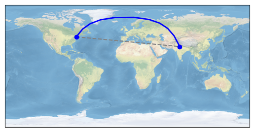
添加文字标注:
>>> ax = plt.axes(projection=ccrs.PlateCarree())
>>> ax.stock_img()
>>>
>>>
>>> plt.plot([ny_lon, delhi_lon], [ny_lat, delhi_lat],
>>>          color='blue', linewidth=2, marker='o',
>>>          transform=ccrs.Geodetic(),
>>>          )
>>> plt.plot([ny_lon, delhi_lon], [ny_lat, delhi_lat],
>>>          color='gray', linestyle='--',
>>>          transform=ccrs.PlateCarree(),
>>>          )
>>> plt.text(ny_lon - 3, ny_lat - 12, 'New York',
>>>          horizontalalignment='right',
>>>          transform=ccrs.Geodetic())
>>>
>>> plt.text(delhi_lon + 3, delhi_lat - 12, 'Delhi',
>>>          horizontalalignment='left',
>>>          transform=ccrs.Geodetic())
>>>
>>> plt.show()
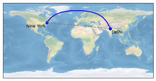
请注意,在平面地图上,纽约和德里之间的蓝色线(最短距离)不是直线。 这是因为大地坐标系是一个真正的球面坐标系,其中两点之间的线被定义为地球上这些点之间的最短路径,而不是二维笛卡尔空间。
10.1.4. 关于坐标轴
默认情况下,Matplotlib会根据打印的数据自动设置轴的限制。 Cartopy
实现了一个 GeoAxes 类,这相当于结果地图的限制。
有时这种自动缩放是一种理想的特性,而其他时候则不是。
要设置 Cartopy 地理轴的范围,有几个方便的选项:
对于“全局”绘图,使用
set_global()方法。要基于边界框在任何坐标系中设置地图的范围,请使用
set_extent()方法。或者,可以在
GeoAxes的本机坐标系中使用标准限制设置方法(例如set_xlim()和set_ylim())。