注解
点击 here 下载完整的示例代码
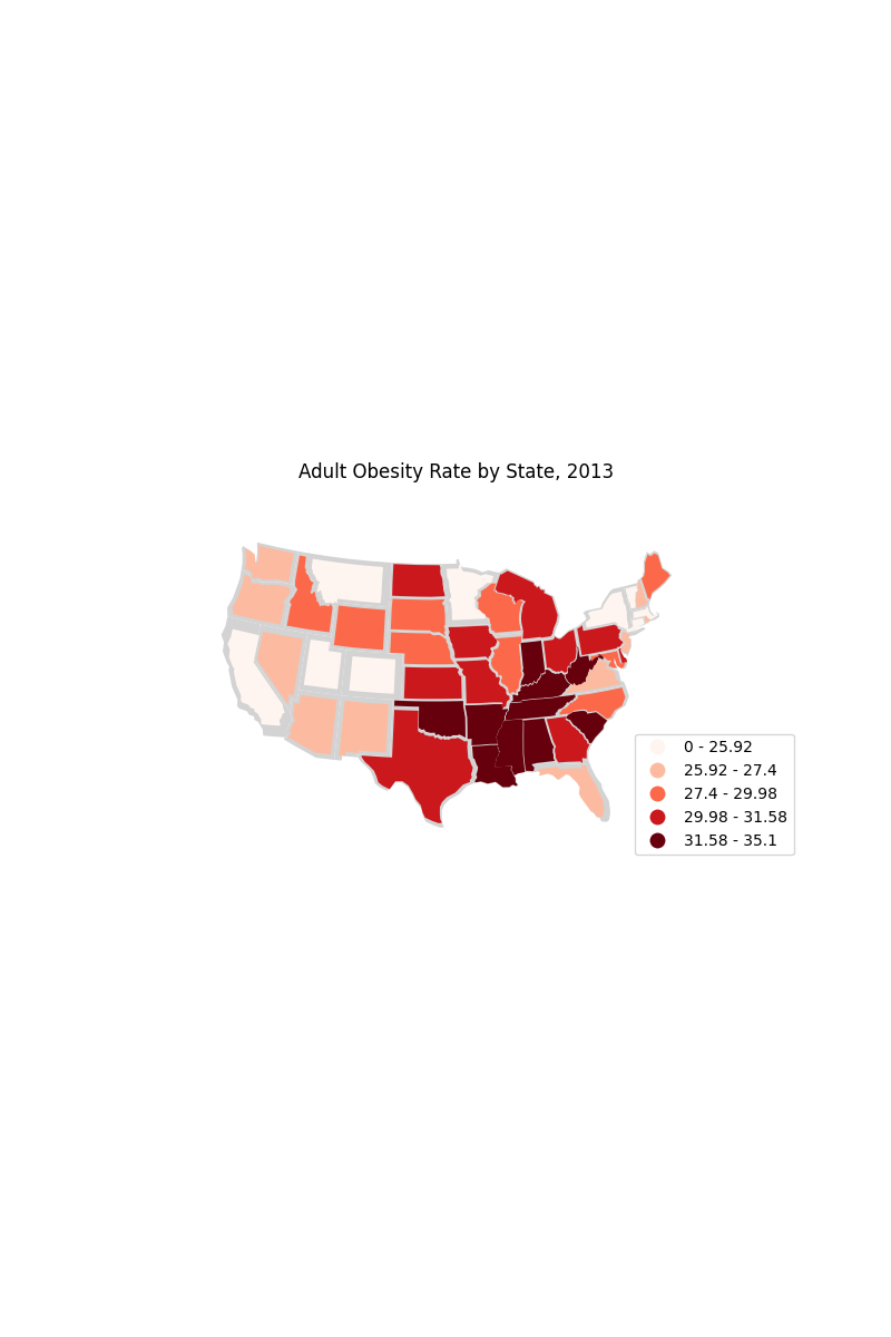
美国各州肥胖率图表
这个例子 cartogram 展示了美国肥胖的地区趋势。崎岖的山区最健康;深南部最不健康。
这个例子的灵感来自 "Non-Contiguous Cartogram" D3.JS示例库中的示例。
import pandas as pd
import geopandas as gpd
import geoplot as gplt
import geoplot.crs as gcrs
import matplotlib.pyplot as plt
import mapclassify as mc

# load the data
obesity_by_state = pd.read_csv(gplt.datasets.get_path('obesity_by_state'), sep='\t')
contiguous_usa = gpd.read_file(gplt.datasets.get_path('contiguous_usa'))
contiguous_usa['Obesity Rate'] = contiguous_usa['state'].map(
    lambda state: obesity_by_state.query("State == @state").iloc[0]['Percent']
)
scheme = mc.Quantiles(contiguous_usa['Obesity Rate'], k=5)


ax = gplt.cartogram(
    contiguous_usa,
    scale='Obesity Rate', limits=(0.75, 1),
    projection=gcrs.AlbersEqualArea(central_longitude=-98, central_latitude=39.5),
    hue='Obesity Rate', cmap='Reds', scheme=scheme,
    linewidth=0.5,
    legend=True, legend_kwargs={'loc': 'lower right'}, legend_var='hue',
    figsize=(8, 12)
)
gplt.polyplot(contiguous_usa, facecolor='lightgray', edgecolor='None', ax=ax)

plt.title("Adult Obesity Rate by State, 2013")
plt.savefig("obesity.png", bbox_inches='tight', pad_inches=0.1)
脚本的总运行时间: (0分3.205秒)