快速启动
geoplot 是一个地理空间数据可视化库,专为数据科学家和地理空间分析人员设计,他们只想完成一些事情。在本教程中,我们将学习 geoplot 看看它是怎么用的。
您可以使用交互式方式运行本教程代码 Binder .
# Configure matplotlib.
%matplotlib inline

# Unclutter the display.
import pandas as pd; pd.set_option('max_columns', 6)
地理空间分析的出发点是地理空间数据。在Python中使用 geopandas -地理空间数据解析库 pandas 类库。
import geopandas as gpd
geopandas 表示使用 GeoDataFrame ,这只是 pandas DataFrame 带着一个特殊的 geometry 包含描述相关记录物理性质的几何对象的列:a POINT 在太空中 POLYGON 纽约的形状,等等。
import geoplot as gplt
usa_cities = gpd.read_file(gplt.datasets.get_path('usa_cities'))
usa_cities.head()
| id | POP_2010 | ELEV_IN_FT | STATE | geometry | |
|---|---|---|---|---|---|
| 0 | 53 | 40888.0 | 1611.0 | ND | POINT (-101.2962732 48.23250950000011) |
| 1 | 101 | 52838.0 | 830.0 | ND | POINT (-97.03285469999997 47.92525680000006) |
| 2 | 153 | 15427.0 | 1407.0 | ND | POINT (-98.70843569999994 46.91054380000003) |
| 3 | 177 | 105549.0 | 902.0 | ND | POINT (-96.78980339999998 46.87718630000012) |
| 4 | 192 | 17787.0 | 2411.0 | ND | POINT (-102.7896241999999 46.87917560000005) |
中的所有函数 geoplot take a GeoDataFrame as input. To learn more about manipulating geospatial data, see the section Working with Geospatial Data .
import geoplot as gplt
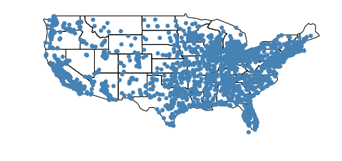
如果数据由一组点组成,则可以使用 pointplot .
continental_usa_cities = usa_cities.query('STATE not in ["HI", "AK", "PR"]')
gplt.pointplot(continental_usa_cities)
<matplotlib.axes._subplots.AxesSubplot at 0x1290c9320>

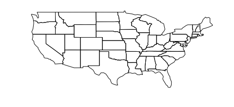
如果使用多边形数据,则可以使用 geoplot polyplot .
contiguous_usa = gpd.read_file(gplt.datasets.get_path('contiguous_usa'))
gplt.polyplot(contiguous_usa)
<matplotlib.axes._subplots.AxesSubplot at 0x1291c7128>
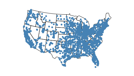
我们可以使用套印将这两个图结合起来。 过涂 将几个不同的地块堆叠在一起的行为是否有助于为我们的地块提供额外的背景:
ax = gplt.polyplot(contiguous_usa)
gplt.pointplot(continental_usa_cities, ax=ax)
<matplotlib.axes._subplots.AxesSubplot at 0x129a73eb8>
你可能注意到这张美国地图看起来很奇怪。在地球上,两维空间是不可能的。因此,每当我们把数据从球体上取下来放到地图上时,我们都在使用某种 投影 ,或使球体变平的方法。在没有投影或“全权委托”的情况下绘制数据会在地图中造成扭曲。我们可以通过选择更好的投影来“修复”失真。
阿尔伯斯等面积投影是美国最常见的投影之一。下面是你如何使用它 geoplot :
import geoplot.crs as gcrs

ax = gplt.polyplot(contiguous_usa, projection=gcrs.AlbersEqualArea())
gplt.pointplot(continental_usa_cities, ax=ax)
<cartopy.mpl.geoaxes.GeoAxesSubplot at 0x129aec6a0>
好多了!要了解有关投影的更多信息,请查看教程的“投影”部分 Working with Projections .
如果你想创建一个 webmap 相反呢?这也很容易做到。
ax = gplt.webmap(contiguous_usa, projection=gcrs.WebMercator())
gplt.pointplot(continental_usa_cities, ax=ax)
<cartopy.mpl.geoaxes.GeoAxesSubplot at 0x129b80c18>
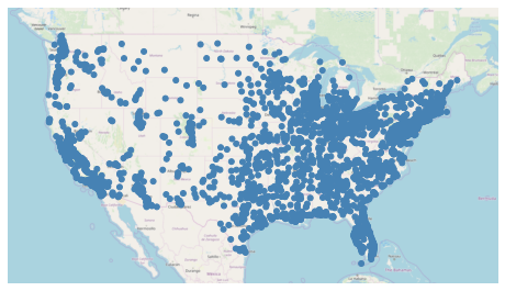
这是一个静态网络地图。也可以使用交互式(滚动窗格)网络地图: see the demo 举个例子。
这张地图告诉我们,任何一个海岸的城市都比落基山脉及其周围的城市要多,但它没有告诉我们任何关于城市本身的信息。我们可以通过添加 hue 到绘图:
ax = gplt.webmap(contiguous_usa, projection=gcrs.WebMercator())
gplt.pointplot(continental_usa_cities, ax=ax, hue='ELEV_IN_FT', legend=True)
<cartopy.mpl.geoaxes.GeoAxesSubplot at 0x129c42c88>
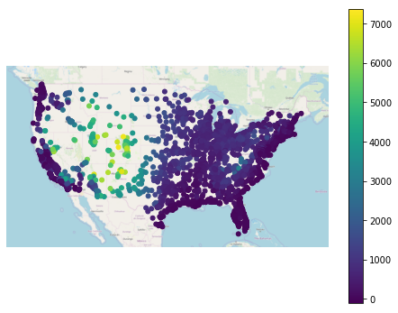
这张地图告诉我们一个清晰的故事:美国中部的城市拥有更高的 ELEV_IN_FT 然后是美国其他大多数城市,尤其是沿海城市。打开图例有助于使此结果更易于解释。
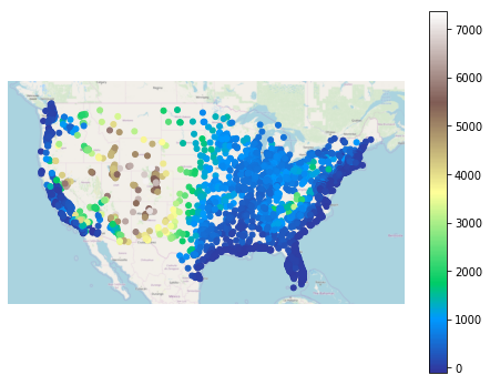
使用不同的 colormap 使用 cmap 参数:
ax = gplt.webmap(contiguous_usa, projection=gcrs.WebMercator())
gplt.pointplot(continental_usa_cities, ax=ax, hue='ELEV_IN_FT', cmap='terrain', legend=True)
<cartopy.mpl.geoaxes.GeoAxesSubplot at 0x12c8642b0>
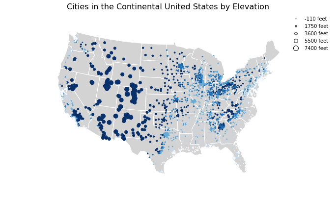
geoplot 配备了多种视觉选项,可根据您的喜好进行调整。
ax = gplt.polyplot(
    contiguous_usa, projection=gcrs.AlbersEqualArea(),
    edgecolor='white', facecolor='lightgray',
    figsize=(12, 8)
)
gplt.pointplot(
    continental_usa_cities, ax=ax, hue='ELEV_IN_FT', cmap='Blues',
    scheme='quantiles',
    scale='ELEV_IN_FT', limits=(1, 10),
    legend=True, legend_var='scale',
    legend_kwargs={'frameon': False},
    legend_values=[-110, 1750, 3600, 5500, 7400],
    legend_labels=['-110 feet', '1750 feet', '3600 feet', '5500 feet', '7400 feet']
)
ax.set_title('Cities in the Continental United States by Elevation', fontsize=16)
/Users/alex/miniconda3/envs/geoplot-dev/lib/python3.6/site-packages/scipy/stats/stats.py:1633: FutureWarning: Using a non-tuple sequence for multidimensional indexing is deprecated; use arr[tuple(seq)] instead of arr[seq]. In the future this will be interpreted as an array index, arr[np.array(seq)], which will result either in an error or a different result.
  return np.add.reduce(sorted[indexer] * weights, axis=axis) / sumval
Text(0.5, 1.0, 'Cities in the Continental United States by Elevation')
让我们看一下中可用的其他两种绘图类型 geoplot (for the full list, see the Plot Reference )
gplt.choropleth(
    contiguous_usa, hue='population', projection=gcrs.AlbersEqualArea(),
    edgecolor='white', linewidth=1,
    cmap='Greens', legend=True,
    scheme='FisherJenks',
    legend_labels=[
        '<3 million', '3-6.7 million', '6.7-12.8 million',
        '12.8-25 million', '25-37 million'
    ]
)
<cartopy.mpl.geoaxes.GeoAxesSubplot at 0x12cb5e128>
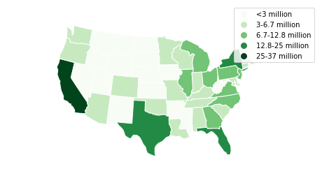
这个 choropleth 按州划分的人口比例表明,某些沿海州比美国中部的其他州大得多。A choropleth 是地图制图学中显示区域信息的旗手,因为它易于制作和解释。
boroughs = gpd.read_file(gplt.datasets.get_path('nyc_boroughs'))
collisions = gpd.read_file(gplt.datasets.get_path('nyc_collision_factors'))

ax = gplt.kdeplot(collisions, cmap='Reds', shade=True, clip=boroughs, projection=gcrs.AlbersEqualArea())
gplt.polyplot(boroughs, zorder=1, ax=ax)
/Users/alex/miniconda3/envs/geoplot-dev/lib/python3.6/site-packages/scipy/stats/stats.py:1633: FutureWarning: Using a non-tuple sequence for multidimensional indexing is deprecated; use arr[tuple(seq)] instead of arr[seq]. In the future this will be interpreted as an array index, arr[np.array(seq)], which will result either in an error or a different result.
  return np.add.reduce(sorted[indexer] * weights, axis=axis) / sumval
<cartopy.mpl.geoaxes.GeoAxesSubplot at 0x12f173ac8>

A kdeplot 将点数据平滑到热图中。这使得在您的输入数据中很容易发现区域趋势。这个 clip 参数可用于将生成的绘图剪裁到周围的几何图形(在本例中为纽约市的轮廓)。
你现在应该知道的够多了 geoplot 在你自己的项目中尝试!
安装 geoplot, run conda install geoplot. To see more examples using geoplot, check out the Gallery .