自定义绘图
geoplot 打印有大量样式参数,包括外观参数(例如,地图边框的颜色)和信息参数(例如,颜色地图的选择)。本教程的这一部分解释了这些方法是如何工作的。
您可以使用交互式方式跟随本教程 Binder .
位置
A visual variable 用来传达信息的情节。每个地图都有一个共同的变量 位置 .
%matplotlib inline
import geopandas as gpd
import geoplot as gplt

continental_usa_cities = gpd.read_file(gplt.datasets.get_path('usa_cities'))
continental_usa_cities = continental_usa_cities.query('STATE not in ["AK", "HI", "PR"]')
contiguous_usa = gpd.read_file(gplt.datasets.get_path('contiguous_usa'))
import geoplot.crs as gcrs

ax = gplt.webmap(contiguous_usa, projection=gcrs.WebMercator())
gplt.pointplot(continental_usa_cities, ax=ax)
<cartopy.mpl.geoaxes.GeoAxesSubplot at 0x12beeeda0>
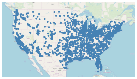
这幅图显示了美国大陆人口超过10000的城市。它只有一个视觉变量,位置。通过考察这些地点的分布,我们发现落基山脉周围的美国部分地区人口比沿海地区更为稀少。
色调
中的“色调”参数 geoplot 添加 颜色 作为绘图中的视觉变量。
此参数称为“色调”,而不是“颜色”,因为
color是中的保留关键字matplotlib应用程序编程接口。
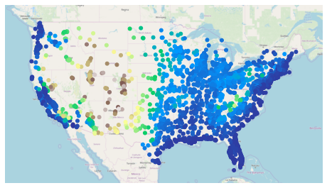
ax = gplt.webmap(contiguous_usa, projection=gcrs.WebMercator())
gplt.pointplot(
    continental_usa_cities,
    hue='ELEV_IN_FT',
    ax=ax
)
<cartopy.mpl.geoaxes.GeoAxesSubplot at 0x12bfb88d0>
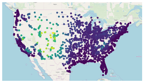
在这种情况下,我们设置 hue='ELEV_IN_FT' ,讲述 geoplot 根据平均高程为点着色。
有两种为几何体指定颜色的方法:一种是连续的colormap,它只在一系列数据上应用颜色;另一种是分类的colormap,它存储数据而不将颜色应用到这些存储桶。
geoplot 默认情况下使用连续颜色贴图。要切换到分类颜色映射,请使用 scheme 参数:
import mapclassify as mc
scheme = mc.Quantiles(continental_usa_cities['ELEV_IN_FT'], k=5)

ax = gplt.webmap(contiguous_usa, projection=gcrs.WebMercator())
gplt.pointplot(
    continental_usa_cities,
    hue='ELEV_IN_FT', scheme=scheme,
    ax=ax
)
/Users/alex/miniconda3/envs/geoplot-dev/lib/python3.6/site-packages/scipy/stats/stats.py:1633: FutureWarning: Using a non-tuple sequence for multidimensional indexing is deprecated; use arr[tuple(seq)] instead of arr[seq]. In the future this will be interpreted as an array index, arr[np.array(seq)], which will result either in an error or a different result.
  return np.add.reduce(sorted[indexer] * weights, axis=axis) / sumval
<cartopy.mpl.geoaxes.GeoAxesSubplot at 0x12bfddeb8>
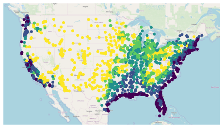
这个 mapclassify 库中有丰富的分类颜色映射列表可供选择。也可以指定自己的自定义分类方案。参考 California districts demo 在图库中查看更多信息。
geoplot 使用 viridis 默认情况下为colormap。要指定可选颜色映射,请使用 cmap 参数:
ax = gplt.webmap(contiguous_usa, projection=gcrs.WebMercator())
gplt.pointplot(
    continental_usa_cities,
    hue='ELEV_IN_FT', cmap='terrain',
    ax=ax
)
<cartopy.mpl.geoaxes.GeoAxesSubplot at 0x12c832d30>
有 over fifty named colormaps 在里面 matplotlib—the reference page has the full list . 也可以创建自己的颜色映射。参考 Napoleon’s march on Moscow 例如在图库中的示例。
超级用户功能:颜色映射规范化
Colormap normalization 中支持 geoplot 通过 norm 参数。
规模
另一个视觉变量出现在 geoplot 是 规模 .
large_continental_usa_cities = continental_usa_cities.query('POP_2010 > 100000')

ax = gplt.webmap(contiguous_usa, projection=gcrs.WebMercator())
gplt.pointplot(
    large_continental_usa_cities, projection=gcrs.AlbersEqualArea(),
    scale='POP_2010', limits=(4, 50),
    ax=ax
)
<cartopy.mpl.geoaxes.GeoAxesSubplot at 0x12dd552b0>
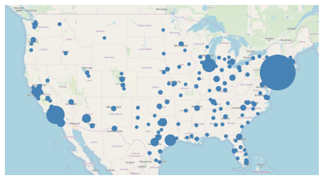
它的大小决定了信息的大小。例如,在这个图中我们可以比在 hue -一些城市(如纽约市和洛杉矶)比其他城市大多少。
您可以使用 limits 参数。
高级用户功能:自定义缩放功能
geoplotuses a linear scale by default. To use a different scale, like e.g. logarithmic, pass a scaling function to thescale_funcparameter. Refer to the USA city elevations 以图库中的演示为例。
传说
A legend 提供与绘图中的视觉变量相对应的值的参考。图例是一项重要功能,因为它们使地图具有可解释性。没有图例,只能将可视变量映射到相对大小。通过图例,可以进一步将它们映射到实际的值范围。
要在绘图中添加图例,请设置 legend=True .
import mapclassify as mc
scheme = mc.Quantiles(large_continental_usa_cities['POP_2010'], k=5)

ax = gplt.webmap(contiguous_usa, projection=gcrs.WebMercator())
gplt.pointplot(
    large_continental_usa_cities, projection=gcrs.AlbersEqualArea(),
    scale='POP_2010', limits=(4, 50),
    hue='POP_2010', cmap='viridis', scheme=scheme,
    legend=True, legend_var='hue',
    ax=ax
)
/Users/alex/miniconda3/envs/geoplot-dev/lib/python3.6/site-packages/scipy/stats/stats.py:1633: FutureWarning: Using a non-tuple sequence for multidimensional indexing is deprecated; use arr[tuple(seq)] instead of arr[seq]. In the future this will be interpreted as an array index, arr[np.array(seq)], which will result either in an error or a different result.
  return np.add.reduce(sorted[indexer] * weights, axis=axis) / sumval
<cartopy.mpl.geoaxes.GeoAxesSubplot at 0x135c57e80>
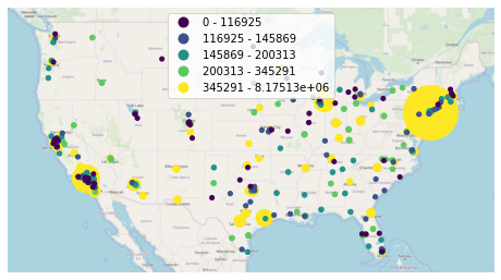
您将获得的图例类型取决于您的配置选项。有三种不同的类型。这个例子演示了 分类颜色图图例 . 如果颜色映射是连续的(例如。 scheme=None; see the section on Hue a) 连续色条 将改用:
ax = gplt.webmap(contiguous_usa, projection=gcrs.WebMercator())
gplt.pointplot(
    large_continental_usa_cities, projection=gcrs.AlbersEqualArea(),
    scale='POP_2010', limits=(2, 30),
    hue='POP_2010', cmap='viridis',
    legend=True,
    ax=ax
)
/Users/alex/Desktop/geoplot/geoplot/geoplot.py:258: UserWarning: Please specify "legend_var" explicitly when both "hue" and "scale" are specified. Defaulting to "legend_var='hue'".
  f'Please specify "legend_var" explicitly when both "hue" and "scale" are '
<cartopy.mpl.geoaxes.GeoAxesSubplot at 0x1347b5d30>
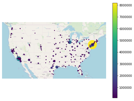
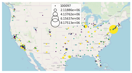
或者,设置 legend_var='scale' 使用A 比例图例 而是:
ax = gplt.webmap(contiguous_usa, projection=gcrs.WebMercator())
gplt.pointplot(
    large_continental_usa_cities, projection=gcrs.AlbersEqualArea(),
    scale='POP_2010', limits=(2, 30),
    hue='POP_2010', cmap='viridis', scheme=scheme,
    legend=True, legend_var='scale',
    ax=ax
)
<cartopy.mpl.geoaxes.GeoAxesSubplot at 0x13755dda0>
可以使用微调图例的外观 legend_kwargs parameter. The list of values this parameter accepts depends on the legend type. In the case of a categorical colormap legend or a scale legend, a matplotlib Legend is used, whose keyword options are listed in the matplotlib documentation . 对于colorbar图例,允许的关键字参数列在中的不同页面中 the matplotlib documentation .
下面是一个使用 legend_kwargs 用于重新定位图例的参数:
ax = gplt.webmap(contiguous_usa, projection=gcrs.WebMercator())
gplt.pointplot(
    large_continental_usa_cities, projection=gcrs.AlbersEqualArea(),
    scale='POP_2010', limits=(2, 30),
    hue='POP_2010', cmap='viridis', scheme=scheme,
    legend=True, legend_var='scale',
    legend_kwargs={'bbox_to_anchor': (1, 0.35), 'frameon': False},
    legend_values=[8000000, 6000000, 4000000, 2000000, 100000],
    legend_labels=['8 million', '6 million', '4 million', '2 million', '100 thousand'],
    ax=ax
)
<cartopy.mpl.geoaxes.GeoAxesSubplot at 0x13969c4a8>
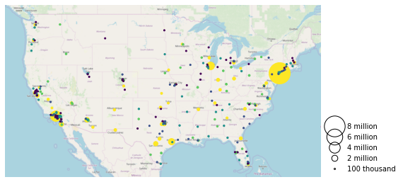
这个例子还演示了 legend_values 和 legend_labels 参数分别自定义图例中的标记和标签。
超级用户功能:自定义图例标记
关键字参数
legend_kwargsthat start withmarker(e.g.marker,markeredgecolor,markeredgewidth,markerfacecolor, andmarkersize) will be passed through the legend down to the legend markers .
范围
这个 程度 一个图的长度是它的轴的跨度。在 geoplot 它的格式是 (min_longitude, min_latitude, max_longitude, max_latitude) . 例如,一个覆盖整个世界的情节的跨度为 (-180, -180, 180, 180) .
这个 extent 参数可用于手动设置绘图范围。这可以用来改变地图的焦点。例如,这里有一张加利福尼亚州人口稠密城市的地图。
import mapclassify as mc
scheme = mc.Quantiles(large_continental_usa_cities['POP_2010'], k=5)

extent = contiguous_usa.query('state == "California"').total_bounds
ax = gplt.pointplot(
    large_continental_usa_cities, projection=gcrs.WebMercator(),
    scale='POP_2010', limits=(5, 100),
    hue='POP_2010', scheme=scheme, cmap='viridis'
)
gplt.webmap(
    contiguous_usa, ax=ax, extent=extent
)
/Users/alex/miniconda3/envs/geoplot-dev/lib/python3.6/site-packages/scipy/stats/stats.py:1633: FutureWarning: Using a non-tuple sequence for multidimensional indexing is deprecated; use arr[tuple(seq)] instead of arr[seq]. In the future this will be interpreted as an array index, arr[np.array(seq)], which will result either in an error or a different result.
  return np.add.reduce(sorted[indexer] * weights, axis=axis) / sumval
<cartopy.mpl.geoaxes.GeoAxesSubplot at 0x13edeb550>
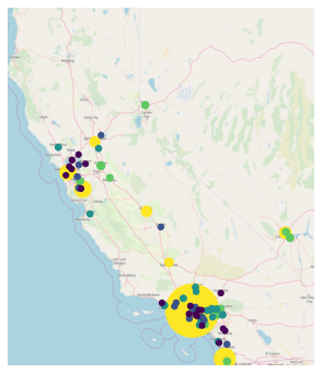
这个 total_bounds 属性 GeoDataFrame ,它返回给定数据块的范围边界框值,在这方面非常有用。
外观参数
未解释为的参数的关键字段 geoplot 而是直接传递给底层 matplotlib 图表实例。这意味着 matplotlib 有打印自定义选项。
我们不会在这里讨论每一个可能的选项,但是我们会提到您想要调整的最常见参数:
edgecolor-控制边框线的颜色。linewidth-控制边框线的宽度。facecolor-控制形状填充的颜色。
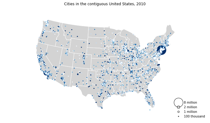
将我们在本指南中学到的所有知识与 matplotlib 定制我们可以生成一些非常漂亮的图:
import geoplot.crs as gcrs
import matplotlib.pyplot as plt
import mapclassify as mc

scheme = mc.Quantiles(continental_usa_cities['POP_2010'], k=5)
proj = gcrs.AlbersEqualArea()

ax = gplt.polyplot(
    contiguous_usa,
    zorder=-1,
    linewidth=1,
    projection=proj,
    edgecolor='white',
    facecolor='lightgray',
    figsize=(12, 12)
)

gplt.pointplot(
    continental_usa_cities,
    scale='POP_2010',
    limits=(2, 30),
    hue='POP_2010',
    cmap='Blues',
    scheme=scheme,
    legend=True,
    legend_var='scale',
    legend_values=[8000000, 2000000, 1000000, 100000],
    legend_labels=['8 million', '2 million', '1 million', '100 thousand'],
    legend_kwargs={'frameon': False, 'loc': 'lower right'},
    ax=ax
)

plt.title("Cities in the contiguous United States, 2010")
/Users/alex/miniconda3/envs/geoplot-dev/lib/python3.6/site-packages/scipy/stats/stats.py:1633: FutureWarning: Using a non-tuple sequence for multidimensional indexing is deprecated; use arr[tuple(seq)] instead of arr[seq]. In the future this will be interpreted as an array index, arr[np.array(seq)], which will result either in an error or a different result.
  return np.add.reduce(sorted[indexer] * weights, axis=axis) / sumval
Text(0.5, 1.0, 'Cities in the contiguous United States, 2010')