注解
点击 here 下载完整的示例代码
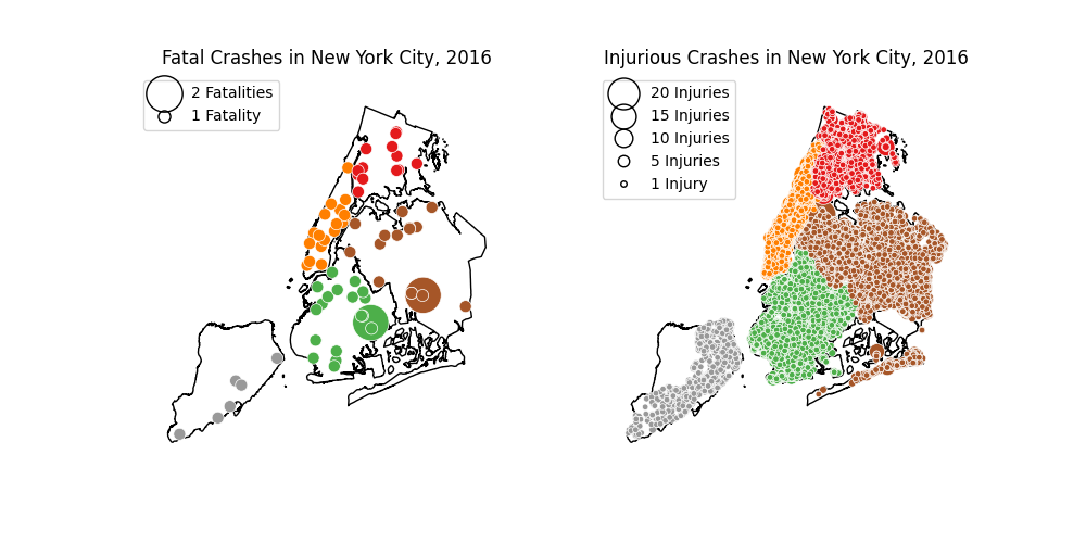
纽约交通事故和致命伤害阴谋
该示例绘制了纽约市致命(>=1死亡)和伤害(>=1受伤需要住院治疗)车辆碰撞。受伤比死亡更常见。
import geopandas as gpd
import geoplot as gplt
import geoplot.crs as gcrs
import matplotlib.pyplot as plt

# load the data
nyc_boroughs = gpd.read_file(gplt.datasets.get_path('nyc_boroughs'))
nyc_fatal_collisions = gpd.read_file(gplt.datasets.get_path('nyc_fatal_collisions'))
nyc_injurious_collisions = gpd.read_file(gplt.datasets.get_path('nyc_injurious_collisions'))


fig = plt.figure(figsize=(10,5))
proj = projection=gcrs.AlbersEqualArea(central_latitude=40.7128, central_longitude=-74.0059)
ax1 = plt.subplot(121, projection=proj)
ax2 = plt.subplot(122, projection=proj)

ax1 = gplt.pointplot(
    nyc_fatal_collisions, projection=proj,
    hue='BOROUGH', cmap='Set1',
    edgecolor='white', linewidth=0.5,
    scale='NUMBER OF PERSONS KILLED', limits=(8, 24),
    legend=True, legend_var='scale',
    legend_kwargs={'loc': 'upper left', 'markeredgecolor': 'black'},
    legend_values=[2, 1], legend_labels=['2 Fatalities', '1 Fatality'],
    ax=ax1
)
gplt.polyplot(nyc_boroughs, ax=ax1)
ax1.set_title("Fatal Crashes in New York City, 2016")

gplt.pointplot(
    nyc_injurious_collisions, projection=proj,
    hue='BOROUGH', cmap='Set1',
    edgecolor='white', linewidth=0.5,
    scale='NUMBER OF PERSONS INJURED', limits=(4, 20),
    legend=True, legend_var='scale',
    legend_kwargs={'loc': 'upper left', 'markeredgecolor': 'black'},
    legend_values=[20, 15, 10, 5, 1],
    legend_labels=['20 Injuries', '15 Injuries', '10 Injuries', '5 Injuries', '1 Injury'],
    ax=ax2
)
gplt.polyplot(nyc_boroughs, ax=ax2, projection=proj)
ax2.set_title("Injurious Crashes in New York City, 2016")

plt.savefig("nyc-collisions-map.png", bbox_inches='tight', pad_inches=0)
脚本的总运行时间: (0分24.788秒)