备注
Go to the end 下载完整的示例代码。
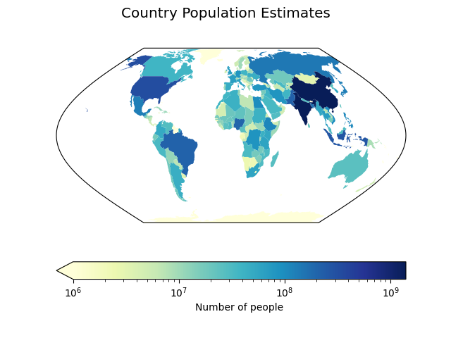
Choropleth地图:将数据与几何关联#
此示例展示了如何基于数据数组对几何图形进行着色。 该功能自Cartopy 0.23起可用。
import matplotlib.colors as mcolors
import matplotlib.pyplot as plt

import cartopy.crs as ccrs
import cartopy.io.shapereader as shpreader


def main():
    # Load Natural Earth's country shapefiles.
    shpfilename = shpreader.natural_earth(resolution='110m',
                                          category='cultural',
                                          name='admin_0_countries')
    reader = shpreader.Reader(shpfilename)
    countries = reader.records()

    # Get hold of the geometry and population estimate from each country's record.
    geometries = []
    population_estimates = []

    for country in countries:
        geometries.append(country.geometry)
        population_estimates.append(country.attributes['POP_EST'])

    # Set up a figure and an axes with the Eckert VI projection.
    fig = plt.figure()
    ax = fig.add_subplot(projection=ccrs.EckertVI())

    # Plot the geometries coloured according to population estimate.
    art = ax.add_geometries(geometries, crs=ccrs.PlateCarree(),
                            array=population_estimates, cmap='YlGnBu',
                            norm=mcolors.LogNorm(vmin=1e6))
    cbar = fig.colorbar(art, orientation='horizontal', extend='min')
    cbar.set_label('Number of people')
    fig.suptitle('Country Population Estimates', fontsize='x-large')

    plt.show()


if __name__ == '__main__':
    main()
Total running time of the script: (0分0.703秒)
Gallery generated by Sphinx-Gallery _