测绘和绘图工具#
地貌熊猫 将高级接口提供给 matplotlib 用于绘制地图的库。映射形状就像使用 plot() 对象上的方法 GeoSeries 或 GeoDataFrame 。
加载一些示例数据:
In [1]: world = geopandas.read_file(geopandas.datasets.get_path('naturalearth_lowres'))

In [2]: cities = geopandas.read_file(geopandas.datasets.get_path('naturalearth_cities'))
我们现在可以绘制这些GeoDataFrame:
# Examine country GeoDataFrame
In [3]: world.head()
Out[3]:
pop_est continent name iso_a3 gdp_md_est geometry
0 920938 Oceania Fiji FJI 8374.0 MULTIPOLYGON (((180.000000000 -16.067132664, 1...
1 53950935 Africa Tanzania TZA 150600.0 POLYGON ((33.903711197 -0.950000000, 34.072620...
2 603253 Africa W. Sahara ESH 906.5 POLYGON ((-8.665589565 27.656425890, -8.665124...
3 35623680 North America Canada CAN 1674000.0 MULTIPOLYGON (((-122.840000000 49.000000000, -...
4 326625791 North America United States of America USA 18560000.0 MULTIPOLYGON (((-122.840000000 49.000000000, -...
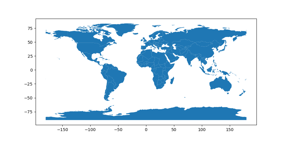
# Basic plot, random colors
In [4]: world.plot();
请注意,一般而言,可以传递给 pyplot 在……里面 matplotlib (或 style options that work for lines )可以传递给 plot() 方法。
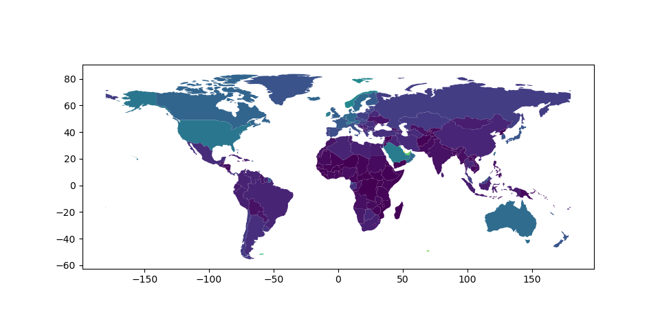
科洛普莱斯地图#
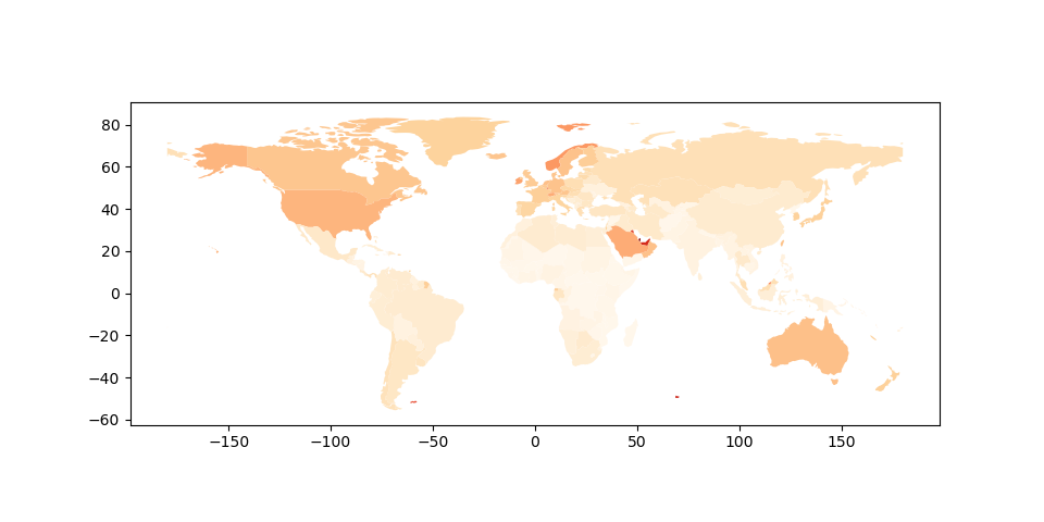
地貌熊猫 便于创建全色贴图(每个形状的颜色基于关联变量的值的贴图)。只需将PLOT命令与 column 参数设置为要用来分配颜色的值的列。
 # Plot by GDP per capita
In [5]: world = world[(world.pop_est>0) & (world.name!="Antarctica")]

In [6]: world['gdp_per_cap'] = world.gdp_md_est / world.pop_est

In [7]: world.plot(column='gdp_per_cap');
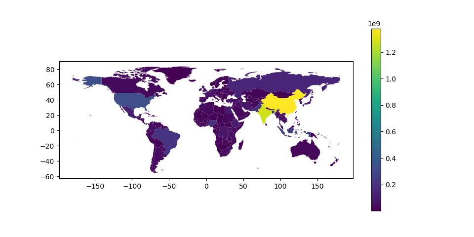
创造传奇#
绘制地图时,可以使用启用图例 legend 论点:
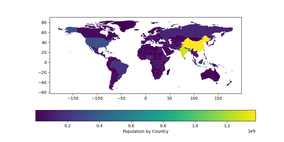
# Plot population estimates with an accurate legend
In [8]: import matplotlib.pyplot as plt

In [9]: fig, ax = plt.subplots(1, 1)

In [10]: world.plot(column='pop_est', ax=ax, legend=True)
Out[10]: <AxesSubplot:>
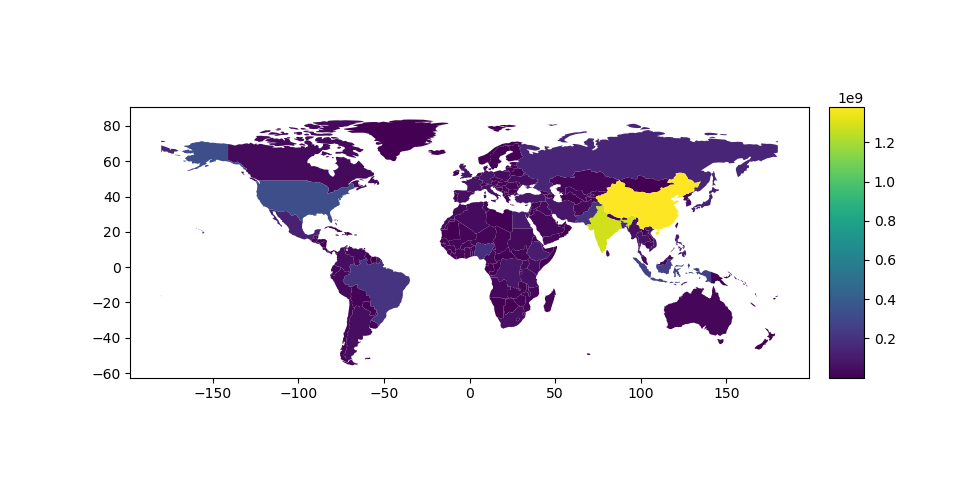
但是,图例和绘图轴的默认外观可能并不理想。用户可以定义曲线图轴(使用 ax )和图例轴(带有 cax ),然后将它们传递给 plot() 打电话。下面的示例使用 mpl_toolkits 要垂直对齐绘图轴和图例轴,请执行以下操作:
# Plot population estimates with an accurate legend
In [11]: from mpl_toolkits.axes_grid1 import make_axes_locatable

In [12]: fig, ax = plt.subplots(1, 1)

In [13]: divider = make_axes_locatable(ax)

In [14]: cax = divider.append_axes("right", size="5%", pad=0.1)

In [15]: world.plot(column='pop_est', ax=ax, legend=True, cax=cax)
Out[15]: <AxesSubplot:>
下面的示例绘制地图下方的颜色条,并使用 legend_kwds :
# Plot population estimates with an accurate legend
In [16]: import matplotlib.pyplot as plt

In [17]: fig, ax = plt.subplots(1, 1)

In [18]: world.plot(column='pop_est',
   ....:            ax=ax,
   ....:            legend=True,
   ....:            legend_kwds={'label': "Population by Country",
   ....:                         'orientation': "horizontal"})
   ....:
Out[18]: <AxesSubplot:>
选择颜色#
用户还可以修改使用的颜色 plot() 使用 cmap 选项(有关色彩映射表的完整列表,请参阅 matplotlib website ):
In [19]: world.plot(column='gdp_per_cap', cmap='OrRd');
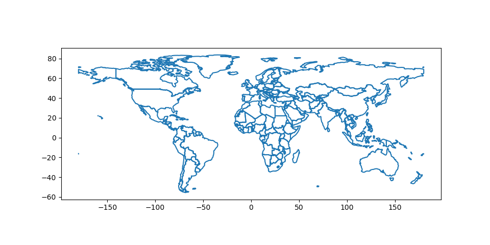
当您只想显示边界时,要使颜色变得透明,有两种选择。一种选择是这样做 world.plot(facecolor="none", edgecolor="black") 。然而,这可能会导致很多混淆,因为 "none" 和 None 在使用的上下文中不同 facecolor 而他们做的却是相反的事情。 None 是否基于matplotlib的“默认行为”,并且如果您将其用于 facecolor ,它实际上增加了一种颜色。第二种选择是使用 world.boundary.plot() 。这一选项更加明确和明确。
In [20]: world.boundary.plot();
颜色贴图的缩放方式也可以使用 scheme 选项(如果您有 mapclassify 安装,可通过以下方式完成 conda install -c conda-forge mapclassify )。这个 scheme 选项可以设置为地图分类提供的任何方案(例如,‘box_plot’、‘equence_interval’、‘Fisher_Jenks’、‘Fisher_Jenks_Sampled’、‘Headail_Breakes’、‘jenks_caspall’、‘jenks_caspall_Forced’、‘jenks_caspall_sampled’、‘max_p_ategfier’、‘Maximum_Breakes’、‘Natural_Breakes’、‘Quantiles’、‘Percent’、‘std_Means’或‘User_Defined’)。参数可以在CLASSICATION_KWDS字典中传递。请参阅 mapclassify documentation 获取有关这些地图分类方案的更多详细信息。
In [21]: world.plot(column='gdp_per_cap', cmap='OrRd', scheme='quantiles');
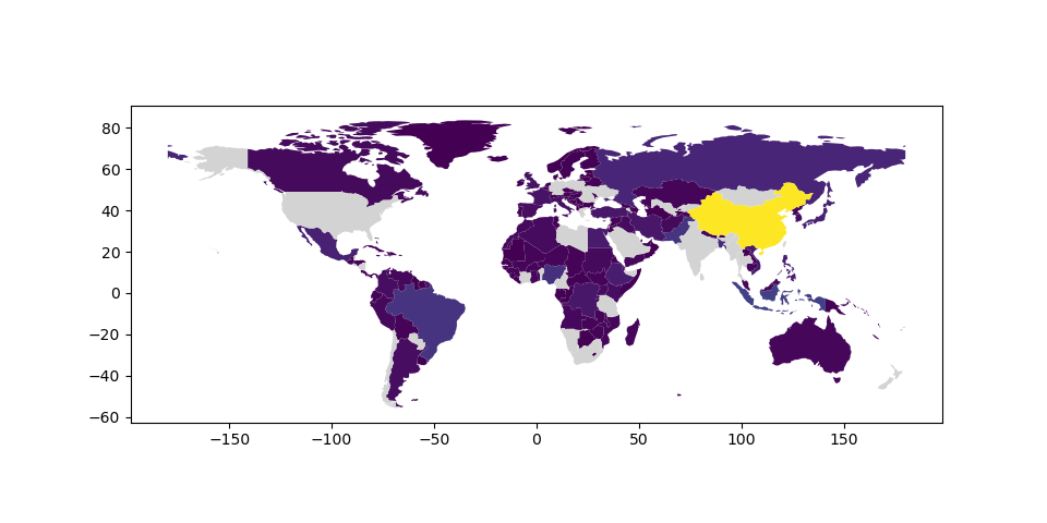
缺少数据#
在某些情况下,人们可能想要绘制包含缺失值的数据-对于某些特征,人们根本不知道该值。默认情况下,Geopandas(0.7版)会忽略这些功能。
In [22]: import numpy as np

In [23]: world.loc[np.random.choice(world.index, 40), 'pop_est'] = np.nan

In [24]: world.plot(column='pop_est');

然而,通过 missing_kwds 用户可以指定包含NONE或NAN的要素的样式和标签。
In [25]: world.plot(column='pop_est', missing_kwds={'color': 'lightgrey'});

In [26]: world.plot(
   ....:     column="pop_est",
   ....:     legend=True,
   ....:     scheme="quantiles",
   ....:     figsize=(15, 10),
   ....:     missing_kwds={
   ....:         "color": "lightgrey",
   ....:         "edgecolor": "red",
   ....:         "hatch": "///",
   ....:         "label": "Missing values",
   ....:     },
   ....: );
   ....:
---------------------------------------------------------------------------
ModuleNotFoundError                       Traceback (most recent call last)
File /usr/local/lib/python3.10/dist-packages/geopandas-0.10.2+79.g3abc6a7-py3.10.egg/geopandas/plotting.py:735, in plot_dataframe(df, column, cmap, color, ax, cax, categorical, legend, scheme, k, vmin, vmax, markersize, figsize, legend_kwds, categories, classification_kwds, missing_kwds, aspect, **style_kwds)
    734 try:
--> 735     import mapclassify
    737 except ImportError:

ModuleNotFoundError: No module named 'mapclassify'

During handling of the above exception, another exception occurred:

ImportError                               Traceback (most recent call last)
Input In [26], in <cell line: 1>()
----> 1 world.plot(
      2     column="pop_est",
      3     legend=True,
      4     scheme="quantiles",
      5     figsize=(15, 10),
      6     missing_kwds={
      7         "color": "lightgrey",
      8         "edgecolor": "red",
      9         "hatch": "///",
     10         "label": "Missing values",
     11     },
     12 );

File /usr/local/lib/python3.10/dist-packages/geopandas-0.10.2+79.g3abc6a7-py3.10.egg/geopandas/plotting.py:951, in GeoplotAccessor.__call__(self, *args, **kwargs)
    949 kind = kwargs.pop("kind", "geo")
    950 if kind == "geo":
--> 951     return plot_dataframe(data, *args, **kwargs)
    952 if kind in self._pandas_kinds:
    953     # Access pandas plots
    954     return PlotAccessor(data)(kind=kind, **kwargs)

File /usr/local/lib/python3.10/dist-packages/geopandas-0.10.2+79.g3abc6a7-py3.10.egg/geopandas/plotting.py:738, in plot_dataframe(df, column, cmap, color, ax, cax, categorical, legend, scheme, k, vmin, vmax, markersize, figsize, legend_kwds, categories, classification_kwds, missing_kwds, aspect, **style_kwds)
    735     import mapclassify
    737 except ImportError:
--> 738     raise ImportError(mc_err)
    740 if Version(mapclassify.__version__) < Version("2.4.0"):
    741     raise ImportError(mc_err)

ImportError: The 'mapclassify' package (>= 2.4.0) is required to use the 'scheme' keyword.
其他地图自定义#
贴图通常不一定要有轴标签。您可以使用以下命令将其关闭 set_axis_off() 或 axis("off") 轴方法。
In [27]: ax = world.plot()

In [28]: ax.set_axis_off();

带有图层的地图#
有两种制作多层地图的策略--一种更简洁,另一种更灵活。
然而,在组合贴图之前,请记住始终确保它们共享一个公共的CRS(这样它们就会对齐)。
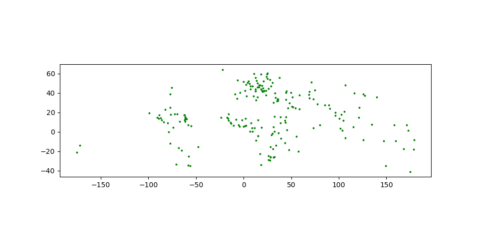
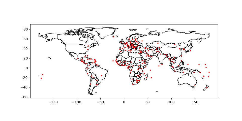
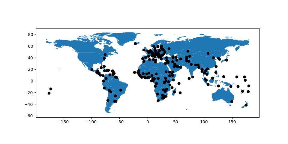
# Look at capitals
# Note use of standard `pyplot` line style options
In [29]: cities.plot(marker='*', color='green', markersize=5);

# Check crs
In [30]: cities = cities.to_crs(world.crs)

# Now we can overlay over country outlines
# And yes, there are lots of island capitals
# apparently in the middle of the ocean!
方法1
In [31]: base = world.plot(color='white', edgecolor='black')

In [32]: cities.plot(ax=base, marker='o', color='red', markersize=5);
方法2:使用matplotlib对象
In [33]: import matplotlib.pyplot as plt

In [34]: fig, ax = plt.subplots()

# set aspect to equal. This is done automatically
# when using *geopandas* plot on it's own, but not when
# working with pyplot directly.
In [35]: ax.set_aspect('equal')

In [36]: world.plot(ax=ax, color='white', edgecolor='black')
Out[36]: <AxesSubplot:>

In [37]: cities.plot(ax=ax, marker='o', color='red', markersize=5)
Out[37]: <AxesSubplot:>

In [38]: plt.show();

控制绘图中多个图层的顺序#
打印多个图层时,请使用 zorder 控制要打印的层的顺序。越低的 zorder 则该层在地图上的位置越低,反之亦然。
未指定 zorder ,城市(点)将按照基于几何图形类型的默认顺序在世界(多边形)下方打印。
In [39]: ax = cities.plot(color='k')

In [40]: world.plot(ax=ax);

我们可以设置 zorder 对于比世界更高的城市来说,要把它移到榜首。
In [41]: ax = cities.plot(color='k', zorder=2)

In [42]: world.plot(ax=ax, zorder=1);
大熊猫地块#
打印方法还允许熊猫的不同打印样式以及默认打印样式 geo 剧情。这些方法可以使用 kind 中的关键字参数 plot() ,并包括:
geo用于映射line对于折线图bar或barh对于条形图hist对于直方图box对于BoxPlotkde或density对于密度图area对于面积地块scatter对于散点图hexbin对于六角形柱状图pie对于饼图
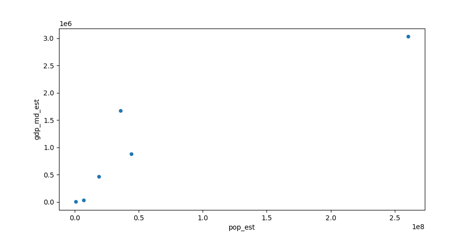
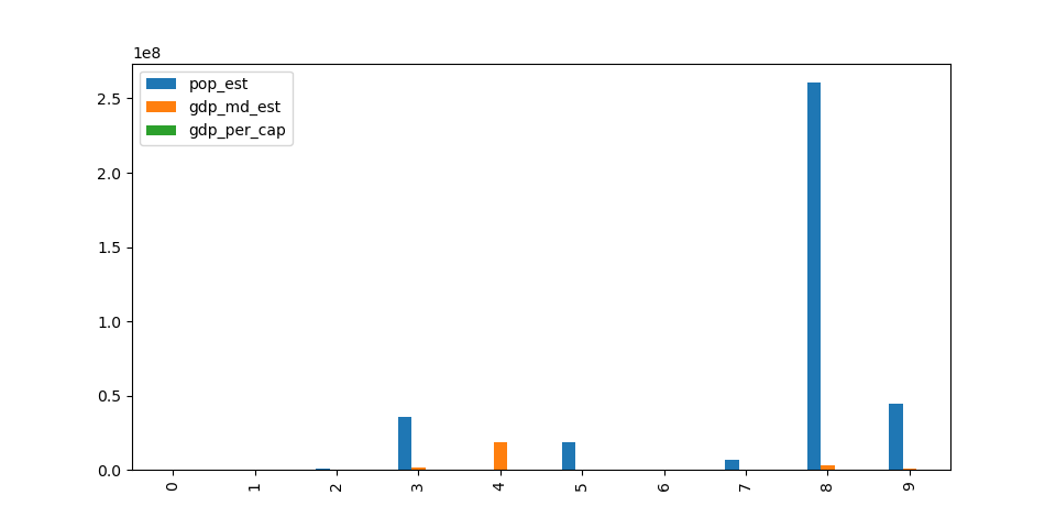
In [43]: gdf = world.head(10)

In [44]: gdf.plot(kind='scatter', x="pop_est", y="gdp_md_est")
Out[44]: <AxesSubplot:xlabel='pop_est', ylabel='gdp_md_est'>
也可以使用创建这些其他地块 GeoDataFrame.plot.<kind> 访问器方法,而不是提供 kind 关键字参数。
In [45]: gdf.plot.bar()
Out[45]: <AxesSubplot:>
有关更多信息,请查看 pandas documentation 。
其他资源#
指向Jupyter笔记本的链接,用于执行不同的地图任务: