绘图配置文件
This tool creates a profile plot for scores over sets of genomic regions. Typically, these regions are genes, but any other regions defined in BED will work. A matrix generated by computeMatrix is required.
usage: plotProfile -m matrix.gz
help: plotProfile -h / plotProfile --help
Required arguments
- --matrixFile, -m
Matrix file from the computeMatrix tool.
- --outFileName, -out, -o
File name to save the image to. The file ending will be used to determine the image format. The available options are: "png", "eps", "pdf" and "svg", e.g., MyHeatmap.png.
Output options
- --outFileSortedRegions
File name into which the regions are saved after skipping zeros or min/max threshold values. The order of the regions in the file follows the sorting order selected. This is useful, for example, to generate other heatmaps while keeping the sorting of the first heatmap. Example: Heatmap1sortedRegions.bed
- --outFileNameData
File name to save the data underlying data for the average profile, e.g. myProfile.tab.
- --dpi
Set the DPI to save the figure.
Clustering arguments
- --kmeans
Number of clusters to compute. When this option is set, the matrix is split into clusters using the k-means algorithm. Only works for data that is not grouped, otherwise only the first group will be clustered. If more specific clustering methods are required, then save the underlying matrix and run the clustering using other software. The plotting of the clustering may fail with an error if a cluster has very few members compared to the total number or regions.
- --hclust
Number of clusters to compute. When this option is set, then the matrix is split into clusters using the hierarchical clustering algorithm, using "ward linkage". Only works for data that is not grouped, otherwise only the first group will be clustered. --hclust could be very slow if you have >1000 regions. In those cases, you might prefer --kmeans or if more clustering methods are required you can save the underlying matrix and run the clustering using other software. The plotting of the clustering may fail with an error if a cluster has very few members compared to the total number of regions.
- --silhouette
Compute the silhouette score for regions. This is only applicable if clustering has been performed. The silhouette score is a measure of how similar a region is to other regions in the same cluster as opposed to those in other clusters. It will be reported in the final column of the BED file with regions. The silhouette evaluation can be very slow when you have morethan 100 000 regions.
Optional arguments
- --version
show program's version number and exit
- --averageType
Possible choices: mean, median, min, max, std, sum
The type of statistic that should be used for the profile. The options are: "mean", "median", "min", "max", "sum" and "std".
- --plotHeight
Plot height in cm.
- --plotWidth
Plot width in cm. The minimum value is 1 cm.
- --plotType
Possible choices: lines, fill, se, std, overlapped_lines, heatmap
"lines" will plot the profile line based on the average type selected. "fill" fills the region between zero and the profile curve. The fill in color is semi transparent to distinguish different profiles. "se" and "std" color the region between the profile and the standard error or standard deviation of the data. As in the case of fill, a semi-transparent color is used. "overlapped_lines" plots each region's value, one on top of the other. "heatmap" plots a summary heatmap.
- --colors
List of colors to use for the plotted lines (N.B., not applicable to '--plotType overlapped_lines'). Color names and html hex strings (e.g., #eeff22) are accepted. The color names should be space separated. For example, --colors red blue green
- --numPlotsPerRow
Number of plots per row
- --clusterUsingSamples
List of sample numbers (order as in matrix), that are used for clustering by --kmeans or --hclust if not given, all samples are taken into account for clustering. Example: --ClusterUsingSamples 1 3
- --startLabel
[only for scale-regions mode] Label shown in the plot for the start of the region. Default is TSS (transcription start site), but could be changed to anything, e.g. "peak start". Same for the --endLabel option. See below.
- --endLabel
[only for scale-regions mode] Label shown in the plot for the region end. Default is TES (transcription end site).
- --refPointLabel
[only for reference-point mode] Label shown in the plot for the reference-point. Default is the same as the reference point selected (e.g. TSS), but could be anything, e.g. "peak start".
- --labelRotation
Rotation of the X-axis labels in degrees. The default is 0, positive values denote a counter-clockwise rotation.
- --regionsLabel, -z
Labels for the regions plotted in the heatmap. If more than one region is being plotted, a list of labels separated by spaces is required. If a label itself contains a space, then quotes are needed. For example, --regionsLabel label_1, "label 2".
- --samplesLabel
Labels for the samples plotted. The default is to use the file name of the sample. The sample labels should be separated by spaces and quoted if a label itselfcontains a space E.g. --samplesLabel label-1 "label 2"
- --plotTitle, -T
Title of the plot, to be printed on top of the generated image. Leave blank for no title.
- --yAxisLabel, -y
Y-axis label for the top panel.
- --yMin
Minimum value for the Y-axis. Multiple values, separated by spaces can be set for each profile. If the number of yMin values is smaller thanthe number of plots, the values are recycled.
- --yMax
Maximum value for the Y-axis. Multiple values, separated by spaces can be set for each profile. If the number of yMin values is smaller thanthe number of plots, the values are recycled.
- --legendLocation
Possible choices: best, upper-right, upper-left, upper-center, lower-left, lower-right, lower-center, center, center-left, center-right, none
Location for the legend in the summary plot. Note that "none" does not work for the profiler.
- --perGroup
The default is to plot all groups of regions by sample. Using this option instead plots all samples by group of regions. Note that this is only useful if you have multiple groups of regions. by sample rather than group.
- --plotFileFormat
Possible choices: png, pdf, svg, eps, plotly
Image format type. If given, this option overrides the image format based on the plotFile ending. The available options are: "png", "eps", "pdf", "plotly" and "svg"
- --verbose
If set, warning messages and additional information are given.
An example usage is: plotProfile -m matrix.gz
细节
喜欢 地图 , plotProfile 只需将压缩矩阵 computeMatrix 并将其转化为总结图。
除了用于优化可视化效果的大量参数外,还可以将配置文件基础的值导出为表。
可选输出类型 |
command |
computeMatrix |
plotHeatmap |
plotProfile |
热量的基础值 |
|
对 |
对 |
不 |
配置文件的基础值 |
|
不 |
对 |
对 |
排序和/或筛选区域 |
|
对 |
对 |
对 |
小技巧
有关可选输出的更多详细信息,请参阅 计算机 .
使用实例
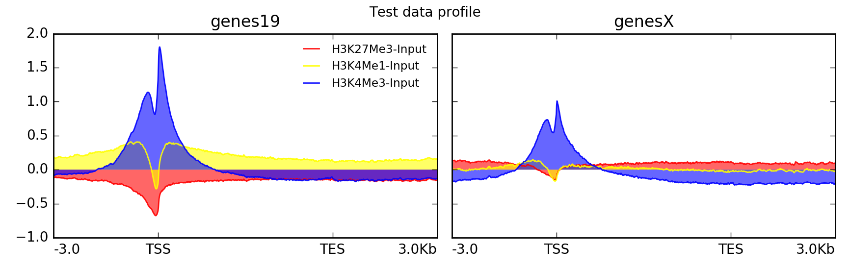
下面的例子为我们的测试编码数据集绘制了HG19转录的信号剖面图。注意,基质包含多组区域(在本例中,每个现有染色体一组)。
# run compute matrix to collect the data needed for plotting
$ computeMatrix scale-regions -S H3K27Me3-input.bigWig \
                                 H3K4Me1-Input.bigWig  \
                                 H3K4Me3-Input.bigWig \
                              -R genes19.bed genesX.bed \
                              --beforeRegionStartLength 3000 \
                              --regionBodyLength 5000 \
                              --afterRegionStartLength 3000
                              --skipZeros -o matrix.mat.gz

$ plotProfile -m matrix.mat.gz \
              -out ExampleProfile1.png \
              --numPlotsPerRow 2 \
              --plotTitle "Test data profile"

plotProfile 具有许多选项,包括更改绘制的线条类型以及按组而不是按样本绘制。
这里是相同的数据集,但使用不同的参数集绘制。
$ plotProfile -m matrix.mat.gz \
     -out ExampleProfile2.png \
     --plotType=fill \ # add color between the x axis and the lines
     --perGroup \ # make one image per BED file instead of per bigWig file
     --colors red yellow blue \
     --plotTitle "Test data profile"
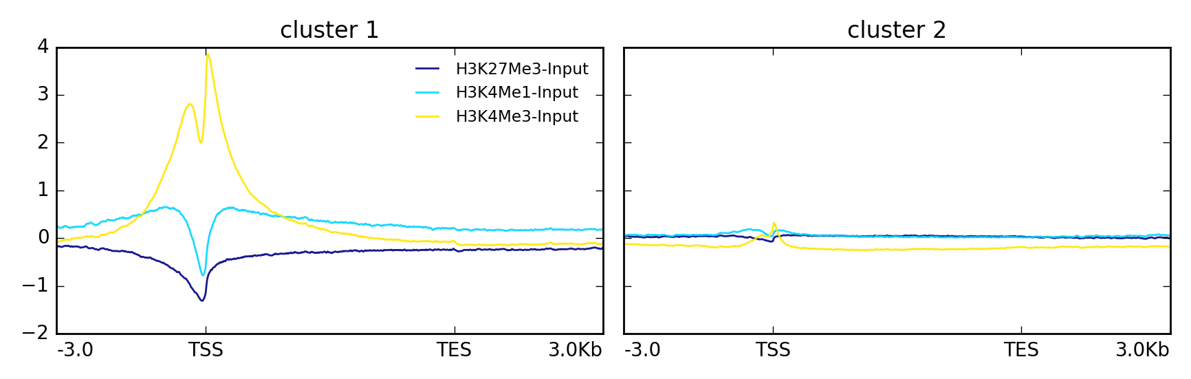
在另一个例子中,使用k-均值将数据集群为两组。
$ plotProfile -m matrix.mat.gz \
      --perGroup \
      --kmeans 2 \
      -out ExampleProfile3.png
这是相同的数据,但使用 --plotType heatmap
$ plotProfile -m matrix.mat.gz \
      --perGroup \
      --kmeans 2 \
      -plotType heatmap \
      -out ExampleProfile3.png

deepTools Galaxy <http://deeptools.ie-freiburg.mpg.de> _. |
code @ github <https://github.com/deeptools/deepTools/> _. |