普洛相关
Tool for the analysis and visualization of sample correlations based on the output of multiBamSummary or multiBigwigSummary. Pearson or Spearman methods are available to compute correlation coefficients. Results can be saved as multiple scatter plots depicting the pairwise correlations or as a clustered heatmap, where the colors represent the correlation coefficients and the clusters are constructed using complete linkage. Optionally, the values can be saved as tables, too.
detailed help:
plotCorrelation -h
usage: plotCorrelation -in matrix.gz -c spearman -p heatmap -o plot.png
help: plotCorrelation -h / plotCorrelation --help
Required arguments
- --corData, -in
Compressed matrix of values generated by multiBigwigSummary or multiBamSummary
- --corMethod, -c
Possible choices: spearman, pearson
Correlation method.
- --whatToPlot, -p
Possible choices: heatmap, scatterplot
Choose between a heatmap or pairwise scatter plots
Optional arguments
- --plotFile, -o
File to save the heatmap to. The file extension determines the format, so heatmap.pdf will save the heatmap in PDF format. The available formats are: .png, .eps, .pdf and .svg.
- --skipZeros
By setting this option, genomic regions that have zero or missing (nan) values in all samples are excluded.
- --labels, -l
User defined labels instead of default labels from file names. Multiple labels have to be separated by spaces, e.g. --labels sample1 sample2 sample3
- --plotTitle, -T
Title of the plot, to be printed on top of the generated image. Leave blank for no title. (Default: )
- --plotFileFormat
Possible choices: png, pdf, svg, eps, plotly
Image format type. If given, this option overrides the image format based on the plotFile ending. The available options are: png, eps, pdf and svg.
- --removeOutliers
If set, bins with very large counts are removed. Bins with abnormally high reads counts artificially increase pearson correlation; that's why, multiBamSummary tries to remove outliers using the median absolute deviation (MAD) method applying a threshold of 200 to only consider extremely large deviations from the median. The ENCODE blacklist page (https://sites.google.com/site/anshulkundaje/projects/blacklists) contains useful information about regions with unusually high countsthat may be worth removing.
- --version
show program's version number and exit
Output optional options
- --outFileCorMatrix
Save matrix with pairwise correlation values to a tab-separated file.
Heatmap options
- --plotHeight
Plot height in cm. (Default: 9.5)
- --plotWidth
Plot width in cm. The minimum value is 1 cm. (Default: 11)
- --zMin, -min
Minimum value for the heatmap intensities. If not specified, the value is set automatically
- --zMax, -max
Maximum value for the heatmap intensities.If not specified, the value is set automatically
- --colorMap
Color map to use for the heatmap. Available values can be seen here: http://matplotlib.org/examples/color/colormaps_reference.html
- --plotNumbers
If set, then the correlation number is plotted on top of the heatmap. This option is only valid when plotting a heatmap.
Scatter plot options
- --xRange
The X axis range. The default scales these such that the full range of dots is displayed.
- --yRange
The Y axis range. The default scales these such that the full range of dots is displayed.
- --log1p
Plot the natural log of the scatter plot after adding 1. Note that this is ONLY for plotting, the correlation is unaffected.
example usages: plotCorrelation -in results_file --whatToPlot heatmap --corMethod pearson -o heatmap.png
背景
plotCorrelation 根据基因组区域内的读取覆盖率(或其他分数)计算两个或多个文件之间的总体相似性,必须使用 多BAM摘要 或 多大人物概要 .
相关计算
相关计算的结果是 相关系数表 这表明两个样本之间的关系有多“强”,它将由介于-1和1之间的数字组成。(-1表示完全反相关,1表示完全相关。)
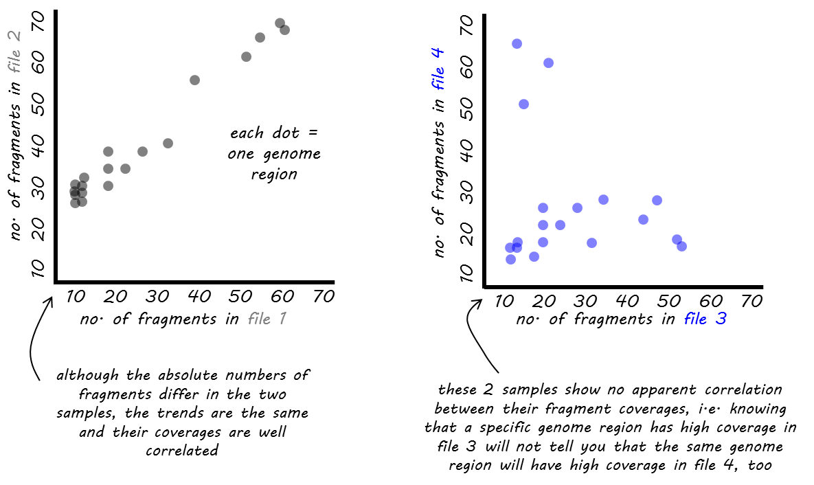
我们为相关计算提供了两种不同的函数: 皮尔逊 或 斯皮尔曼 .
这个 皮尔逊法 测量 度量差异 在样本之间,因此受到异常值的影响。更准确地说,它被定义为两个变量的协方差除以它们的标准差的乘积。
这个 斯皮尔曼法 基于 排名 . 如果你想象一场有3名参赛者的比赛,在第一名和第二名选手非常接近的情况下,第三名选手摔断了腿,挡住了前两名选手的去路,那么皮尔森会受到第三名选手与第一名选手有很长的距离,而第三名选手与第一名选手却有很长的距离这一事实的强烈影响。皮尔曼只关心一个人排在第一,二个人排在第二,三个人排在第三,他们之间的距离被忽略了。
小技巧
Pearson是遵循正态分布的数据的适当度量,而Spearman并没有做出这一假设,而且通常不受异常值的驱动,但也有一个警告,即不太敏感。
层次聚类
如果使用 plotCorrelation 这将自动导致基于相关系数的样本聚类。这有助于确定不同样本类型是否可以分离,即不同条件下的样本预期会比相同条件下的复制更不相同。
这个 距离 其中样本对基于相关系数, r ,其中距离=1- r . 样本的相似性是通过最近点算法来评估的,也就是说,考虑树的任意两个成员之间的最短距离来决定是否加入一个集群。有关算法的更多详细信息,请访问 here .
实例
下面是一个来自不同人类细胞系的RNA序列数据的例子,我们从https://genome.ucsc.edu/encode/datamatrix/encode datamatrix human.html下载了这些数据。
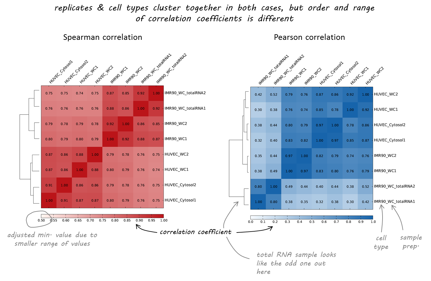
正如您所看到的,两个相关计算或多或少都同意哪些样本几乎相同(复制,由标签末尾的1或2指示)。然而,随着两种不同的细胞类型(huvec和imr90)被清晰地分离,斯皮尔曼相关性似乎更为强大,更符合我们的预期。
在下面的示例中,根据计算的覆盖率文件执行相关性分析 多BAM摘要 或 多大人物概要 对于我们的测试,编码芯片序列数据集。
Scatterplot
在这里,我们用双色散点图计算每个转录的平均分数。 多大人物概要 并包括每个比较的皮尔逊相关系数。
$ deepTools2.0/bin/plotCorrelation \
-in scores_per_transcript.npz \
--corMethod pearson --skipZeros \
--plotTitle "Pearson Correlation of Average Scores Per Transcript" \
--whatToPlot scatterplot \
-o scatterplot_PearsonCorr_bigwigScores.png   \
--outFileCorMatrix PearsonCorr_bigwigScores.tab
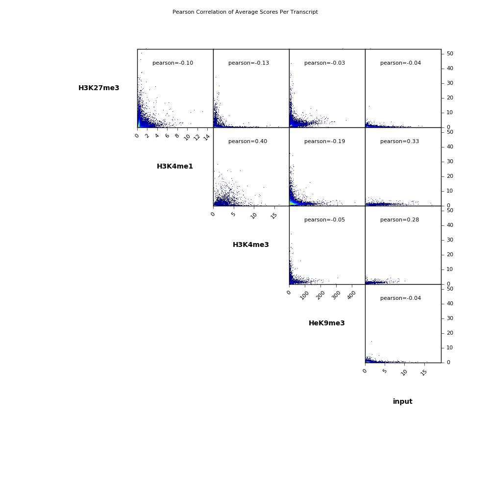
$ cat PearsonCorr_bigwigScores.tab
    'H3K27me3'      'H3K4me1'       'H3K4me3'       'HeK9me3'       'input'
    'H3K27me3'      1.0000  -0.1032 -0.1269 -0.0339 -0.0395
    'H3K4me1'       -0.1032 1.0000  0.3985  -0.1863 0.3328
    'H3K4me3'       -0.1269 0.3985  1.0000  -0.0480 0.2822
    'HeK9me3'       -0.0339 -0.1863 -0.0480 1.0000  -0.0353
    'input' -0.0395 0.3328  0.2822  -0.0353 1.0000
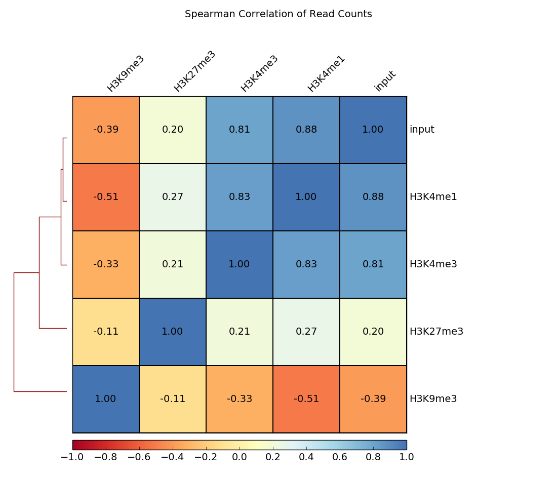
Heatmap
除了散点图外,还可以生成热图,其中成对相关系数用不同的颜色强度表示,并使用层次聚类进行聚类。
这里的例子计算读取计数的斯皮尔曼相关系数。树形图显示哪些样本的读取计数彼此最相似。
$ deepTools2.0/bin/plotCorrelation \
    -in readCounts.npz \
    --corMethod spearman --skipZeros \
    --plotTitle "Spearman Correlation of Read Counts" \
    --whatToPlot heatmap --colorMap RdYlBu --plotNumbers \
    -o heatmap_SpearmanCorr_readCounts.png   \
    --outFileCorMatrix SpearmanCorr_readCounts.tab
deepTools Galaxy <http://deeptools.ie-freiburg.mpg.de> _. |
code @ github <https://github.com/deeptools/deepTools/> _. |