注解
Click here 下载完整的示例代码
PyPror教程
pyplot接口简介。
pyplot简介
matplotlib.pyplot 是使matplotlib像MATLAB一样工作的函数集合。每个 pyplot 函数对图形进行一些更改:例如,创建图形、在图形中创建绘图区域、在绘图区域中绘制一些线、用标签装饰绘图等。
在 matplotlib.pyplot 在函数调用中保留各种状态,以便跟踪当前图形和绘图区域等内容,并且绘图功能指向当前轴(请注意,文档中的“轴”在此处和大多数位置都指 axes part of a figure 而不是一个以上轴的严格数学术语)。
注解
Pyplot API通常不如面向对象的API灵活。您在这里看到的大多数函数调用也可以作为 Axes 对象。我们建议浏览教程和示例以了解这是如何工作的。
使用pyplot生成可视化效果非常迅速:
import matplotlib.pyplot as plt
plt.plot([1, 2, 3, 4])
plt.ylabel('some numbers')
plt.show()
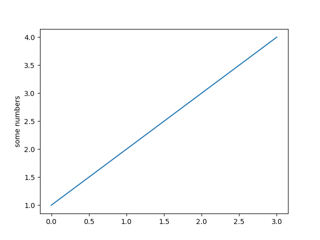
你可能想知道为什么x轴在0-3之间,y轴在1-4之间。如果提供单个列表或数组 plot ,matplotlib假定它是一个y值序列,并自动为您生成x值。由于python范围从0开始,因此默认的x向量的长度与y相同,但从0开始。因此x数据是 [0, 1, 2, 3] .
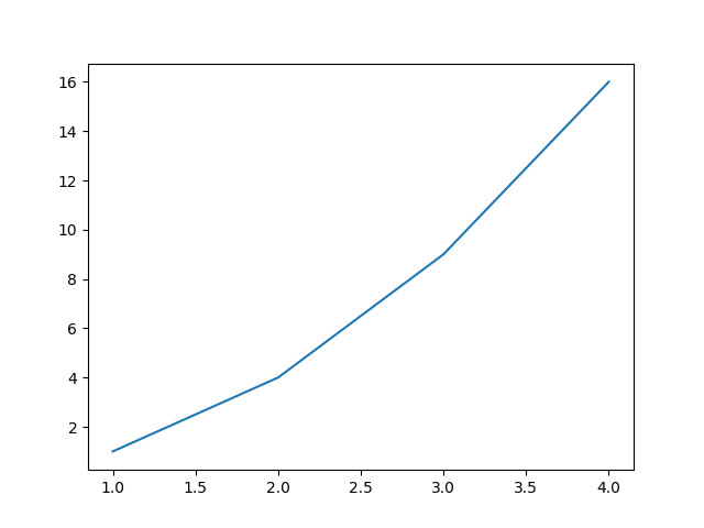
plot 是一个多功能函数,将接受任意数量的参数。例如,要绘制x与y的对比图,可以编写:
plt.plot([1, 2, 3, 4], [1, 4, 9, 16])
出:
[<matplotlib.lines.Line2D object at 0x7fa9c9e58438>]
设置绘图样式的格式
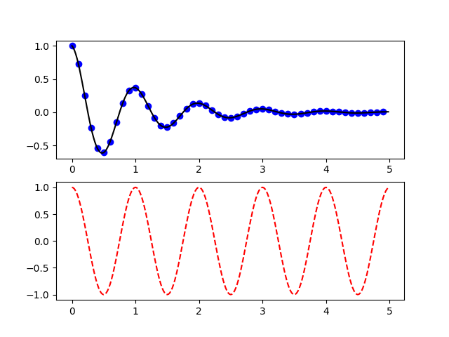
对于每对x,y参数,都有一个可选的第三个参数,它是指示绘图颜色和线条类型的格式字符串。格式字符串的字母和符号来自matlab,您可以将颜色字符串与线样式字符串连接起来。默认格式字符串是“b-”,这是一条纯蓝色的线。例如,要用红色圆圈绘制上面的内容,您将发出
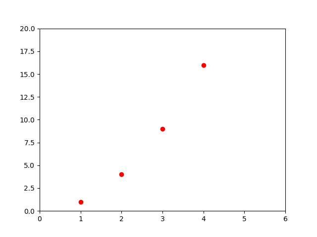
见 plot 有关线条样式和格式字符串的完整列表的文档。这个 axis 上例中的函数获取 [xmin, xmax, ymin, ymax] 并指定轴的视区。
如果matplotlib仅限于使用列表,那么它对于数字处理将相当无用。通常,您将使用 numpy 数组。实际上,所有序列都在内部转换为numpy数组。下面的示例演示如何使用数组在一个函数调用中绘制具有不同格式样式的几行。
使用关键字字符串打印
有些情况下,数据的格式允许您使用字符串访问特定变量。例如,使用 numpy.recarray 或 pandas.DataFrame .
Matplotlib允许您为此类对象提供 data 关键字参数。如果提供,则可以使用与这些变量对应的字符串生成绘图。
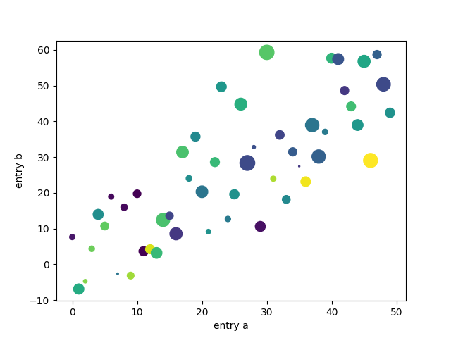
data = {'a': np.arange(50),
        'c': np.random.randint(0, 50, 50),
        'd': np.random.randn(50)}
data['b'] = data['a'] + 10 * np.random.randn(50)
data['d'] = np.abs(data['d']) * 100

plt.scatter('a', 'b', c='c', s='d', data=data)
plt.xlabel('entry a')
plt.ylabel('entry b')
plt.show()
用分类变量绘图
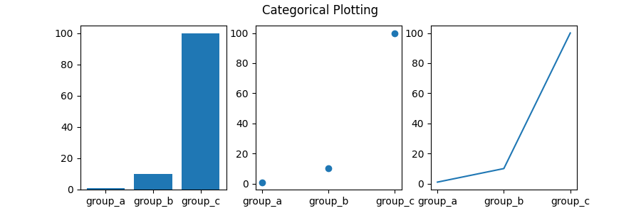
也可以使用分类变量创建一个图。Matplotlib允许您将分类变量直接传递给许多绘图函数。例如:
names = ['group_a', 'group_b', 'group_c']
values = [1, 10, 100]

plt.figure(figsize=(9, 3))

plt.subplot(131)
plt.bar(names, values)
plt.subplot(132)
plt.scatter(names, values)
plt.subplot(133)
plt.plot(names, values)
plt.suptitle('Categorical Plotting')
plt.show()
控制线条属性
线条具有许多可以设置的属性:线条宽度、虚线样式、抗锯齿等;请参见 matplotlib.lines.Line2D . 有几种方法可以设置线条属性
使用关键字参数::
使用的setter方法
Line2D实例。plot返回的列表Line2D对象;例如line1, line2 = plot(x1, y1, x2, y2). 在下面的代码中,我们假设只有一行,因此返回的列表的长度为1。我们使用tuple解包line,要获取该列表的第一个元素:使用
setp. 下面的示例使用MATLAB风格的函数来设置行列表的多个属性。setp透明地处理对象列表或单个对象。您可以使用python关键字参数或matlab样式的字符串/值对:lines = plt.plot(x1, y1, x2, y2) # use keyword args plt.setp(lines, color='r', linewidth=2.0) # or MATLAB style string value pairs plt.setp(lines, 'color', 'r', 'linewidth', 2.0)
这有空的 Line2D 性质。
| 财产 | 价值类型 |
|---|---|
| 阿尔法 | 浮动 |
| 有生气的 | [真假] |
| 抗锯齿或AA | [真假] |
| clip_box | matplotlib.transform.bbox实例 |
| clip_on | [真假] |
| clip_path | 一个路径实例和一个转换实例,一个补丁 |
| 颜色或C | 任何Matplotlib颜色 |
| 包含 | 命中测试功能 |
| dash_capstyle | ['butt' | 'round' | 'projecting'] |
| dash_joinstyle | ['miter' | 'round' | 'bevel'] |
| 破折号 | 点中的开/关墨水顺序 |
| 数据 | (np.array扩展数据,np.array Ydata) |
| 图形 | matplotlib.figure.figure实例 |
| 标签 | 任何字符串 |
| 直线或LS | [ '-' | '--' | '-.' | ':' | 'steps' | ...] |
| 线宽或线性宽度 | 浮点值 |
| 标记 | [ '+' | ',' | '.' | '1' | '2' | '3' | '4' ] |
| markeredgecolor或mec | 任何Matplotlib颜色 |
| 标记边缘宽度或新宽度 | 浮点值 |
| MarkerFaceColor或MFC | 任何Matplotlib颜色 |
| 标记或MS | 浮动 |
| 市场化的 | [无整数(startind,stead)] |
| 捡拾器 | 用于交互式行选择 |
| 拾取半径 | 线拾取选择半径 |
| solid_capstyle | ['butt' | 'round' | 'projecting'] |
| solid_joinstyle | ['miter' | 'round' | 'bevel'] |
| 转型 | matplotlib.transforms.transform实例 |
| 看得见的 | [真假] |
| 外部数据存储器 | np.array |
| YDATA | np.array |
| Z阶 | 任意数 |
要获取可设置行属性的列表,请调用 setp 以一行或多行作为参数的函数
In [69]: lines = plt.plot([1, 2, 3])

In [70]: plt.setp(lines)
  alpha: float
  animated: [True | False]
  antialiased or aa: [True | False]
  ...snip
使用多个图形和轴
MATLAB和 pyplot ,具有当前图形和当前轴的概念。所有打印功能都适用于当前轴。函数 gca 返回当前轴(A matplotlib.axes.Axes 实例) gcf 返回当前数字(a matplotlib.figure.Figure 实例)。通常情况下,你不必担心这件事,因为它都是在幕后处理的。下面是创建两个子批次的脚本。
这个 figure 此处呼叫是可选的,因为 figure(1) 将在默认情况下创建,就像 subplot(111) 如果不手动指定任何轴,默认情况下将创建。这个 subplot 调用指定 numrows, numcols, plot_number 在哪里? plot_number 范围从1到 numrows*numcols . 中的逗号 subplot 呼叫是可选的,如果 numrows*numcols<10 . 所以 subplot(211) 相同 subplot(2, 1, 1) .
可以创建任意数量的子插槽和轴。如果要手动放置轴,即不在矩形网格上,请使用 axes ,它允许您将位置指定为 axes([left, bottom, width, height]) 其中所有值都是分数(0到1)坐标。见 轴演示 例如手动放置轴和 基本子批次演示 例如,有很多子批次。
可以使用多个图形创建多个图形 figure 数字越大的呼叫。当然,每个图形可以包含尽可能多的轴和子图,如您的心所愿:
import matplotlib.pyplot as plt
plt.figure(1)                # the first figure
plt.subplot(211)             # the first subplot in the first figure
plt.plot([1, 2, 3])
plt.subplot(212)             # the second subplot in the first figure
plt.plot([4, 5, 6])


plt.figure(2)                # a second figure
plt.plot([4, 5, 6])          # creates a subplot(111) by default

plt.figure(1)                # figure 1 current; subplot(212) still current
plt.subplot(211)             # make subplot(211) in figure1 current
plt.title('Easy as 1, 2, 3') # subplot 211 title
您可以用清除当前数字 clf 和当前的轴 cla . 如果您觉得在幕后为您维护状态(特别是当前的图像、图形和轴)很烦人,请不要失望:这只是一个围绕面向对象API的薄的有状态包装器,您可以使用它(请参见 艺术家辅导 )
如果要制作大量的图形,还需要注意一件事:图形所需的内存不会完全释放,直到用 close . 删除对图形的所有引用和/或使用窗口管理器终止图形出现在屏幕上的窗口是不够的,因为pyplot在 close 被称为。
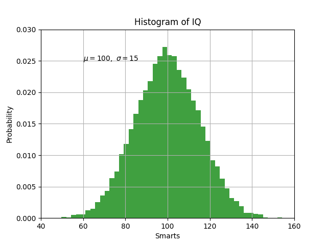
使用文本
text 可用于在任意位置添加文本,以及 xlabel , ylabel 和 title 用于在指定位置添加文本(请参见 matplotlib图中的文本 更详细的例子)
mu, sigma = 100, 15
x = mu + sigma * np.random.randn(10000)

# the histogram of the data
n, bins, patches = plt.hist(x, 50, density=1, facecolor='g', alpha=0.75)


plt.xlabel('Smarts')
plt.ylabel('Probability')
plt.title('Histogram of IQ')
plt.text(60, .025, r'$\mu=100,\ \sigma=15$')
plt.axis([40, 160, 0, 0.03])
plt.grid(True)
plt.show()
所有的 text 函数返回 matplotlib.text.Text 实例。与上面的行一样,可以通过向文本函数传递关键字参数或使用 setp ::
t = plt.xlabel('my data', fontsize=14, color='red')
这些特性在 文本属性和布局 .
在文本中使用数学表达式
matplotlib接受任何文本表达式中的tex表达式。例如,编写表达式 \(\sigma_i=15\) 在标题中,您可以编写一个用美元符号包围的tex表达式:
plt.title(r'$\sigma_i=15$')
这个 r 在标题字符串之前是很重要的--它表示该字符串是 raw 字符串,不要将反斜杠视为python转义。Matplotlib有一个内置的tex表达式解析器和布局引擎,并提供自己的数学字体——有关详细信息,请参阅 写数学表达式 . 因此,您可以跨平台使用数学文本,而无需安装tex。对于安装了LaTex和Dvipng的用户,还可以使用LaTex来格式化文本,并将输出直接合并到显示图形或保存的PostScript中--请参见 Latex 文本渲染 .
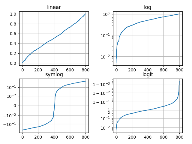
对数轴和其他非线性轴
matplotlib.pyplot 不仅支持线性轴比例,还支持对数和逻辑比例。如果数据跨越多个数量级,则通常使用这种方法。更改轴的比例很容易:
plt.xscale('log')
下面是四个具有相同数据和不同比例的Y轴绘图的示例。
# Fixing random state for reproducibility
np.random.seed(19680801)

# make up some data in the open interval (0, 1)
y = np.random.normal(loc=0.5, scale=0.4, size=1000)
y = y[(y > 0) & (y < 1)]
y.sort()
x = np.arange(len(y))

# plot with various axes scales
plt.figure()

# linear
plt.subplot(221)
plt.plot(x, y)
plt.yscale('linear')
plt.title('linear')
plt.grid(True)

# log
plt.subplot(222)
plt.plot(x, y)
plt.yscale('log')
plt.title('log')
plt.grid(True)

# symmetric log
plt.subplot(223)
plt.plot(x, y - y.mean())
plt.yscale('symlog', linthresh=0.01)
plt.title('symlog')
plt.grid(True)

# logit
plt.subplot(224)
plt.plot(x, y)
plt.yscale('logit')
plt.title('logit')
plt.grid(True)
# Adjust the subplot layout, because the logit one may take more space
# than usual, due to y-tick labels like "1 - 10^{-3}"
plt.subplots_adjust(top=0.92, bottom=0.08, left=0.10, right=0.95, hspace=0.25,
                    wspace=0.35)

plt.show()
也可以添加自己的比例,请参见 创建缩放和转换的开发人员指南 有关详细信息。
脚本的总运行时间: (0分4.024秒)
关键词:matplotlib代码示例,codex,python plot,pyplot Gallery generated by Sphinx-Gallery