资料表连接 (QGIS3)
并非您要使用的每个数据集都采用空间格式。通常,数据会以表格或电子表格的形式出现,您需要将其与现有空间数据链接起来以用于分析。此操作称为 表联接 ,使用 按字段值联接属性 处理算法完成。
内容说明
我们会使用美国加州的人口统计分区 shapefile,与美国人口调查局提供的人口数资料表,做一份加州的人口分布图。
你还会学到这些
在 QGIS 中载入不含任何地理资讯的 CSV 档案。
使用数据库管理器执行 SQL 查询以计算组统计信息。
取得资料
US Census Bureau 提供 TIGER / Line Shapefiles。 您可以访问 FTP site 并下载加利福尼亚州的人口普查区shapefile。下载 California Census Tracts for California 文件。
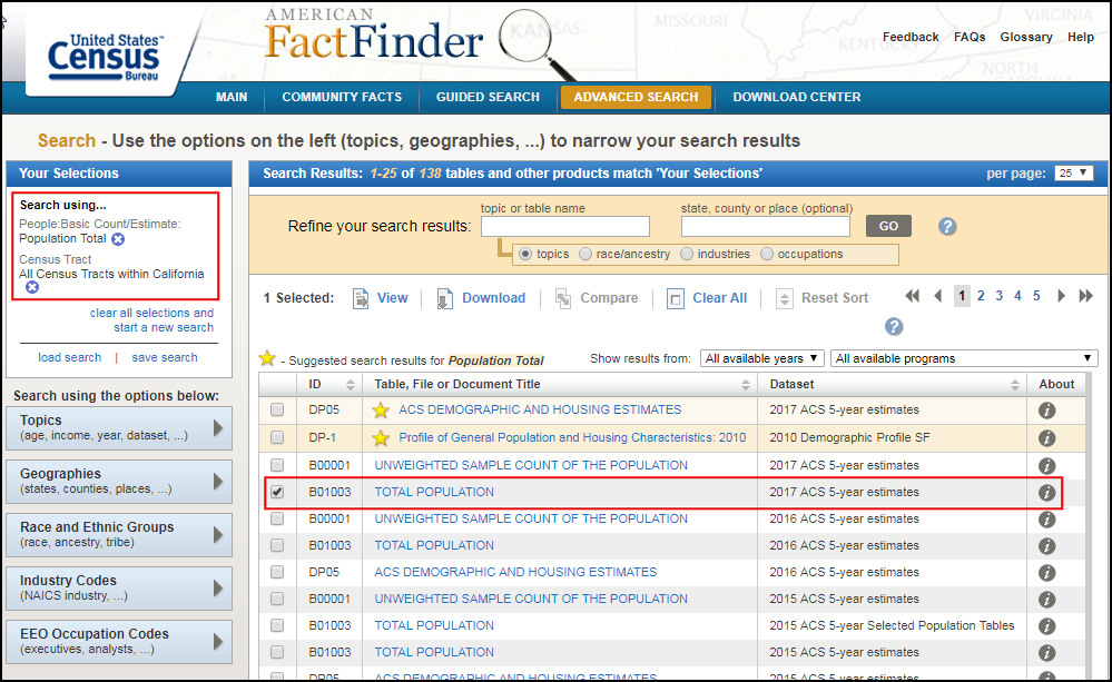
Americal FactFinder 是美国所有人口普查数据的存储库。您可以使用 高级搜索 并查询 主题-基本计数/估算 和 地理-所有加利福尼亚人口普查区 来创建自定义 CSV 并下载。本教程使用 总人口| 2017 ACS 5年估算 数据。
为了方便起见,你也可以直接用下面的连结下载这两份资料集:
资料来源 [TIGER] [USCENSUS]
操作流程
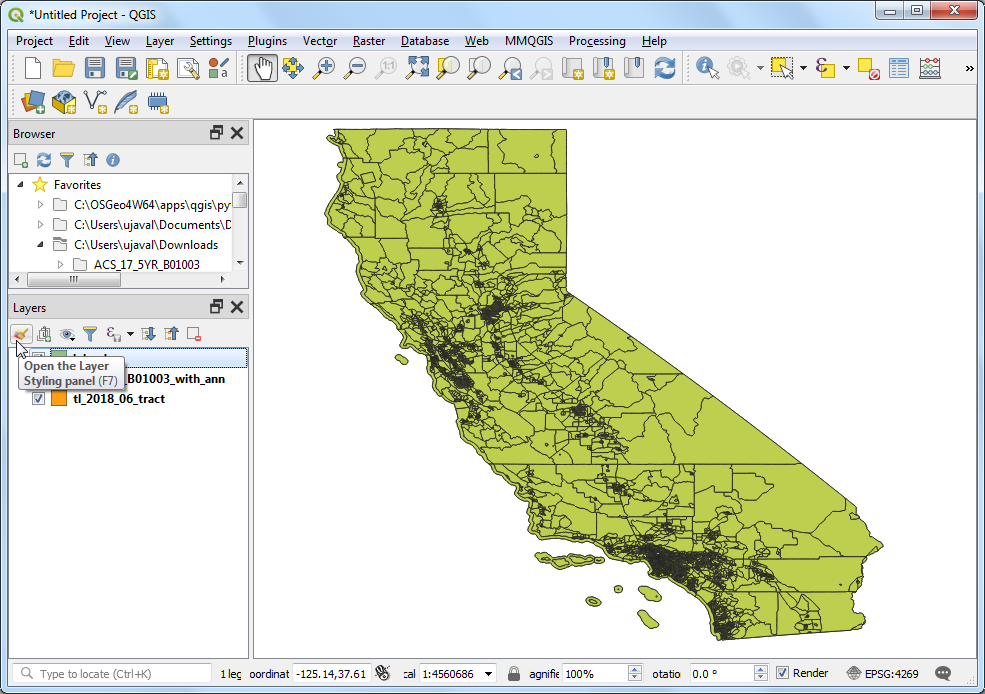
在 QGIS 浏览器中找到
tl_2018_06_tract.zip文件并展开它。选择tl_2018_06_tract.shp文件并将其拖到画布上。
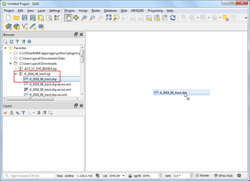
您将在 Layers 面板中看到加载的
tl_2018_06_tract层。该层包含加利福尼亚人口普查区域的边界。右键单击tl_2018_06_tract层,然后选择 Open Attribute Table 。
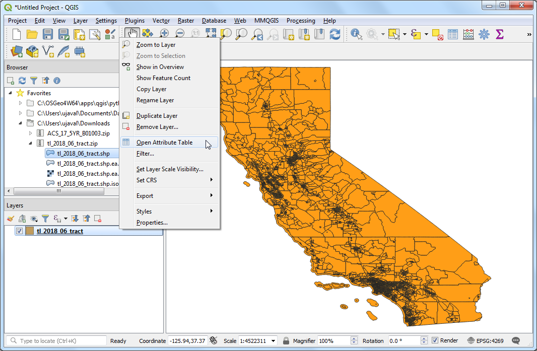
检查图层的属性。要将表与该层连接,我们需要为每个功能部件使用唯一且通用的属性。在这种情况下,
GEOID字段是每个区域的唯一标识符,可用于将该层与包含相同 ID 的任何其他层或表链接起来。

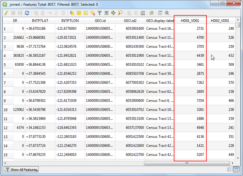
解压缩
ACS_17_5YR_B01003.zip文件并在文本编辑器中打开ACS_17_5YR_B01003_with_ann.csv文件。您会注意到,文件的每一行都包含有关区域的信息以及我们在上一步中看到的唯一标识符。请注意,此字段在 CSV 中称为GEO.id2。 您还将注意到,HD01_VD01列具有每个普查区域的人口值。
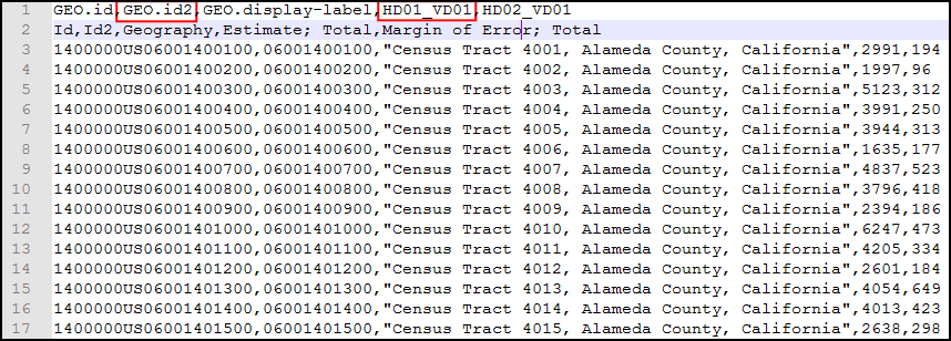
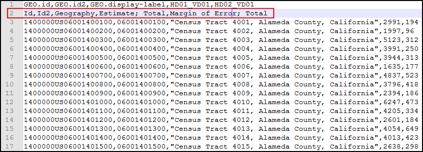
在导入此 CSV 文件之前,我们需要进行少量修改。QGIS CSV 导入程序希望文件的第一行包含列标题,而所有其余行都包含这些列的数据。该文件包含带有列标签的额外第2行。删除该行并保存文件。
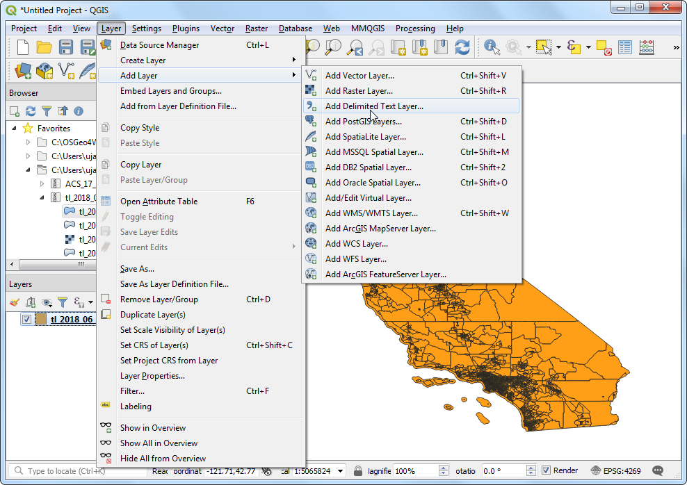
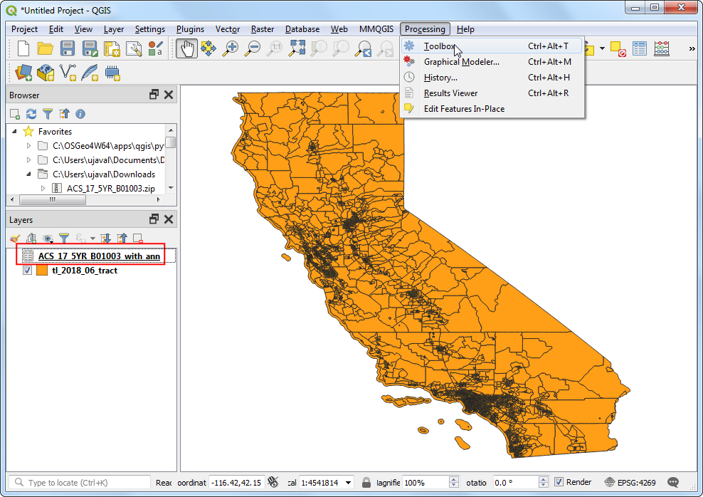
现在,我们准备将 CSV 文件导入 QGIS 。转到 。
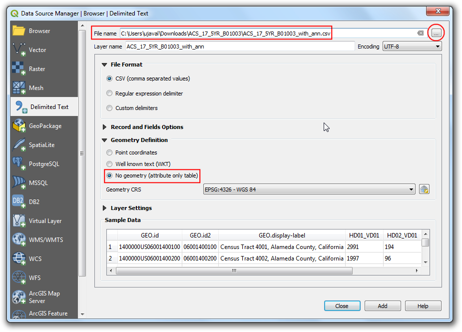
在 Data Source Manager 窗口中,单击 … 按钮,然后浏览到CSV文件并选择它。确保已将 文件格式 选择为 CSV(逗号分隔值) 。由于我们将其导入为表格,因此必须使用 No geometry (attribute table only) 选项指定文件中不包含几何图形。验证底部的 Sample Data 预览看起来不错,然后单击 Add,然后单击 Close 。
CSV 现在将作为表格导入到 QGIS 中,并在 Layers 面板中显示为
ACS_17_5YR_B01003_with_ann。现在我们准备创建表联接。 转到 。
首先,我们需要在 Processing Toolbox 中更改默认设置。点击 Options 按钮。
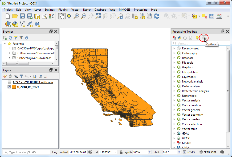
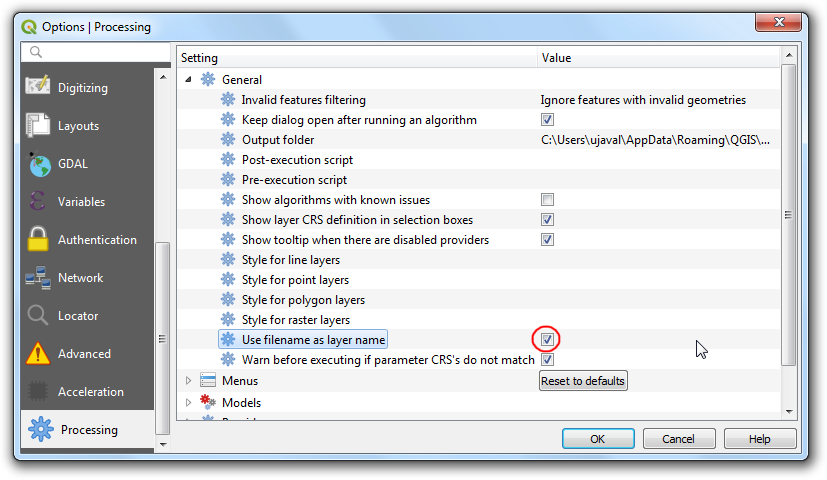
在 Processing Options 标签中,选中 Use filename as layer name 选项。 使用处理工具箱中的算法时,此选项使输出图层名称更加直观和有用。点击 OK 。
返回 Processing Toolbox 中,搜索并找到 算法然后双击将其打开。
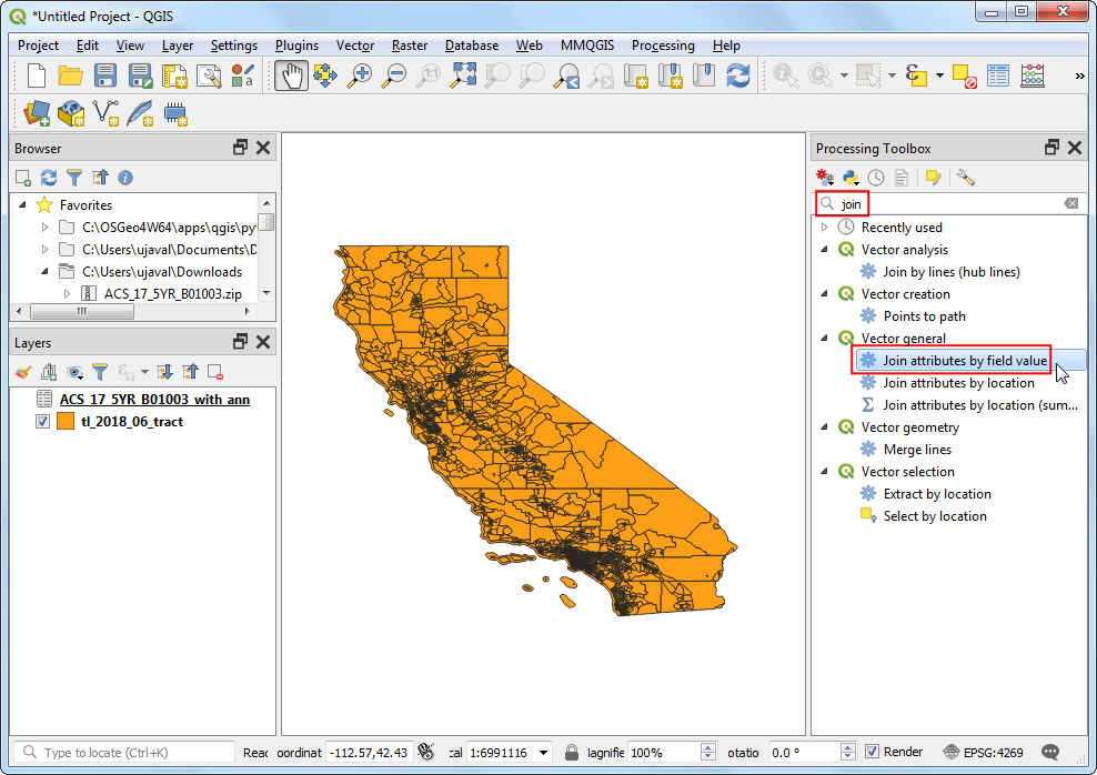
在 Join Attributes by Field Values 对话框中,选择
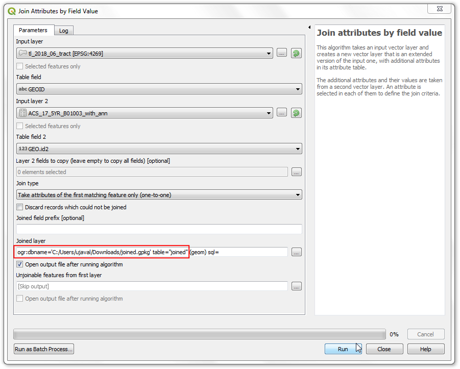
tl_2018_06_tract作为 Input layer ,并选择GEOID作为 Table field 。 选择ACS_17_5YR_B01003_with_ann作为 Input layer 2 的名称,并选择GEO.id2作为 :guilabel: Table field 2 的名称。将其他选项保留为默认值,然后单击 … 按钮以选择输出文件位置,然后选择保存到GeoPackage ...。
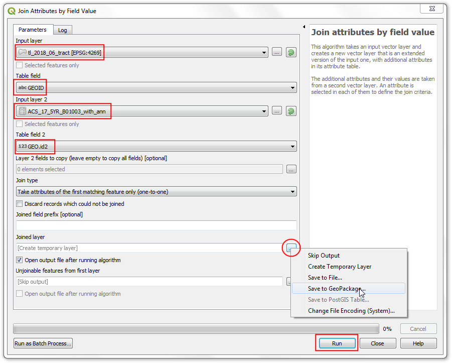
将输出地理包命名为
joined.gpkg,将输出层命名为joined。 点击 Run 。
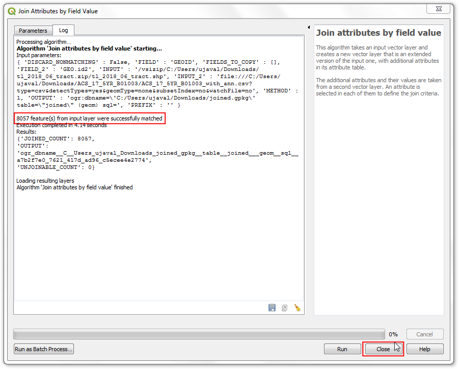
处理完成后,请验证算法是否成功,然后单击 Close 。
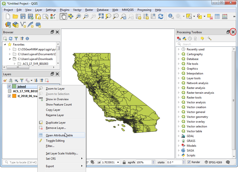
您会在 Layers 面板看到一个新的
joined图层。此时,CSV 文件中的字段将与人口普查区域图层结合在一起。您可以立即关闭 Processing Toolbox 。右键单击joined层,然后选择 Open Attribute Table 。
您将看到一组新字段,包括包含人口估计值的
HD01_VD01字段。
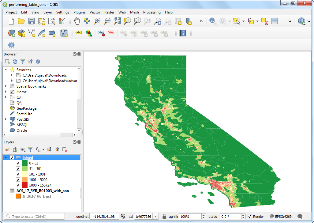
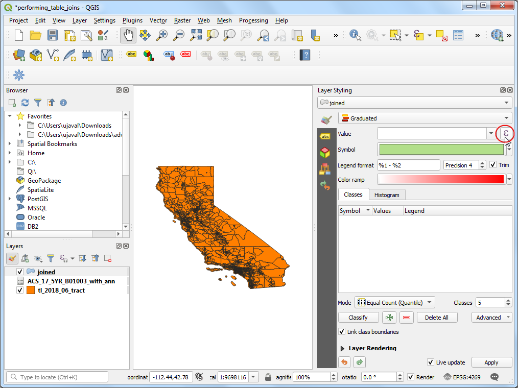
现在我们已经在人口普查区域中拥有了人口数据,我们可以对其进行样式设置以创建人口分布的可视化。选择
joined图层并单击 Open the Layer Styling Panel 按钮。
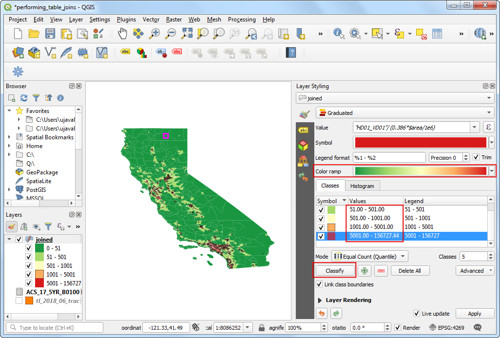
In the Layer Styling panel, select
Graduatedfrom the drop-down menu. As we are looking to create a population density map, we want to assign different color to each census tract feature based on the population density. We have the population in the HD01_VD01 field, but we don’t have population density in any fields to select as the Value. Fortunately, QGIS allows us to input an expression here. Click Expression button.
注解
When creating a thematic (choropleth) map such as this, it is important to normalize the values you are mapping. Mapping total counts per polygon is not correct. It is important to normalize the values dividing by the area. If you are displaying totals such as crime, you can normalize them by diving by total population, thus mapping crime rate and not crime. Learn more
Enter the following expression to calculate the population density.
$areacalculates the area of the feature in square meters. We then convert it to square miles and calculate the population density with the formula Population/Area. Click OK.
"HD01_VD01"/ (0.386*$area/1e6)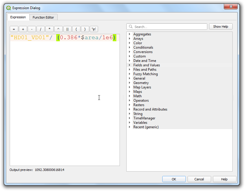
Back in the Layer Styling Panel, choose a color ramp of your choice and click Classify. You can adjust the class ranges to be more appropriate to the region.
The visualization feels a bit cluttered because of the polygon borders. Click on the dropdown next to Symbol. Select Simple fill and check Transparent stroke.
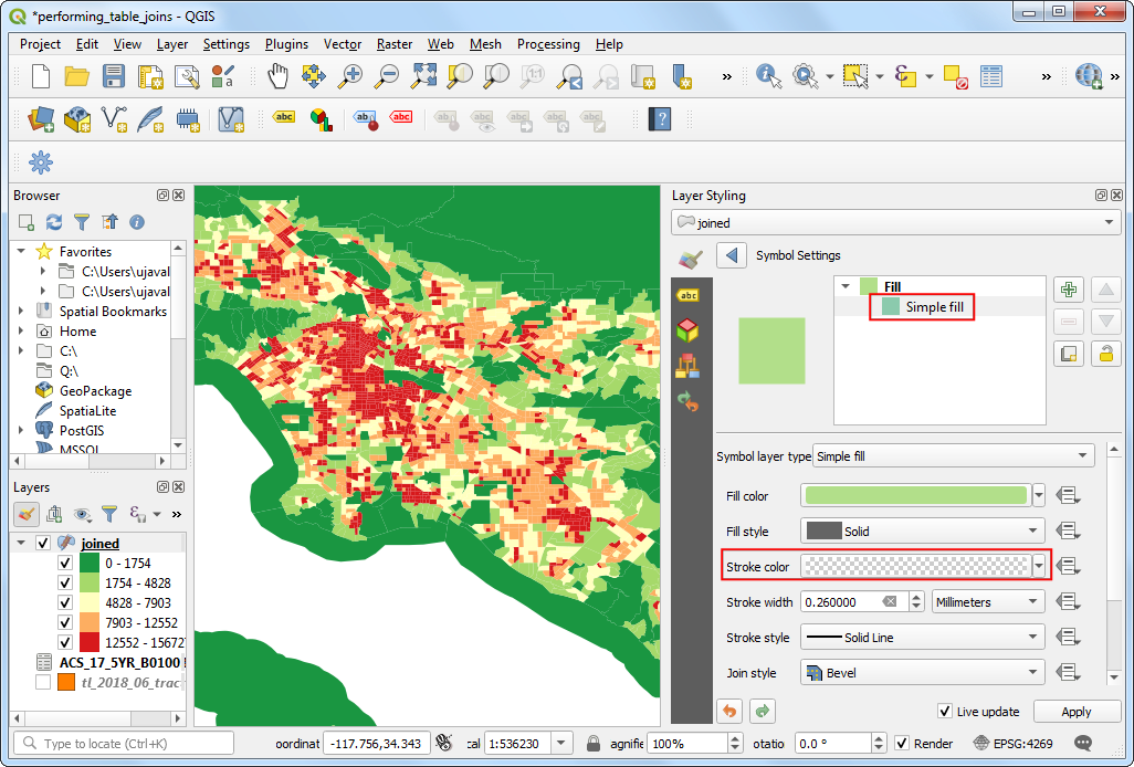
Now we have a nice looking information visualization of population density in California.