摘要: 关于矢量数据 矢量数据由称为顶点的离散几何位置(x、y 值)组成,这些位置定义了空间对象的 “shape”。顶点的组织决定了正在使用的矢量类型。矢量数据分为三种类型: 点:每个单独的点都由单个 x、y 坐标定义。矢量点文件中可以有很多点。点数据的示例包括: ...
关于矢量数据
矢量数据由称为顶点的离散几何位置(x、y 值)组成,这些位置定义了空间对象的 “shape”。顶点的组织决定了正在使用的矢量类型。矢量数据分为三种类型:
- 点:每个单独的点都由单个 x、y 坐标定义。矢量点文件中可以有很多点。点数据的示例包括: 采样位置、单棵树的位置或地块的位置。
- 线:线由许多(至少 2 个)连接的顶点或点组成。例如,一条道路或一条溪流可以用一条线来表示。这条线由一系列线段组成,道路或溪流中的每个“弯道”代表一个具有定义 x, y 位置的顶点。
- 多边形:多边形由 3 个或更多个相连且 “closed” 的顶点组成。因此,地块边界、湖泊、海洋和州或国家的轮廓通常由多边形表示。有时,多边形中间可能有一个洞(如环状物),这是需要注意的事情,但不是将在本教程中处理的问题。
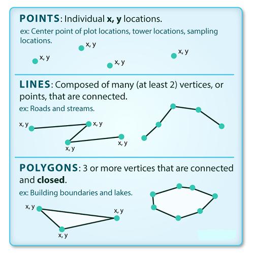
上图显示矢量对象有 3 种类型:点、线或多边形,每种对象类型都有不同的结构。
数据提示:有时,国家、地区等边界层存储为线而不是多边形。然而,当这些边界被表示为一条线时,将不会创建一个具有定义的可以“填充”的“区域”封闭对象。
Shapefiles:点、线和多边形
矢量格式的地理空间数据通常以一种格式存储 shapefile。由于点、线和多边形的结构不同,每个单独的 shapefile 只能包含一种矢量类型(所有点、所有线或所有多边形),不会在单个 shapefile 中找到混合的点、线和多边形对象。
存储在 shapefile 中的对象通常具有一组 attributes 描述数据的关联。例如,包含流位置的线形状文件可能包含关联的流名称、流 “order” 和有关每个流线对象的其他信息。
一个数据集 - 多个文件
虽然文本文件通常是自包含的(一个 CSV)由一个唯一文件组成,但实际上许多空间格式由多个文件组成。一个 shapefile 由 3 个或更多文件创建,所有这些文件必须保留相同的名称并存储在相同的文件目录中,方便使用。
Shapefile 结构
有 3 个关键文件与 shapefile 相关联:
- .shp:包含所有要素几何的文件。
- .shx:索引几何的文件。
- .dbf:以表格格式存储要素属性的文件。
这些文件需要具有相同的名称并存储在相同的目录(文件夹)中才能在 GISR 或 Python 工具中正确打开。有时,shapefile 会有其他关联文件,包括:
.prj:包含投影格式信息的文件,以及坐标系和投影信息。它是一个纯文本文件,使用众所周知的文本 (WKT) 格式描述投影。.sbn和.sbx:作为要素空间索引的文件。.shp.xml:XML 格式的地理空间元数据文件(例如 ISO 19115 或 XML 格式)。
数据管理 - 共享 Shapefiles
使用 shapefile 时,必须将所有关键关联文件类型放在一起。当共享 shapefile 时,在发送之前将所有这些文件压缩到一个软件包中非常重要!
导入 Shapefiles
将使用该 geopandas 库处理 Python,还将使用它 matplotlib.pyplot 来绘制数据。
# import necessary packages
import os
import matplotlib.pyplot as plt
import geopandas as gpd
import earthpy as et

# set home directory and download data
et.data.get_data("spatial-vector-lidar")
os.chdir(os.path.join(et.io.HOME, 'earth-analytics'))

## Downloading from https://ndownloader.figshare.com/files/12459464
Extracted output to /root/earth-analytics/data/spatial-vector-lidar/.
将导入的 shapefile 是:
- 代表现场边界的多边形形状文件,
- 代表道路的线形文件,
打开的第一个 shapefile 包含已测量树木地块的点位置。要导入 shapefile,可使用该 geopandas 函数 read_file()。请注意,调用该 read_file() 函数 gpd.read_file() 是为了告知 python 在库中查找该函数geopandas。
# import shapefile using geopandas
sjer_plot_locations = gpd.read_file('data/spatial-vector-lidar/california/neon-sjer-site/vector_data/SJER_plot_centroids.shp')
CRS UTM 区域 18N,CRS extent 在指定单位时对于解释对象值至关重要。
空间数据属性
shapefile 中的每个对象都有一个或多个与之关联的属性。Shapefile 属性类似于电子表格中的字段或列。电子表格中的每一行都有一组与其关联的列,这些列描述行元素。在 shapefile 的情况下,每一行代表一个空间对象,例如,一条道路,表示为线 shapefile 中的一条线,将有一个“行”属性与之关联。这些属性可以包括描述存储在 shapefile 中对象的不同类型信息。因此,道路可能有名称、长度、车道数、限速、道路类型和其他存储的属性。
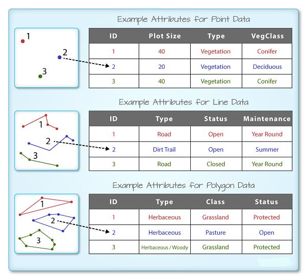
R 空间对象中的每个空间特征都具有相同的一组描述或表征该特征的关联属性。属性数据存储在单独的 *.dbf 文件中。属性数据可以与电子表格进行比较。电子表格中的每一行代表空间对象中的一个要素。
GeoDataFrame 只需在控制台中输入对象名称(例如,sjer_plot_locations),即可查看与 geopandas 关联的属性表。使用的 .head(3) 函数仅显示属性表的前 3 行。请记住,函数中的数字 .head() 表示函数将返回的总行数。
# view  the top 6 lines of attribute table of data
sjer_plot_locations.head(6)
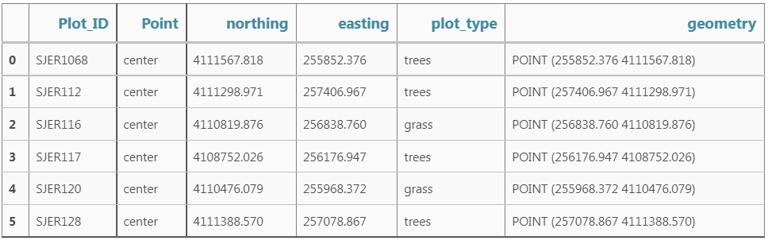
在这种情况下,有几个与积分相关的属性,包括:
- Plot_ID、Point、easting、geometry、northing、plot_type
数据提示:首字母缩写词 OGR,指的是 OpenGIS Simple Features Reference Implementation,了解有关 OGR 的更多信息(https://trac.osgeo.org/gdal/wiki/FAQGeneral)。
Geopandas 数据结构
请注意,geopandas 数据结构是一个 data.frame 包含 geometry 存储 x、y 点位置值的列。所有其他 shapefile 要素属性都包含在列中,这与使用 GIS 工具(如 ArcGIS 或 QGIS)时可能习惯的情况类似。
Shapefile 元数据和属性
当将 SJER_plot_centroids shapefile 图层导入 Python 函数时 gpd.read_file(),该函数会自动将有关数据的信息存储为属性。如对地理空间元数据特别感兴趣,它描述了矢量数据的格式、CRS、extent 和其他组件,以及描述与每个单独的矢量对象关联的属性。
空间元数据
所有 shapefile 的关键元数据包括:
- 对象类型:导入对象的类。
- 坐标参考系统 (CRS):数据的投影。
- 范围:shapefile的空间范围(shapefile 覆盖的地理区域)。
请注意,shapefile 的空间范围表示 shapefile 中所有空间对象的范围。
还可以使用 class(),.crs 和 .total_bounds 方法查看 shapefile 元数据:
type(sjer_plot_locations)
## geopandas.geodataframe.GeoDataFrame
# view the spatial extent
sjer_plot_locations.total_bounds
## array([ 254738.618, 4107527.074,  258497.102, 4112167.778])
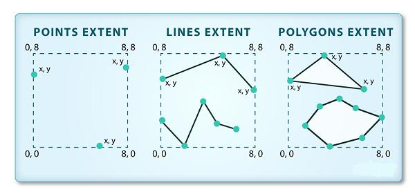
shapefile 或 geopandas GeoDataFrame 的空间范围表示最北、最东南和最西的地理“边缘”或位置。因此表示空间对象的整体地理覆盖范围。
sjer_plot_locations.crs
## <Projected CRS: EPSG:32611>
Name: WGS 84 / UTM zone 11N
Axis Info [cartesian]:
- E[east]: Easting (metre)
- N[north]: Northing (metre)
Area of Use:
- name: World - N hemisphere - 120°W to 114°W - by country
- bounds: (-120.0, 0.0, -114.0, 84.0)
Coordinate Operation:
- name: UTM zone 11N
- method: Transverse Mercator
Datum: World Geodetic System 1984
- Ellipsoid: WGS 84
- Prime Meridian: Greenwich
数据的 CRS 是 epsg 代码:32611,将在后面的课程中了解 CRS 格式和结构,但现在快速谷歌搜索显示此 CRS 是:UTM zone 11 North - WGS84。
sjer_plot_locations.geom_type
## 0     Point
1     Point
2     Point
3     Point
4     Point
5     Point
6     Point
7     Point
8     Point
9     Point
10    Point
11    Point
12    Point
13    Point
14    Point
15    Point
16    Point
17    Point
dtype: object
Shapefile 中有多少特征?
可使用 pandas 方法查看数据中的要素数量(按属性表中的行数计算)和要素属性(列数).shape。请注意,数据作为两个值的向量返回:
(行,列)
另请注意,列数包括存储几何(x、y 坐标位置)的列。
sjer_plot_locations.shape
## (18, 6)
绘制 Shapefile
接下来,可以使用 .plot() 方法可视化 Python geodata.frame 对象中的数据。请注意,可使用以下语法使用地质标准基准绘图创建绘图:
dataframe_name.plot()
该图变大但添加了 figsize = () 参数。
# plot the data using geopandas .plot() method
fig, ax = plt.subplots(figsize = (10,10))
sjer_plot_locations.plot(ax=ax)
plt.show()
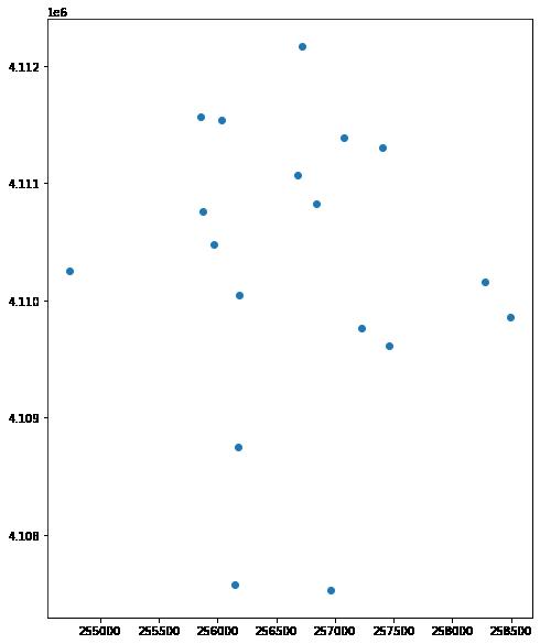
上图显示使用 geopandas 绘图方法绘制的现场位置的绘图。
可按特征属性绘制数据并添加图例。接下来将以下绘图参数添加到 geopandas 绘图中:
- column:要使用绘制数据的属性列
- categorical=True:将绘图设置为绘制分类数据 - 在本例中为绘图类型
- 图例:添加图例
- markersize:增加或减少绘图上呈现的点或标记的大小
- cmap:设置用于绘制数据的颜色
如果要指定输出图的大小,请使用 fig size。
fig, ax = plt.subplots(figsize = (10,10))
# quickly plot the data adding a legend
sjer_plot_locations.plot(column='plot_type',
                         categorical=True,
                         legend=True,
                         figsize=(10,6),
                         markersize=45,
                         cmap="Set2", ax=ax);
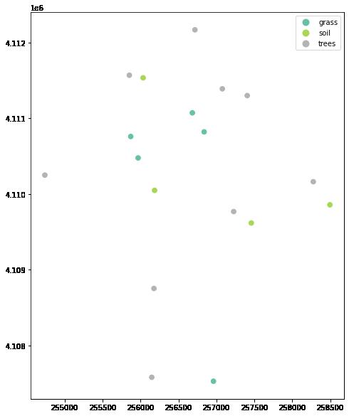
以上绘图显示了使用 geopandas 绘图方法绘制的现场位置,并按绘图类型着色。也可以为情节添加标题。下面将绘图元素分配给一个名为 ax 的变量,并可以使用 向情节添加标题 ax.set_title()。
# Plot the data adjusting marker size and colors
# # 'col' sets point symbol color
# quickly plot the data adding a legend
ax = sjer_plot_locations.plot(column='plot_type',
                         categorical=True,
                         legend=True,
                         figsize=(10,10),
                         markersize=45,
                         cmap="Set2")
# add a title to the plot
ax.set_title('SJER Plot Locations\nMadera County, CA', fontsize=16);
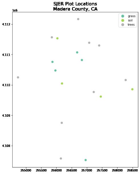
以上绘图显示了使用 geopandas 绘图方法绘制的现场位置,并按绘图类型着色。
更改绘图颜色和符号
可使用 cmap 参数来调整绘图的颜色。下面使用了一个颜色图,它是 matplotlib 颜色图库的一部分。最后使用 marker= 参数来指定标记样式。
fig, ax = plt.subplots(figsize = (10,10))

sjer_plot_locations.plot(column='plot_type',
                              categorical=True,
                              legend=True,
                              marker='*',
                              markersize=65,
                              cmap='OrRd', ax=ax)
# add a title to the plot
ax.set_title('SJER Plot Locations\nMadera County, CA',
            fontsize=16)
plt.show()
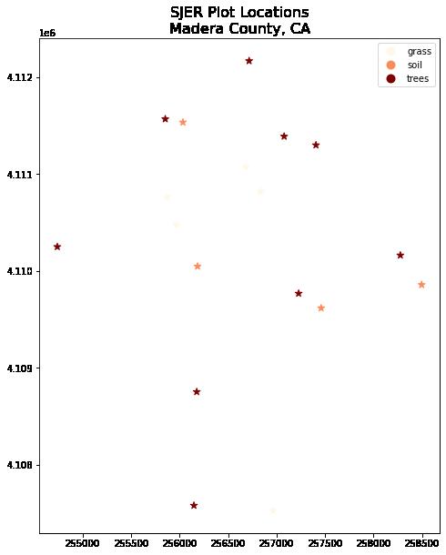
以上绘图显示了使用 geopandas 绘图方法绘制的现场位置,并按绘图类型着色但使用不同的调色板。
ax = sjer_plot_locations.plot(figsize=(10, 10),
                              column='plot_type',
                              categorical=True,
                              marker='*',
                              markersize=65,
                              cmap='OrRd')
# add a title to the plot
ax.set_title('SJER Plot Locations\nMadera County, CA',
            fontsize = 16)
plt.show()
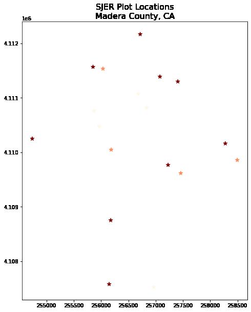
以上绘图显示了使用 geopandas 绘图方法绘制的现场位置,并按绘图类型和自定义符号系统着色。
利用 matplotlib 和 geopandas 绘制形状文件
至此已看到如何使用 geopandas 绘图快速绘制 shapefile。geopandas 绘图是快速探索数据的绝佳选择。然而,它的可定制性不如 matplotlib 绘图。下面将学习如何使用 matplotlib 设置轴来创建相同的地图。
如要与 matplotlib 一起绘制,请先设置轴。在 ax 参数中定义数字大小和标记大小,也可以使用参数调整绘图的符号大小 markersize,以及使用添加标题 ax.set_title()。通过调整参数来创建更大的地图 figsize。下面将其设置为 10 x 10。
绘制多个 Shapefiles
也可以使用 geopandas 方法在彼此之上绘制多个图层 .plot,可进行如下操作:
ax像上面那样定义变量,为我们的图添加标题。- 使用 geopandas
.plot()方法向图中添加尽可能多的图层。
通知如下:
ax.set_axis_off()用于关闭 x 和 y 轴,plt.axis('equal')用于确保 x 和 y 轴均匀间隔。
# import crop boundary
sjer_crop_extent = gpd.read_file("data/spatial-vector-lidar/california/neon-sjer-site/vector_data/SJER_crop.shp")
fig, ax = plt.subplots(figsize = (10, 10))

# first setup the plot using the crop_extent layer as the base layer
sjer_crop_extent.plot(color='lightgrey',
                      edgecolor = 'black',
                      ax = ax,
                      alpha=.5)
# then add another layer using geopandas syntax .plot, and calling the ax variable as the axis argument
sjer_plot_locations.plot(ax=ax,
                         column='plot_type',
                         categorical=True,
                         marker='*',
                         legend=True,
                         markersize=50,
                         cmap='Set2')
# add a title to the plot
ax.set_title('SJER Plot Locations\nMadera County, CA')
ax.set_axis_off()
plt.axis('equal')
plt.show()
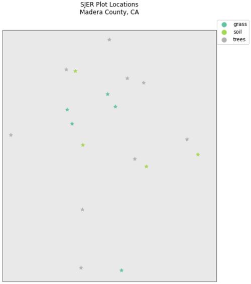
以上绘图显示了使用 geopandas 绘图方法绘制的现场位置,并按绘图类型和自定义符号系统着色。
带有 Geopandas 的自定义图例 - 可选
接下来是进一步自定义 geopandas 图的示例。
目前,在 Geopandas 中创建自定义图例还没有完美的方法,尽管正在考虑该功能。另一种方法是使用循环和字典绘制数据,该专业术语提供想要应用于每个点类型的各种属性。
# make it a bit nicer using a dictionary to assign colors and line widths
plot_attrs = {'grass': ['blue', '*'],
               'soil': ['brown','o'],
               'trees': ['green','*']}

# plot the data
fig, ax = plt.subplots(figsize  = (12, 8))

# first setup the plot using the crop_extent layer as the base layer
sjer_crop_extent.plot(color='lightgrey',
                      edgecolor = 'black',
                      ax = ax,
                      alpha=.5)

for ctype, data in sjer_plot_locations.groupby('plot_type'):
    data.plot(color=plot_attrs[ctype][0],
              label = ctype,
              ax = ax,
             marker = plot_attrs[ctype][1],
)

ax.legend(title="Custom Legend")
ax.set_title("United States Roads by Type", fontsize=20)
ax.set_axis_off()
plt.axis('equal')
plt.show()
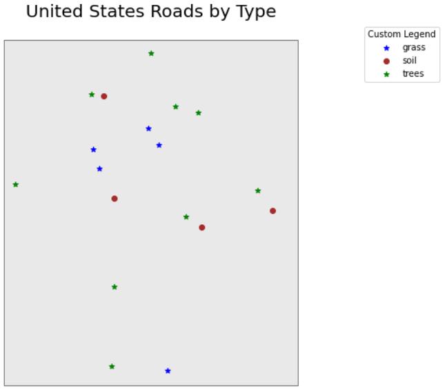
以上绘图显示了使用 geopandas 绘图方法绘制的现场位置,并按绘图类型和自定义符号系统着色。