9. 地图制作
|
目标: |
对空间数据地图制作的认识 |
关键词: |
地图制作、地图布局、比例尺、指北针、图例、地图体、地图单位 |
9.1. 概述
Map production is the process of arranging map elements on a sheet of paper in a way that, even without many words, the average person can understand what it is all about. Maps are usually produced for presentations and reports where the audience or reader is a politician, citizen or a learner with no professional background in GIS. Because of this, a map has to be effective in communicating spatial information. Common elements of a map are the title, map body, legend, north arrow, scale bar, acknowledgement, and map border (see 图 9.45).
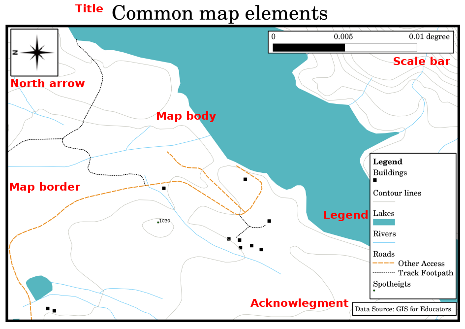
图 9.45 常见的地图元素(以红色标记)包括标题、地图体、图例、指北针、比例尺、确认和地图边框。
其他可能添加的元素包括 graticule ,或 name of the map projection (CRS)。这些元素一起帮助地图阅读器解释地图上显示的信息。当然,地图主体是地图最重要的部分,因为它包含地图信息。其他元素支持交流过程,并帮助地图阅读器确定自己的位置和理解地图主题。例如,标题描述主题,图例将地图符号与地图数据相关联。
9.2. 标题详解
地图标题非常重要,因为它通常是读者在地图上看到的第一件事。它可以比作报纸上的标题。它应该简短,但让读者对地图的内容有一个初步的了解。
9.3. 详细映射边框
The map border is a line that defines exactly the edges of the area shown on the map. When printing a map with a graticule (which we describe further down), you often find the coordinate information of the graticule lines along the border lines, as you can see in 图 9.46.
9.4. 地图图例详解
A map is a simplified representation of the real world and map symbols are used to represent real objects. Without symbols, we wouldn't understand maps. To ensure that a person can correctly read a map, a map legend is used to provide a key to all the symbols used on the map. It is like a dictionary that allows you to understand the meaning of what the map shows. A map legend is usually shown a a little box in a corner of the map. It contains icons, each of which will represent a type of feature. For example, a house icon will show you how to identify houses on the map (see 图 9.46).
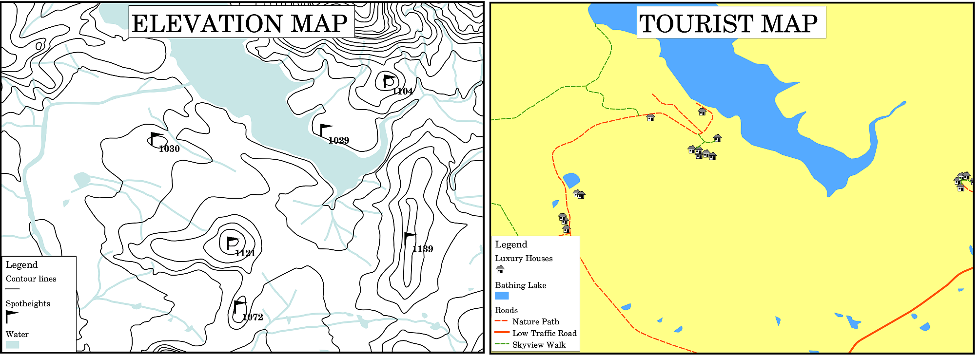
图 9.46 来自同一地区的两张地图,背景都是水体,但主题不同,地图符号和图例中的颜色也不同。
You can also use different symbols and icons in your legend to show different themes. In 图 9.46 you can see a map with a lake in light blue overlaid with contour lines and spot heights to show information about the terrain in that area. On the right side you see the same area with the lake in the background but this map is designed to show tourists the location of houses they can rent for their holidays. It uses brighter colours, a house icon and more descriptive and inviting words in the legend.
9.5. 详细的指北针
北向箭头(有时也称为指南针)是显示主要方向的图形, North , South , East 和 West 。在地图上,它被用来指示北的方向。
例如,在地理信息系统中,这意味着可以在地图上找到位于湖泊以北的房屋。然后,东部的道路将位于地图上水体的右侧,南部的河流将位于水体下方,如果您正在寻找湖泊以西的火车站,您将在地图的左侧找到它。
9.6. 详细扩展
The scale of a map, is the value of a single unit of distance on the map, representing distance in the real world. The values are shown in map units (meters, feet or degrees). The scale can be expressed in several ways, for example, in words, as a ratio or as a graphical scale bar (see 图 9.47).
Expressing a scale in words is a commonly used method and has the advantage of being easily understood by most map users. You can see an example of a word based scale in a 图 9.47 (a). Another option is the representative fraction (RF) method, where both the map distance and the ground distance in the real world are given in the same map units, as a ratio. For example, a RF value 1:25,000 means that any distance on the map is 1/25,000 th of the real distance on the ground (see 图 9.47 (b)). The value 25,000 in the ratio is called the scale denominator. More experienced users often prefer the representative fraction method, because it reduces confusion.
当一个代表性分数表示一个非常小的比率时,例如1:1000000,它被称为 small scale map 。另一方面,如果比例很大,例如1:50,000地图,则称为 large scale map 。记住,小比例尺地图覆盖 large area ,大比例尺地图覆盖 small area 好了!
A scale expression as a graphic or bar scale is another basic method of expressing a scale. A bar scale shows measured distances on the map. The equivalent distance in the real world is placed above as you can see in 图 9.47 (c).
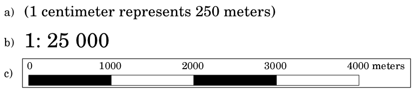
图 9.47 地图比例尺可以用文字(A)、比率(B)或图形或条形图比例尺(C)来表示
地图通常以1:10 000、1:25 000、1:50 000、1:100 000、1:250 000、1:500 000等标准比例尺制作。这对地图阅读器意味着什么?这意味着如果你 multiply 在上测量的距离 map 由. scale denominator ,你就会知道距离在 real world 。
例如,如果我们要在比例为1:25,000的地图上测量100 mm的距离,则可以按如下方式计算真实世界的距离:
100 mm x 25,000 = 2,500,000 mm
这意味着地图上的100毫米相当于真实世界中的2500,000毫米(2500米)。
Another interesting aspect of a map scale, is that the lower the map scale, the more detailed the feature information in the map will be. In 图 9.48, you can see an example of this. Both maps are the same size but have a different scale. The image on the left side shows more details, for example the houses south-west of the water body can be clearly identified as separate squares. In the image on the right you can only see a black clump of rectangles and you are not able to see each house clearly.
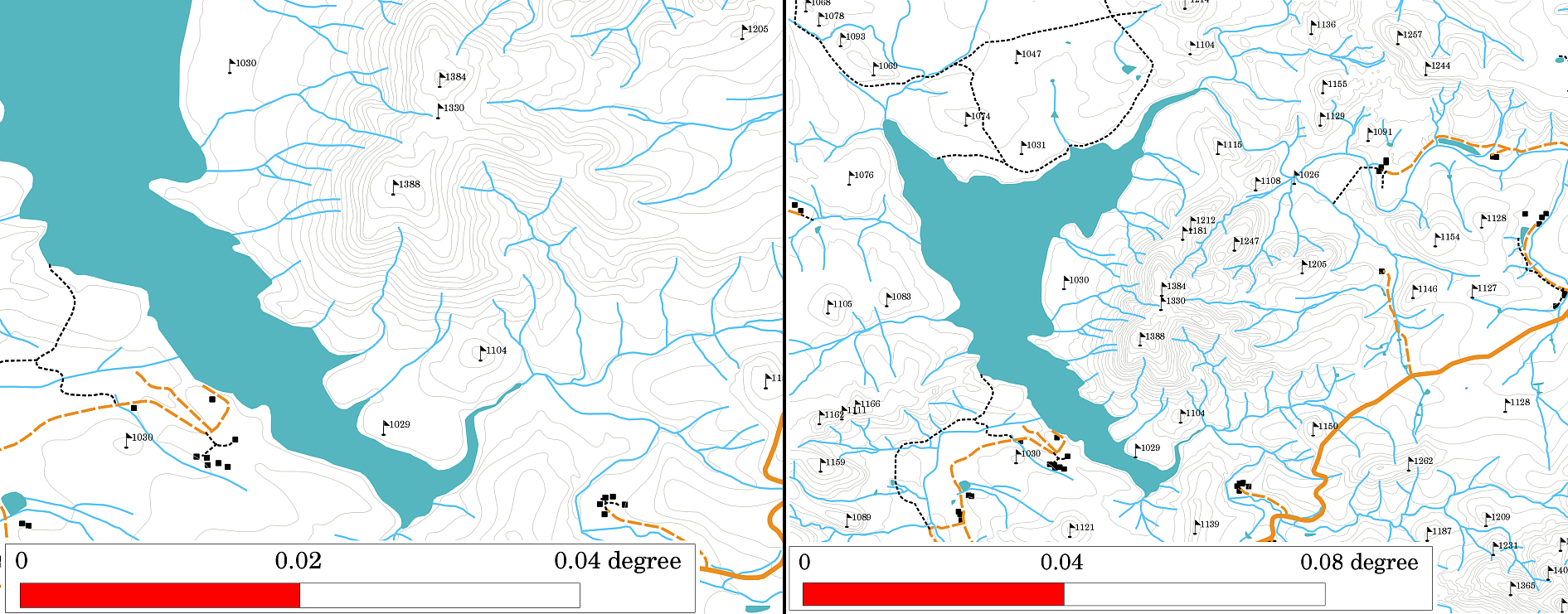
图 9.48 以两种不同比例尺显示一个地区的地图。左边的地图比例尺是1:25,000。右侧的地图比例为1:50,000。
9.7. 详细确认
在地图的确认区域中,可以添加包含重要信息的文本。例如,有关所用数据质量的信息可能有助于读者了解地图是如何创建的、由谁创建以及何时创建的细节。如果你看一张你所在城镇的地形图,知道这张地图是什么时候创建的,是谁做的,这将是很有用的。如果这张地图已经有50年的历史了,你可能会发现很多不再存在的房屋和道路,甚至可能根本不存在。如果你知道地图是由官方机构创建的,你可以联系他们,询问他们是否有更新的地图版本和更新的信息。
9.8. 细微之处
A graticule is a network of lines overlain on a map to make spatial orientation easier for the reader. The lines can be used as a reference. As an example, the lines of a graticule can represent the earth's parallels of latitude and meridians of longitude. When you want to refer to a special area on a map during your presentation or in a report you could say: 'the houses close to latitude 26.04 / longitude -32.11 are often exposed to flooding during January and February' (see 图 9.49).
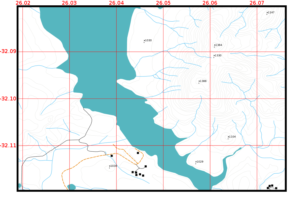
图 9.49 代表地球纬度和经线的经纬线(红线)。地图边框上的纬度和经度值可用于在地图上更好地定位。
9.9. 地图投影的详细名称
地图投影试图在一张纸上显示三维地球及其所有特征,如房屋、道路或湖泊。正如你可以想象的那样,这是非常困难的,即使在数百年后,也没有一个单一的投影能够完美地代表世界上任何一个地区的地球。每一种预测都有优点和缺点。
To be able to create maps as precisely as possible, people have studied, modified, and produced many different kinds of projections. In the end almost every country has developed its own map projection with the goal of improving the map accuracy for their territorial area (see 图 9.50).
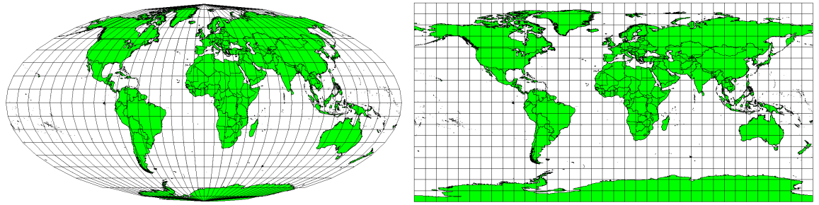
图 9.50 世界在不同的投影中。左为Mollweide等面积投影,右为等距圆柱形投影。
With this in mind, we can now understand why it makes sense to add the name of the projection on a map. It allows the reader to see quickly, if one map can be compared with another. For example, features on a map in a so-called Equal Area projection appear very different to features projected in a Cylindrical Equidistant projection (see 图 9.50).
地图投影是一个非常复杂的话题,我们不能在这里完全涵盖它。如果您想了解更多信息,您可能想看看我们之前的主题:坐标参考系。
9.10. 需要注意的常见问题/事情
有时很难创建一张易于理解和布局良好的地图,同时仍然显示和解释读者需要知道的所有信息。要实现这一点,您需要创建所有地图元素的理想排列和组合。你应该专注于你想要用你的地图讲述什么故事,以及如何对元素进行排序,如图例、比例尺和确认。通过这样做,你将拥有一张精心设计的、具有教育意义的地图,人们愿意查看并能够理解。
9.11. 我们学到了什么?
让我们总结一下我们在此工作表中介绍的内容:
Map production 意味着安排 map elements 在一张纸上。
Map elements 有标题、地图体、地图边框、图例、比例尺、指北针和致谢。
Scale 表示地图上的距离与真实世界中的实际距离的比率。
比例显示在 map units (米、英尺或度)
A legend 解释地图上的所有符号。
一张地图应该是 explain complex information as simply as possible 。
地图通常总是显示在 North up ‘。
9.12. 现在你来试试吧!
以下是一些建议,可供您尝试与您的学习者:
9.13. 一些值得思考的事情
如果您没有可用的计算机,您可以使用任何地形图,并与您的学习者讨论地图设计。弄清楚他们是否理解地图想要传达的信息。还有什么可以改进的?这张地图代表该地区的历史有多准确?100年前的地图与今天的地图有什么不同?
9.14. 进一步阅读
Books :
张康宗(2006)。地理信息系统概论。第三版。麦格劳·希尔。ISBN:0070658986
迈克尔·N·德默斯(2005)。地理信息系统基础。第三版。威利。ISBN:9814126195
Website : Scale (map)
《QGIS用户指南》还提供了更多有关QGIS中地图制作的详细信息。
9.15. 下一步是什么?
在接下来的部分中,我们将更仔细地了解 vector analysis 看看我们如何使用地理信息系统,而不仅仅是制作漂亮的地图!