注解
Click here 下载完整的示例代码
颜色映射规范化
默认情况下使用颜色映射的对象根据数据值线性映射颜色映射中的颜色 vmin 到 vmax . 例如::
pcm = ax.pcolormesh(x, y, Z, vmin=-1., vmax=1., cmap='RdBu_r')
将数据映射到 Z 线性从-1到+1,所以 Z=0 将在颜色图的中心给出颜色 RdBu_r (本例中为白色)。
Matplotlib分两个步骤进行映射,从输入数据到 [0, 1] 先发生,然后映射到颜色映射中的索引。规范化是在 matplotlib.colors() 模块。默认的线性规范化是 matplotlib.colors.Normalize() .
将数据映射到颜色的艺术家传递参数 vmin 和 vmax 构建一个 matplotlib.colors.Normalize() 实例,然后调用它:
In [1]: import matplotlib as mpl

In [2]: norm = mpl.colors.Normalize(vmin=-1, vmax=1)

In [3]: norm(0)
Out[3]: 0.5
然而,有时情况下,以非线性方式将数据映射到颜色映射是有用的。
对数的
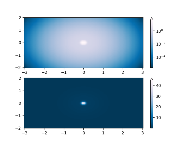
最常见的转换之一是通过取数据的对数(以10为底)绘制数据。此转换对于显示不同规模的更改非常有用。使用 colors.LogNorm 通过规范化数据 \(log_{{10}}\) . 在下面的示例中,有两个凸起,一个比另一个小得多。使用 colors.LogNorm ,可以清楚地看到每个凸起的形状和位置:
import numpy as np
import matplotlib.pyplot as plt
import matplotlib.colors as colors
import matplotlib.cbook as cbook

N = 100
X, Y = np.mgrid[-3:3:complex(0, N), -2:2:complex(0, N)]

# A low hump with a spike coming out of the top right.  Needs to have
# z/colour axis on a log scale so we see both hump and spike.  linear
# scale only shows the spike.
Z1 = np.exp(-X**2 - Y**2)
Z2 = np.exp(-(X * 10)**2 - (Y * 10)**2)
Z = Z1 + 50 * Z2

fig, ax = plt.subplots(2, 1)

pcm = ax[0].pcolor(X, Y, Z,
                   norm=colors.LogNorm(vmin=Z.min(), vmax=Z.max()),
                   cmap='PuBu_r', shading='auto')
fig.colorbar(pcm, ax=ax[0], extend='max')

pcm = ax[1].pcolor(X, Y, Z, cmap='PuBu_r', shading='auto')
fig.colorbar(pcm, ax=ax[1], extend='max')
plt.show()
对称对数
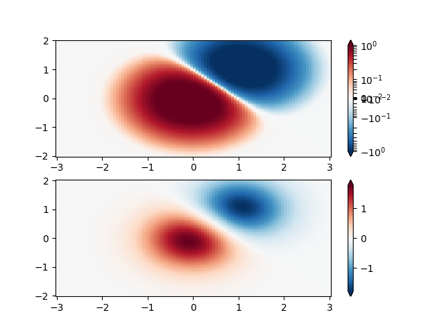
类似地,有时也会有正的和负的数据,但我们仍然希望对两者都应用对数比例。在这种情况下,负数也按对数缩放,并映射到较小的数字;例如,如果 vmin=-vmax ,则负数从0映射到0.5,正数从0.5映射到1。
由于接近零的数值的对数趋于无穷大,因此需要线性映射一个接近零的小范围。参数 直线加速器 允许用户指定此范围的大小(- 直线加速器 , 直线加速器 )颜色映射中此范围的大小由 林鳞 .什么时候? 林鳞 ==1.0(默认值),用于线性范围正负两部分的空间在对数范围内等于10年。
N = 100
X, Y = np.mgrid[-3:3:complex(0, N), -2:2:complex(0, N)]
Z1 = np.exp(-X**2 - Y**2)
Z2 = np.exp(-(X - 1)**2 - (Y - 1)**2)
Z = (Z1 - Z2) * 2

fig, ax = plt.subplots(2, 1)

pcm = ax[0].pcolormesh(X, Y, Z,
                       norm=colors.SymLogNorm(linthresh=0.03, linscale=0.03,
                                              vmin=-1.0, vmax=1.0, base=10),
                       cmap='RdBu_r', shading='auto')
fig.colorbar(pcm, ax=ax[0], extend='both')

pcm = ax[1].pcolormesh(X, Y, Z, cmap='RdBu_r', vmin=-np.max(Z), shading='auto')
fig.colorbar(pcm, ax=ax[1], extend='both')
plt.show()
幂律
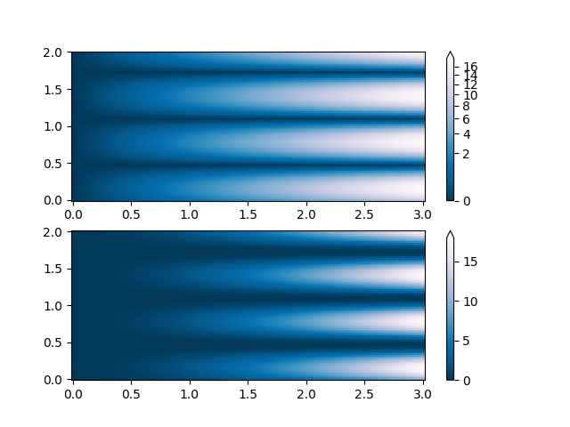
有时将颜色重新映射到幂律关系(即 \(y=x^{{\gamma}}\) 在哪里 \(\gamma\) 就是力量)。为此,我们使用 colors.PowerNorm . 作为一个论点 伽马 ( 伽马 ==1.0只会产生默认的线性规范化):
注解
使用这种类型的转换绘制数据可能有一个很好的理由。技术查看器用于线性轴和对数轴以及数据转换。权力法不那么常见,观众应该清楚地知道他们已经被使用了。
N = 100
X, Y = np.mgrid[0:3:complex(0, N), 0:2:complex(0, N)]
Z1 = (1 + np.sin(Y * 10.)) * X**2

fig, ax = plt.subplots(2, 1)

pcm = ax[0].pcolormesh(X, Y, Z1, norm=colors.PowerNorm(gamma=0.5),
                       cmap='PuBu_r', shading='auto')
fig.colorbar(pcm, ax=ax[0], extend='max')

pcm = ax[1].pcolormesh(X, Y, Z1, cmap='PuBu_r', shading='auto')
fig.colorbar(pcm, ax=ax[1], extend='max')
plt.show()
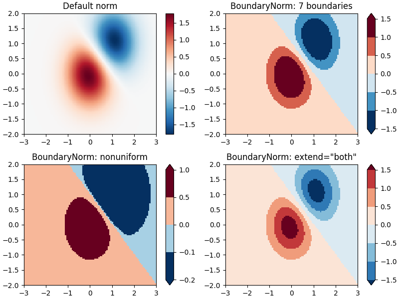
离散界限
Matplotlib附带的另一个规范化是 colors.BoundaryNorm . 除了 vmin 和 vmax ,这会将要映射的数据之间的边界作为参数。然后颜色在这些“界限”之间线性分布。我也能接受 延伸 参数,用于向颜色分布的范围中添加上限值和/或下限值。例如:
注意:与其他规范不同,此规范返回从0到 n色品 - 1。
N = 100
X, Y = np.meshgrid(np.linspace(-3, 3, N), np.linspace(-2, 2, N))
Z1 = np.exp(-X**2 - Y**2)
Z2 = np.exp(-(X - 1)**2 - (Y - 1)**2)
Z = ((Z1 - Z2) * 2)[:-1, :-1]

fig, ax = plt.subplots(2, 2, figsize=(8, 6), constrained_layout=True)
ax = ax.flatten()

# Default norm:
pcm = ax[0].pcolormesh(X, Y, Z, cmap='RdBu_r')
fig.colorbar(pcm, ax=ax[0], orientation='vertical')
ax[0].set_title('Default norm')

# Even bounds give a contour-like effect:
bounds = np.linspace(-1.5, 1.5, 7)
norm = colors.BoundaryNorm(boundaries=bounds, ncolors=256)
pcm = ax[1].pcolormesh(X, Y, Z, norm=norm, cmap='RdBu_r')
fig.colorbar(pcm, ax=ax[1], extend='both', orientation='vertical')
ax[1].set_title('BoundaryNorm: 7 boundaries')

# Bounds may be unevenly spaced:
bounds = np.array([-0.2, -0.1, 0, 0.5, 1])
norm = colors.BoundaryNorm(boundaries=bounds, ncolors=256)
pcm = ax[2].pcolormesh(X, Y, Z, norm=norm, cmap='RdBu_r')
fig.colorbar(pcm, ax=ax[2], extend='both', orientation='vertical')
ax[2].set_title('BoundaryNorm: nonuniform')

# With out-of-bounds colors:
bounds = np.linspace(-1.5, 1.5, 7)
norm = colors.BoundaryNorm(boundaries=bounds, ncolors=256, extend='both')
pcm = ax[3].pcolormesh(X, Y, Z, norm=norm, cmap='RdBu_r')
# The colorbar inherits the "extend" argument from BoundaryNorm.
fig.colorbar(pcm, ax=ax[3], orientation='vertical')
ax[3].set_title('BoundaryNorm: extend="both"')
plt.show()
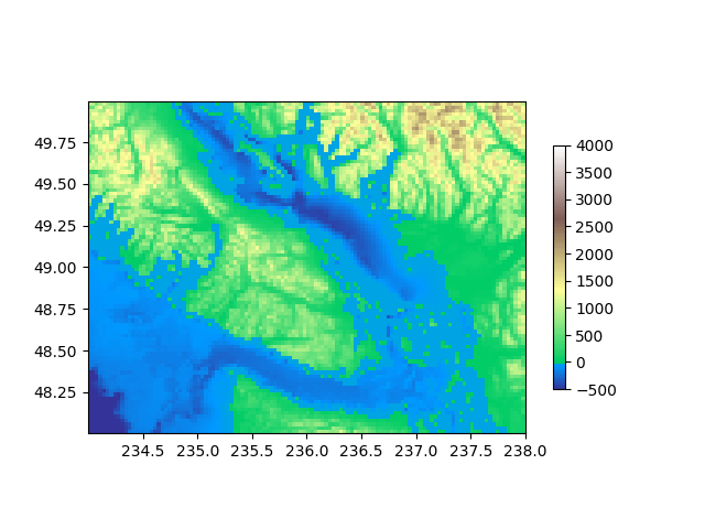
TwoSlopeNorm:中心两侧的不同映射
有时,我们希望在概念中心点的两边有一个不同的颜色映射,我们希望这两个颜色映射具有不同的线性比例。一个例子是地形图,其中陆地和海洋的中心为零,但是陆地的海拔范围通常比水的深度范围大,而且它们通常由不同的颜色图表示。
dem = cbook.get_sample_data('topobathy.npz', np_load=True)
topo = dem['topo']
longitude = dem['longitude']
latitude = dem['latitude']

fig, ax = plt.subplots()
# make a colormap that has land and ocean clearly delineated and of the
# same length (256 + 256)
colors_undersea = plt.cm.terrain(np.linspace(0, 0.17, 256))
colors_land = plt.cm.terrain(np.linspace(0.25, 1, 256))
all_colors = np.vstack((colors_undersea, colors_land))
terrain_map = colors.LinearSegmentedColormap.from_list(
    'terrain_map', all_colors)

# make the norm:  Note the center is offset so that the land has more
# dynamic range:
divnorm = colors.TwoSlopeNorm(vmin=-500., vcenter=0, vmax=4000)

pcm = ax.pcolormesh(longitude, latitude, topo, rasterized=True, norm=divnorm,
                    cmap=terrain_map, shading='auto')
# Simple geographic plot, set aspect ratio beecause distance between lines of
# longitude depends on latitude.
ax.set_aspect(1 / np.cos(np.deg2rad(49)))
fig.colorbar(pcm, shrink=0.6)
plt.show()
自定义规格化:手动实现两个线性范围
这个 TwoSlopeNorm 上面描述的是定义自己的规范的一个有用的例子。
class MidpointNormalize(colors.Normalize):
    def __init__(self, vmin=None, vmax=None, vcenter=None, clip=False):
        self.vcenter = vcenter
        colors.Normalize.__init__(self, vmin, vmax, clip)

    def __call__(self, value, clip=None):
        # I'm ignoring masked values and all kinds of edge cases to make a
        # simple example...
        x, y = [self.vmin, self.vcenter, self.vmax], [0, 0.5, 1]
        return np.ma.masked_array(np.interp(value, x, y))


fig, ax = plt.subplots()
midnorm = MidpointNormalize(vmin=-500., vcenter=0, vmax=4000)

pcm = ax.pcolormesh(longitude, latitude, topo, rasterized=True, norm=midnorm,
                    cmap=terrain_map, shading='auto')
ax.set_aspect(1 / np.cos(np.deg2rad(49)))
fig.colorbar(pcm, shrink=0.6, extend='both')
plt.show()

脚本的总运行时间: (0分4.232秒)
关键词:matplotlib代码示例,codex,python plot,pyplot Gallery generated by Sphinx-Gallery