注解
Click here 下载完整的示例代码
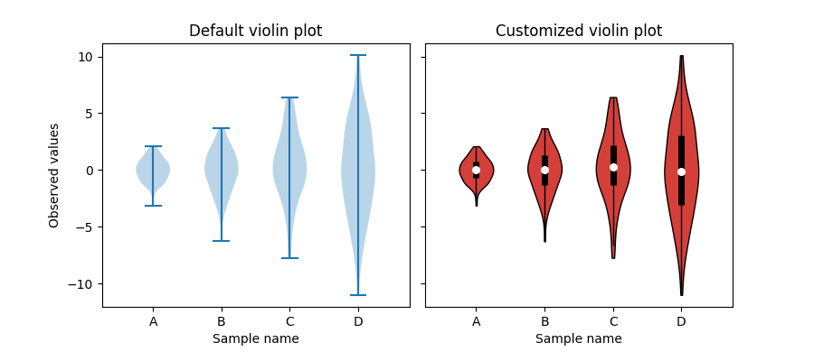
小提琴绘图定制
这个例子演示了如何完全定制小提琴绘图。第一个绘图通过只提供数据来显示默认样式。第二个图首先限制了Matplotlib用额外的Kwarg绘制的内容。然后在顶部绘制一个方框图的简化表示。最后,对小提琴家的风格进行了修改。
有关小提琴情节的更多信息,scikit学习文档有一个很好的部分:https://scikit-learn.org/stable/modules/density.html
import matplotlib.pyplot as plt
import numpy as np


def adjacent_values(vals, q1, q3):
    upper_adjacent_value = q3 + (q3 - q1) * 1.5
    upper_adjacent_value = np.clip(upper_adjacent_value, q3, vals[-1])

    lower_adjacent_value = q1 - (q3 - q1) * 1.5
    lower_adjacent_value = np.clip(lower_adjacent_value, vals[0], q1)
    return lower_adjacent_value, upper_adjacent_value


def set_axis_style(ax, labels):
    ax.get_xaxis().set_tick_params(direction='out')
    ax.xaxis.set_ticks_position('bottom')
    ax.set_xticks(np.arange(1, len(labels) + 1))
    ax.set_xticklabels(labels)
    ax.set_xlim(0.25, len(labels) + 0.75)
    ax.set_xlabel('Sample name')


# create test data
np.random.seed(19680801)
data = [sorted(np.random.normal(0, std, 100)) for std in range(1, 5)]

fig, (ax1, ax2) = plt.subplots(nrows=1, ncols=2, figsize=(9, 4), sharey=True)

ax1.set_title('Default violin plot')
ax1.set_ylabel('Observed values')
ax1.violinplot(data)

ax2.set_title('Customized violin plot')
parts = ax2.violinplot(
        data, showmeans=False, showmedians=False,
        showextrema=False)

for pc in parts['bodies']:
    pc.set_facecolor('#D43F3A')
    pc.set_edgecolor('black')
    pc.set_alpha(1)

quartile1, medians, quartile3 = np.percentile(data, [25, 50, 75], axis=1)
whiskers = np.array([
    adjacent_values(sorted_array, q1, q3)
    for sorted_array, q1, q3 in zip(data, quartile1, quartile3)])
whiskers_min, whiskers_max = whiskers[:, 0], whiskers[:, 1]

inds = np.arange(1, len(medians) + 1)
ax2.scatter(inds, medians, marker='o', color='white', s=30, zorder=3)
ax2.vlines(inds, quartile1, quartile3, color='k', linestyle='-', lw=5)
ax2.vlines(inds, whiskers_min, whiskers_max, color='k', linestyle='-', lw=1)

# set style for the axes
labels = ['A', 'B', 'C', 'D']
for ax in [ax1, ax2]:
    set_axis_style(ax, labels)

plt.subplots_adjust(bottom=0.15, wspace=0.05)
plt.show()
关键词:matplotlib代码示例,codex,python plot,pyplot Gallery generated by Sphinx-Gallery