注解
Click here 下载完整的示例代码
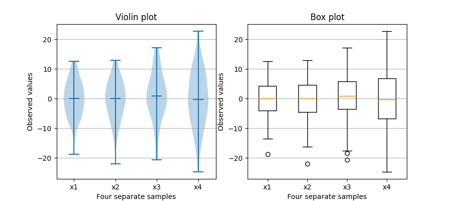
盒图与小提琴图比较
请注意,尽管小提琴图与Tukey(1977)的盒形图密切相关,但它们添加了有用的信息,如样本数据的分布(密度迹线)。
默认情况下,方框图显示的数据点超出1.5*四分位范围,作为胡须上方或下方的异常值,而小提琴图显示的是整个数据范围。
关于箱线图及其历史的一个很好的一般参考资料可以在这里找到:http://vita.had.co.nz/papers/boxplots.pdf
小提琴绘图需要matplotlib>1.4。
有关小提琴情节的更多信息,scikit学习文档有一个很好的部分:https://scikit-learn.org/stable/modules/density.html
import matplotlib.pyplot as plt
import numpy as np

fig, axs = plt.subplots(nrows=1, ncols=2, figsize=(9, 4))

# Fixing random state for reproducibility
np.random.seed(19680801)


# generate some random test data
all_data = [np.random.normal(0, std, 100) for std in range(6, 10)]

# plot violin plot
axs[0].violinplot(all_data,
                  showmeans=False,
                  showmedians=True)
axs[0].set_title('Violin plot')

# plot box plot
axs[1].boxplot(all_data)
axs[1].set_title('Box plot')

# adding horizontal grid lines
for ax in axs:
    ax.yaxis.grid(True)
    ax.set_xticks([y + 1 for y in range(len(all_data))])
    ax.set_xlabel('Four separate samples')
    ax.set_ylabel('Observed values')

# add x-tick labels
plt.setp(axs, xticks=[y + 1 for y in range(len(all_data))],
         xticklabels=['x1', 'x2', 'x3', 'x4'])
plt.show()
关键词:matplotlib代码示例,codex,python plot,pyplot Gallery generated by Sphinx-Gallery