注解
Click here 下载完整的示例代码
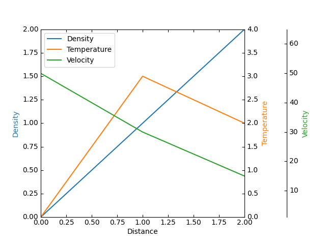
寄生虫轴演示
此示例演示如何使用寄生虫轴将多个数据集绘制到一个绘图上。
注意在这个例子中, par1 和 par2 都是通过调用 twinx() ,将它们的x限制与主机的x轴绑定。从这里开始,这两个轴的行为相互独立:可以绘制不同的数据集,并分别调整y限制。
请注意,此方法使用 mpl_toolkits.axes_grid1.parasite_axes ’ host_subplot 和 mpl_toolkits.axisartist.axislines.Axes . 使用 parasite_axes 的 HostAxes 和 ParasiteAxes 是 寄生轴演示 例子。使用常用Matplotlib子批的另一种方法如所示 多个有刺的牙龈 例子。
from mpl_toolkits.axes_grid1 import host_subplot
from mpl_toolkits import axisartist
import matplotlib.pyplot as plt

host = host_subplot(111, axes_class=axisartist.Axes)
plt.subplots_adjust(right=0.75)

par1 = host.twinx()
par2 = host.twinx()

par2.axis["right"] = par2.new_fixed_axis(loc="right", offset=(60, 0))

par1.axis["right"].toggle(all=True)
par2.axis["right"].toggle(all=True)

p1, = host.plot([0, 1, 2], [0, 1, 2], label="Density")
p2, = par1.plot([0, 1, 2], [0, 3, 2], label="Temperature")
p3, = par2.plot([0, 1, 2], [50, 30, 15], label="Velocity")

host.set_xlim(0, 2)
host.set_ylim(0, 2)
par1.set_ylim(0, 4)
par2.set_ylim(1, 65)

host.set_xlabel("Distance")
host.set_ylabel("Density")
par1.set_ylabel("Temperature")
par2.set_ylabel("Velocity")

host.legend()

host.axis["left"].label.set_color(p1.get_color())
par1.axis["right"].label.set_color(p2.get_color())
par2.axis["right"].label.set_color(p3.get_color())

plt.show()
关键词:matplotlib代码示例,codex,python plot,pyplot Gallery generated by Sphinx-Gallery