注解
Click here 下载完整的示例代码
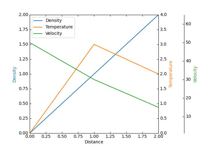
寄生轴演示
创建寄生轴。这样的轴将与主机轴共享X比例,但在Y方向显示不同的比例。
这种方法使用 mpl_toolkits.axes_grid1.parasite_axes.HostAxes 和 mpl_toolkits.axes_grid1.parasite_axes.ParasiteAxes .
使用标准Matplotlib子批的另一种方法如中所示 多个有刺的牙龈 例子。
另一种方法是使用 mpl_toolkits.axes_grid1 和 mpl_toolkits.axisartist 发现在 寄生虫轴演示 例子。
from mpl_toolkits.axisartist.parasite_axes import HostAxes, ParasiteAxes
import matplotlib.pyplot as plt


fig = plt.figure()

host = HostAxes(fig, [0.15, 0.1, 0.65, 0.8])
par1 = ParasiteAxes(host, sharex=host)
par2 = ParasiteAxes(host, sharex=host)
host.parasites.append(par1)
host.parasites.append(par2)

host.axis["right"].set_visible(False)

par1.axis["right"].set_visible(True)
par1.axis["right"].major_ticklabels.set_visible(True)
par1.axis["right"].label.set_visible(True)

par2.axis["right2"] = par2.new_fixed_axis(loc="right", offset=(60, 0))

fig.add_axes(host)

p1, = host.plot([0, 1, 2], [0, 1, 2], label="Density")
p2, = par1.plot([0, 1, 2], [0, 3, 2], label="Temperature")
p3, = par2.plot([0, 1, 2], [50, 30, 15], label="Velocity")

host.set_xlim(0, 2)
host.set_ylim(0, 2)
par1.set_ylim(0, 4)
par2.set_ylim(1, 65)

host.set_xlabel("Distance")
host.set_ylabel("Density")
par1.set_ylabel("Temperature")
par2.set_ylabel("Velocity")

host.legend()

host.axis["left"].label.set_color(p1.get_color())
par1.axis["right"].label.set_color(p2.get_color())
par2.axis["right2"].label.set_color(p3.get_color())

plt.show()
关键词:matplotlib代码示例,codex,python plot,pyplot Gallery generated by Sphinx-Gallery