注解
Click here 下载完整的示例代码
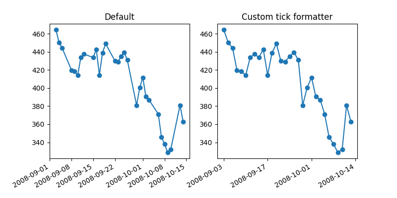
时间序列的自定义刻度格式设置工具
在绘制时间序列(如财务时间序列)时,人们通常会想省去没有数据的日子,即周末。下面的示例说明如何使用“索引格式化程序”来实现所需的绘图。
import numpy as np
import matplotlib.pyplot as plt
import matplotlib.cbook as cbook

# Load a numpy record array from yahoo csv data with fields date, open, close,
# volume, adj_close from the mpl-data/example directory. The record array
# stores the date as an np.datetime64 with a day unit ('D') in the date column.
r = (cbook.get_sample_data('goog.npz', np_load=True)['price_data']
     .view(np.recarray))
r = r[-30:]  # get the last 30 days

# first we'll do it the default way, with gaps on weekends
fig, (ax1, ax2) = plt.subplots(ncols=2, figsize=(8, 4))
ax1.plot(r.date, r.adj_close, 'o-')
ax1.set_title("Default")
fig.autofmt_xdate()

# next we'll write a custom formatter
N = len(r)
ind = np.arange(N)  # the evenly spaced plot indices


def format_date(x, pos=None):
    thisind = np.clip(int(x + 0.5), 0, N - 1)
    return r.date[thisind].item().strftime('%Y-%m-%d')


ax2.plot(ind, r.adj_close, 'o-')
# Use automatic FuncFormatter creation
ax2.xaxis.set_major_formatter(format_date)
ax2.set_title("Custom tick formatter")
fig.autofmt_xdate()

plt.show()
工具书类
以下函数、方法、类和模块的使用如本例所示:
关键词:matplotlib代码示例,codex,python plot,pyplot Gallery generated by Sphinx-Gallery