注解
Click here 下载完整的示例代码
直方图
演示如何使用matplotlib绘制柱状图。
import matplotlib.pyplot as plt
import numpy as np
from matplotlib import colors
from matplotlib.ticker import PercentFormatter

# Fixing random state for reproducibility
np.random.seed(19680801)
生成数据并绘制简单的柱状图
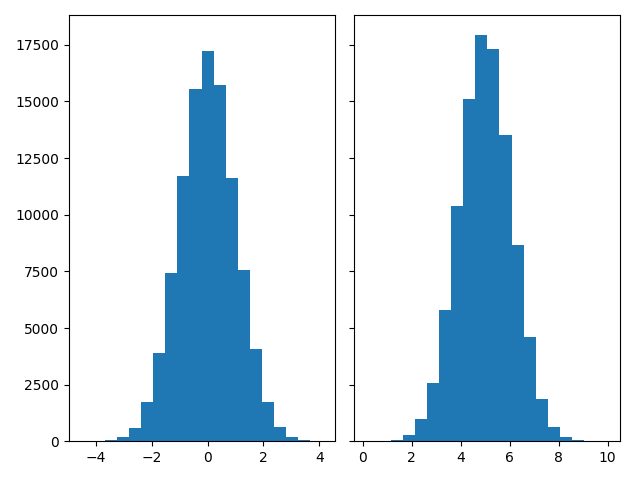
要生成一维柱状图,我们只需要一个数字向量。对于二维柱状图,我们需要第二个向量。我们将在下面生成这两个,并显示每个向量的柱状图。
N_points = 100000
n_bins = 20

# Generate a normal distribution, center at x=0 and y=5
x = np.random.randn(N_points)
y = .4 * x + np.random.randn(100000) + 5

fig, axs = plt.subplots(1, 2, sharey=True, tight_layout=True)

# We can set the number of bins with the `bins` kwarg
axs[0].hist(x, bins=n_bins)
axs[1].hist(y, bins=n_bins)
出:
(array([3.0000e+00, 1.4000e+01, 6.9000e+01, 2.7700e+02, 9.6900e+02,
       2.5790e+03, 5.8010e+03, 1.0379e+04, 1.5122e+04, 1.7920e+04,
       1.7298e+04, 1.3536e+04, 8.6630e+03, 4.6080e+03, 1.8750e+03,
       6.4100e+02, 2.0000e+02, 3.7000e+01, 7.0000e+00, 2.0000e+00]), array([ 0.15026293,  0.64387908,  1.13749522,  1.63111136,  2.12472751,
        2.61834365,  3.11195979,  3.60557594,  4.09919208,  4.59280822,
        5.08642437,  5.58004051,  6.07365665,  6.5672728 ,  7.06088894,
        7.55450508,  8.04812123,  8.54173737,  9.03535351,  9.52896966,
       10.0225858 ]), <BarContainer object of 20 artists>)
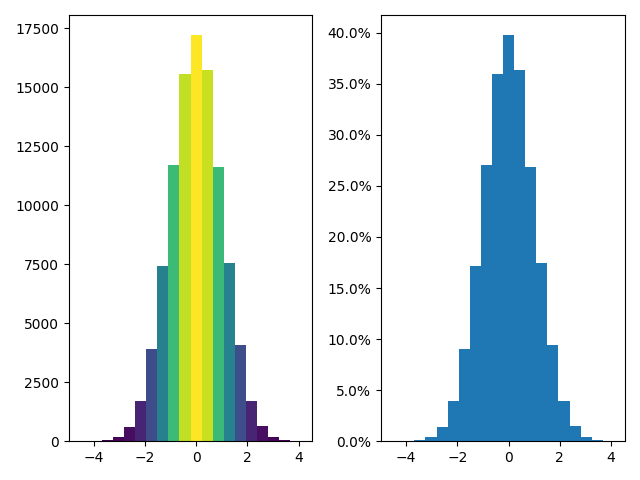
更新柱状图颜色
柱状图方法返回 patches 对象。这使我们能够访问所绘制对象的属性。使用这个,我们可以根据自己的喜好编辑柱状图。让我们根据每个条形图的Y值更改其颜色。
fig, axs = plt.subplots(1, 2, tight_layout=True)

# N is the count in each bin, bins is the lower-limit of the bin
N, bins, patches = axs[0].hist(x, bins=n_bins)

# We'll color code by height, but you could use any scalar
fracs = N / N.max()

# we need to normalize the data to 0..1 for the full range of the colormap
norm = colors.Normalize(fracs.min(), fracs.max())

# Now, we'll loop through our objects and set the color of each accordingly
for thisfrac, thispatch in zip(fracs, patches):
    color = plt.cm.viridis(norm(thisfrac))
    thispatch.set_facecolor(color)

# We can also normalize our inputs by the total number of counts
axs[1].hist(x, bins=n_bins, density=True)

# Now we format the y-axis to display percentage
axs[1].yaxis.set_major_formatter(PercentFormatter(xmax=1))
自定义柱状图
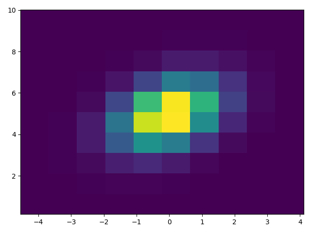
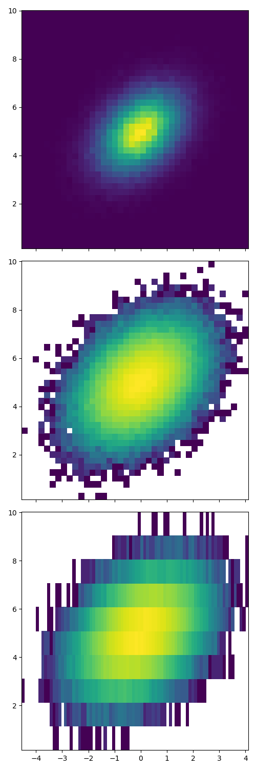
自定义二维柱状图类似于一维情况,可以控制可视组件,如纸槽大小或颜色规格化。
fig, axs = plt.subplots(3, 1, figsize=(5, 15), sharex=True, sharey=True,
                        tight_layout=True)

# We can increase the number of bins on each axis
axs[0].hist2d(x, y, bins=40)

# As well as define normalization of the colors
axs[1].hist2d(x, y, bins=40, norm=colors.LogNorm())

# We can also define custom numbers of bins for each axis
axs[2].hist2d(x, y, bins=(80, 10), norm=colors.LogNorm())

plt.show()
脚本的总运行时间: (0分1.779秒)
关键词:matplotlib代码示例,codex,python plot,pyplot Gallery generated by Sphinx-Gallery