注解
Click here 下载完整的示例代码
填充到和Alpha之间
这个 fill_between 函数在“最小”和“最大”边界之间生成一个着色区域,用于说明范围。它有一个非常方便的 where 将填充与逻辑范围相结合的参数,例如,仅填充某个阈值上的曲线。
在最基本的层面上, fill_between 可用于增强图形的视觉外观。让我们将两个金融时报图表与左侧的简单线图和右侧的填充线进行比较。
import matplotlib.pyplot as plt
import numpy as np
import matplotlib.cbook as cbook


# Fixing random state for reproducibility
np.random.seed(19680801)

# load up some sample financial data
r = (cbook.get_sample_data('goog.npz', np_load=True)['price_data']
     .view(np.recarray))
# create two subplots with the shared x and y axes
fig, (ax1, ax2) = plt.subplots(1, 2, sharex=True, sharey=True)

pricemin = r.close.min()

ax1.plot(r.date, r.close, lw=2)
ax2.fill_between(r.date, pricemin, r.close, facecolor='blue', alpha=0.5)

for ax in ax1, ax2:
    ax.grid(True)

ax1.set_ylabel('price')
for label in ax2.get_yticklabels():
    label.set_visible(False)

fig.suptitle('Google (GOOG) daily closing price')
fig.autofmt_xdate()
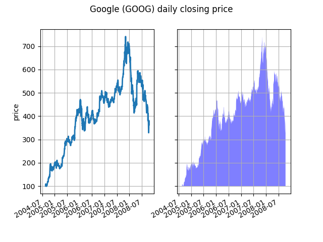
这里不需要alpha通道,但它可以用于软化颜色,以获得更具视觉吸引力的绘图。在其他示例中,如下面我们将看到的,alpha通道在功能上很有用,因为阴影区域可以重叠,alpha允许您同时看到这两个区域。请注意,PostScript格式不支持Alpha(这是PostScript限制,而不是Matplotlib限制),因此在使用Alpha时,请将图形保存在PNG、PDF或SVG中。
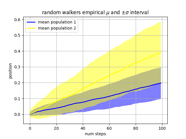
我们的下一个例子计算了两个随机步行者的总体,其平均值和标准偏差与所绘制步骤的正态分布不同。我们使用共享区域绘制人口平均位置的+/-一个标准偏差。这里阿尔法通道是有用的,而不仅仅是美学。
Nsteps, Nwalkers = 100, 250
t = np.arange(Nsteps)

# an (Nsteps x Nwalkers) array of random walk steps
S1 = 0.002 + 0.01*np.random.randn(Nsteps, Nwalkers)
S2 = 0.004 + 0.02*np.random.randn(Nsteps, Nwalkers)

# an (Nsteps x Nwalkers) array of random walker positions
X1 = S1.cumsum(axis=0)
X2 = S2.cumsum(axis=0)


# Nsteps length arrays empirical means and standard deviations of both
# populations over time
mu1 = X1.mean(axis=1)
sigma1 = X1.std(axis=1)
mu2 = X2.mean(axis=1)
sigma2 = X2.std(axis=1)

# plot it!
fig, ax = plt.subplots(1)
ax.plot(t, mu1, lw=2, label='mean population 1', color='blue')
ax.plot(t, mu2, lw=2, label='mean population 2', color='yellow')
ax.fill_between(t, mu1+sigma1, mu1-sigma1, facecolor='blue', alpha=0.5)
ax.fill_between(t, mu2+sigma2, mu2-sigma2, facecolor='yellow', alpha=0.5)
ax.set_title(r'random walkers empirical $\mu$ and $\pm \sigma$ interval')
ax.legend(loc='upper left')
ax.set_xlabel('num steps')
ax.set_ylabel('position')
ax.grid()
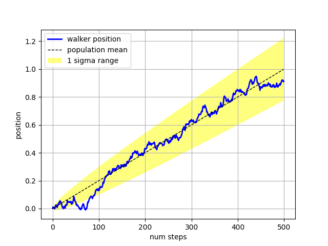
这个 where 关键字参数对于突出显示图形的某些区域非常方便。 where 采用与x、ymin和ymax参数长度相同的布尔值掩码,并且只填充布尔值掩码为真的区域。在下面的例子中,我们模拟了一个单随机步行器,并计算了人口位置的分析平均值和标准偏差。总体平均值显示为黑色虚线,与平均值的正负一西格玛偏差显示为黄色填充区域。我们用Where口罩 X > upper_bound 找到助行器在一西格玛边界上方的区域,并将该区域着色为蓝色。
Nsteps = 500
t = np.arange(Nsteps)

mu = 0.002
sigma = 0.01

# the steps and position
S = mu + sigma*np.random.randn(Nsteps)
X = S.cumsum()

# the 1 sigma upper and lower analytic population bounds
lower_bound = mu*t - sigma*np.sqrt(t)
upper_bound = mu*t + sigma*np.sqrt(t)

fig, ax = plt.subplots(1)
ax.plot(t, X, lw=2, label='walker position', color='blue')
ax.plot(t, mu*t, lw=1, label='population mean', color='black', ls='--')
ax.fill_between(t, lower_bound, upper_bound, facecolor='yellow', alpha=0.5,
                label='1 sigma range')
ax.legend(loc='upper left')

# here we use the where argument to only fill the region where the
# walker is above the population 1 sigma boundary
ax.fill_between(t, upper_bound, X, where=X > upper_bound, facecolor='blue',
                alpha=0.5)
ax.set_xlabel('num steps')
ax.set_ylabel('position')
ax.grid()
填充区域的另一个方便用法是高亮显示轴的水平或垂直跨距,因为Matplotlib具有helper函数 axhspan 和 axvspan . 见 AXHSPAN演示 .
plt.show()
脚本的总运行时间: (0分1.465秒)
关键词:matplotlib代码示例,codex,python plot,pyplot Gallery generated by Sphinx-Gallery