注解
Click here 下载完整的示例代码
嵌套饼图
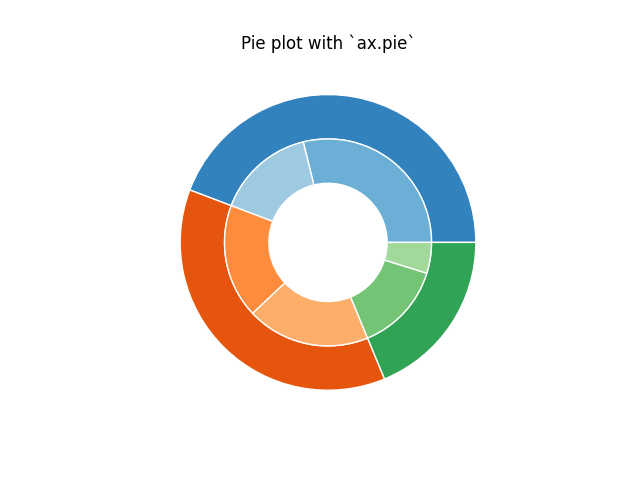
以下示例显示了在Matplotlib中构建嵌套饼图的两种方法。这种图表通常被称为甜甜圈图表。
import matplotlib.pyplot as plt
import numpy as np
构建饼图最简单的方法是使用 pie 方法。
在这种情况下,饼图采用与组中的计数相对应的值。我们将首先生成一些对应于三个组的假数据。在内环中,我们将把每个数字视为属于自己的组。在外圆中,我们将它们绘制为原始3个组的成员。
通过设置一个 width 到馅饼的楔子 楔形支柱 争论。
fig, ax = plt.subplots()

size = 0.3
vals = np.array([[60., 32.], [37., 40.], [29., 10.]])

cmap = plt.get_cmap("tab20c")
outer_colors = cmap(np.arange(3)*4)
inner_colors = cmap([1, 2, 5, 6, 9, 10])

ax.pie(vals.sum(axis=1), radius=1, colors=outer_colors,
       wedgeprops=dict(width=size, edgecolor='w'))

ax.pie(vals.flatten(), radius=1-size, colors=inner_colors,
       wedgeprops=dict(width=size, edgecolor='w'))

ax.set(aspect="equal", title='Pie plot with `ax.pie`')
plt.show()
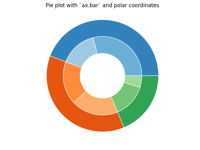
但是,您可以通过在具有极坐标系的轴上使用条形图来完成相同的输出。这可能会给绘图的精确设计带来更多的灵活性。
在这种情况下,我们需要将条形图的x值映射到圆的弧度上。值的累积和用作条的边缘。
fig, ax = plt.subplots(subplot_kw=dict(polar=True))

size = 0.3
vals = np.array([[60., 32.], [37., 40.], [29., 10.]])
#normalize vals to 2 pi
valsnorm = vals/np.sum(vals)*2*np.pi
#obtain the ordinates of the bar edges
valsleft = np.cumsum(np.append(0, valsnorm.flatten()[:-1])).reshape(vals.shape)

cmap = plt.get_cmap("tab20c")
outer_colors = cmap(np.arange(3)*4)
inner_colors = cmap([1, 2, 5, 6, 9, 10])

ax.bar(x=valsleft[:, 0],
       width=valsnorm.sum(axis=1), bottom=1-size, height=size,
       color=outer_colors, edgecolor='w', linewidth=1, align="edge")

ax.bar(x=valsleft.flatten(),
       width=valsnorm.flatten(), bottom=1-2*size, height=size,
       color=inner_colors, edgecolor='w', linewidth=1, align="edge")

ax.set(title="Pie plot with `ax.bar` and polar coordinates")
ax.set_axis_off()
plt.show()
工具书类
以下函数、方法、类和模块的使用如本例所示:
import matplotlib
matplotlib.axes.Axes.pie
matplotlib.pyplot.pie
matplotlib.axes.Axes.bar
matplotlib.pyplot.bar
matplotlib.projections.polar
matplotlib.axes.Axes.set
matplotlib.axes.Axes.set_axis_off
出:
<function _AxesBase.set_axis_off at 0x7faa00da6950>
关键词:matplotlib代码示例,codex,python plot,pyplot Gallery generated by Sphinx-Gallery