注解
Click here 下载完整的示例代码
直方图散点图
以直方图的形式在图的两侧显示散点的边缘分布。
为了使主轴与边缘对齐,下面显示了两个选项。
- 轴的位置以图形坐标中的矩形定义
- 轴的位置是通过gridspec定义的
一种使用 axes_grid1 工具箱显示在 散点直方图(可定位轴) 例子。
让我们首先定义一个函数,该函数以x和y数据为输入,以及三个轴、散点的主轴和两个边缘轴。然后它将在提供的轴内创建散点图和直方图。
import numpy as np
import matplotlib.pyplot as plt

# Fixing random state for reproducibility
np.random.seed(19680801)

# some random data
x = np.random.randn(1000)
y = np.random.randn(1000)


def scatter_hist(x, y, ax, ax_histx, ax_histy):
    # no labels
    ax_histx.tick_params(axis="x", labelbottom=False)
    ax_histy.tick_params(axis="y", labelleft=False)

    # the scatter plot:
    ax.scatter(x, y)

    # now determine nice limits by hand:
    binwidth = 0.25
    xymax = max(np.max(np.abs(x)), np.max(np.abs(y)))
    lim = (int(xymax/binwidth) + 1) * binwidth

    bins = np.arange(-lim, lim + binwidth, binwidth)
    ax_histx.hist(x, bins=bins)
    ax_histy.hist(y, bins=bins, orientation='horizontal')
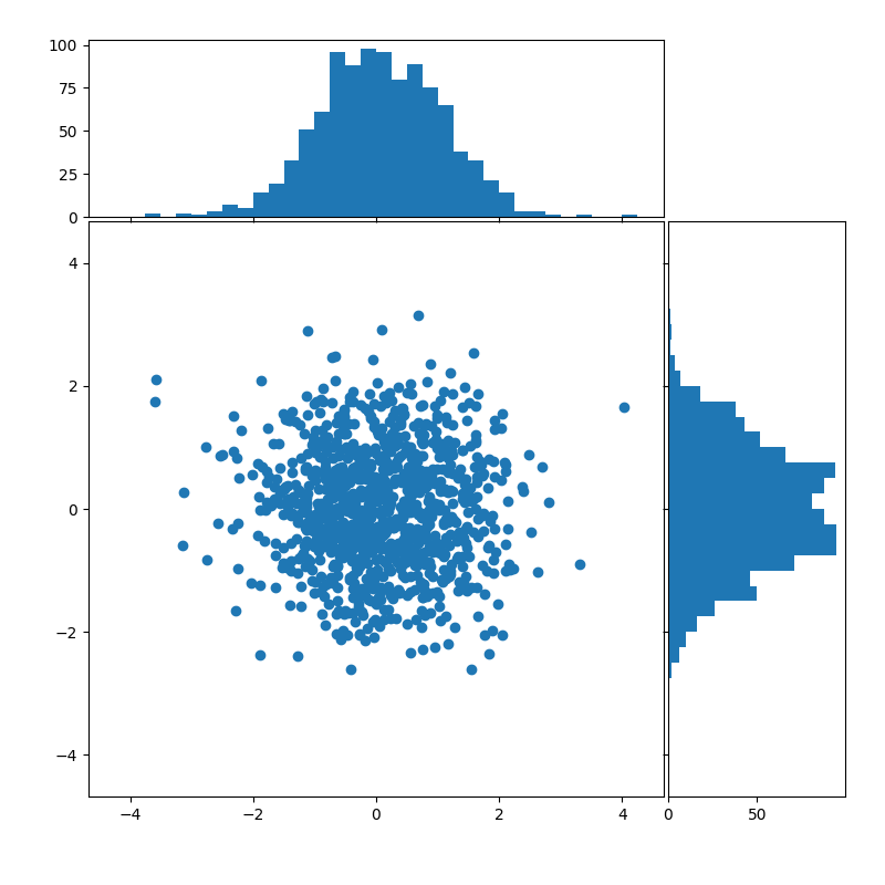
坐标轴
要定义轴位置, Figure.add_axes 带有矩形 [left, bottom, width, height] 在图形坐标中。边缘轴与主轴共用一个维度。
# definitions for the axes
left, width = 0.1, 0.65
bottom, height = 0.1, 0.65
spacing = 0.005


rect_scatter = [left, bottom, width, height]
rect_histx = [left, bottom + height + spacing, width, 0.2]
rect_histy = [left + width + spacing, bottom, 0.2, height]

# start with a square Figure
fig = plt.figure(figsize=(8, 8))

ax = fig.add_axes(rect_scatter)
ax_histx = fig.add_axes(rect_histx, sharex=ax)
ax_histy = fig.add_axes(rect_histy, sharey=ax)

# use the previously defined function
scatter_hist(x, y, ax, ax_histx, ax_histy)

plt.show()
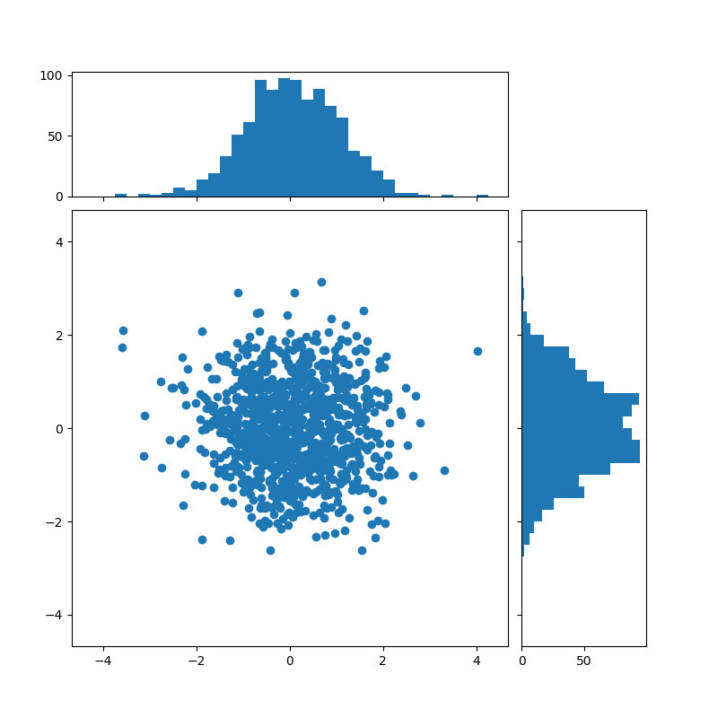
使用gridspec
我们可以同样地定义一个具有不等宽高比的gridspec来实现所需的布局。另请参见 使用GRIDSPEC和其他功能自定义图形布局 辅导的。
# start with a square Figure
fig = plt.figure(figsize=(8, 8))

# Add a gridspec with two rows and two columns and a ratio of 2 to 7 between
# the size of the marginal axes and the main axes in both directions.
# Also adjust the subplot parameters for a square plot.
gs = fig.add_gridspec(2, 2,  width_ratios=(7, 2), height_ratios=(2, 7),
                      left=0.1, right=0.9, bottom=0.1, top=0.9,
                      wspace=0.05, hspace=0.05)

ax = fig.add_subplot(gs[1, 0])
ax_histx = fig.add_subplot(gs[0, 0], sharex=ax)
ax_histy = fig.add_subplot(gs[1, 1], sharey=ax)

# use the previously defined function
scatter_hist(x, y, ax, ax_histx, ax_histy)

plt.show()
工具书类
本例中显示了以下函数、方法和类的使用:
出:
<function Axes.hist at 0x7faa00dc7f28>
脚本的总运行时间: (0分1.374秒)
关键词:matplotlib代码示例,codex,python plot,pyplot Gallery generated by Sphinx-Gallery