注解
Click here 下载完整的示例代码
填充线条之间的区域
这个例子演示了如何使用 fill_between 给两条线之间的区域上色。
import matplotlib.pyplot as plt
import numpy as np
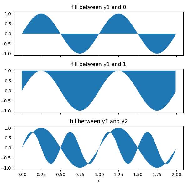
基本用法
参数 y1 和 y2 可以是标量,表示给定y值处的水平边界。只要 y1 给出, y2 默认为0。
x = np.arange(0.0, 2, 0.01)
y1 = np.sin(2 * np.pi * x)
y2 = 0.8 * np.sin(4 * np.pi * x)

fig, (ax1, ax2, ax3) = plt.subplots(3, 1, sharex=True, figsize=(6, 6))

ax1.fill_between(x, y1)
ax1.set_title('fill between y1 and 0')

ax2.fill_between(x, y1, 1)
ax2.set_title('fill between y1 and 1')

ax3.fill_between(x, y1, y2)
ax3.set_title('fill between y1 and y2')
ax3.set_xlabel('x')
fig.tight_layout()
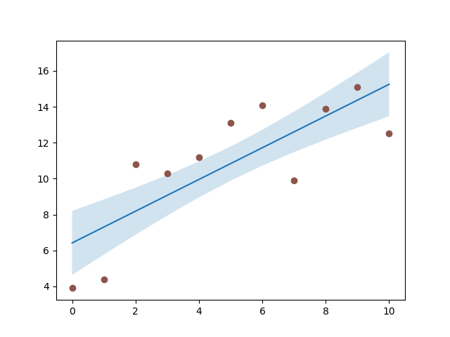
示例:置信区间
一种常见的 fill_between 是置信区间的标志。
fill_between 使用颜色循环的颜色作为填充颜色。当应用于填充区域时,这些可能有点强。因此,经常是一个很好的做法,以减轻颜色,使该地区半透明使用 阿尔法 .
N = 21
x = np.linspace(0, 10, 11)
y = [3.9, 4.4, 10.8, 10.3, 11.2, 13.1, 14.1,  9.9, 13.9, 15.1, 12.5]

# fit a linear curve an estimate its y-values and their error.
a, b = np.polyfit(x, y, deg=1)
y_est = a * x + b
y_err = x.std() * np.sqrt(1/len(x) +
                          (x - x.mean())**2 / np.sum((x - x.mean())**2))

fig, ax = plt.subplots()
ax.plot(x, y_est, '-')
ax.fill_between(x, y_est - y_err, y_est + y_err, alpha=0.2)
ax.plot(x, y, 'o', color='tab:brown')
出:
[<matplotlib.lines.Line2D object at 0x7faa0ce45b00>]
选择性填充水平区域
参数 在哪里? 允许指定要填充的x范围。它是一个布尔数组,大小与 x .
只有相邻的x范围 True 序列被填充。其结果是相邻的 True 和 假 值从不填充。当数据点代表一个连续的数量时,这通常是不需要的。因此,建议设置 interpolate=True 除非数据点的x距离足够细,使得上述影响不明显。插值近似于实际的x位置,在该位置 在哪里? 情况会发生变化,并将填充延伸到那里。
x = np.array([0, 1, 2, 3])
y1 = np.array([0.8, 0.8, 0.2, 0.2])
y2 = np.array([0, 0, 1, 1])

fig, (ax1, ax2) = plt.subplots(2, 1, sharex=True)

ax1.set_title('interpolation=False')
ax1.plot(x, y1, 'o--')
ax1.plot(x, y2, 'o--')
ax1.fill_between(x, y1, y2, where=(y1 > y2), color='C0', alpha=0.3)
ax1.fill_between(x, y1, y2, where=(y1 < y2), color='C1', alpha=0.3)

ax2.set_title('interpolation=True')
ax2.plot(x, y1, 'o--')
ax2.plot(x, y2, 'o--')
ax2.fill_between(x, y1, y2, where=(y1 > y2), color='C0', alpha=0.3,
                 interpolate=True)
ax2.fill_between(x, y1, y2, where=(y1 <= y2), color='C1', alpha=0.3,
                 interpolate=True)
fig.tight_layout()
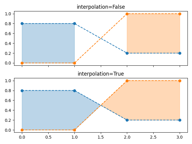
注解
如果 y1 或 y2 是屏蔽数组。由于缺失值无法近似, 内插 在这种情况下没有效果。只有在遮罩值附近添加更多的数据点,才能减少遮罩值周围的间隙。
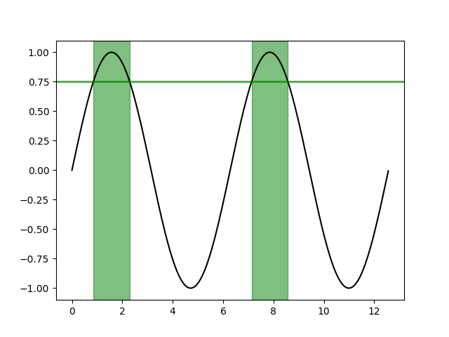
在整个轴上有选择地标记水平区域
相同的选择机制可以应用于填充轴的整个垂直高度。为了独立于y极限,我们添加了一个转换来解释数据坐标中的x值和轴坐标中的y值。
下面的示例标记y数据高于给定阈值的区域。
fig, ax = plt.subplots()
x = np.arange(0, 4 * np.pi, 0.01)
y = np.sin(x)
ax.plot(x, y, color='black')

threshold = 0.75
ax.axhline(threshold, color='green', lw=2, alpha=0.7)
ax.fill_between(x, 0, 1, where=y > threshold,
                color='green', alpha=0.5, transform=ax.get_xaxis_transform())
出:
<matplotlib.collections.PolyCollection object at 0x7faa0d0764e0>
工具书类
本例中显示了以下函数、方法和类的使用:
出:
<function _AxesBase.get_xaxis_transform at 0x7faa00da2400>
脚本的总运行时间: (0分1.961秒)
关键词:matplotlib代码示例,codex,python plot,pyplot Gallery generated by Sphinx-Gallery