 Source
备注
单击 here 下载完整的示例代码或通过活页夹在浏览器中运行此示例
浏览(细胞的)3D图像
本教程是对三维图像处理的介绍。图像表示为 numpy 数组。单通道或灰度图像是形状的像素强度的2D矩阵 (n_row, n_col) ,在哪里 n_row (请回复。 n_col )表示的数量 rows (请回复。 columns )。我们可以将3D体积构建为一系列2D planes ,为3D图像提供形状 (n_plane, n_row, n_col) ,在哪里 n_plane 是飞机的数量。多通道或RGB(A)图像具有附加的 channel 包含颜色信息的最终位置的尺寸。
下表汇总了这些约定:
图像类型 |
坐标 |
|---|---|
2D灰度级 |
|
2D多通道 |
|
3D灰度 |
|
3D多通道 |
|
一些3D图像在每个维度上具有相同的分辨率(例如,球体的同步加速器断层摄影术或计算机生成的渲染)。但大多数实验数据是以较低的三维分辨率之一捕获的,例如,拍摄薄片以将3D结构近似为2D图像堆叠。每个维度中像素之间的距离称为间距,它被编码为一个元组,并被一些人接受为参数 skimage 函数,并可用于调整对过滤器的贡献。
本教程中使用的数据由艾伦细胞科学研究所提供。他们被缩减了4倍的抽样。 row 和 column 以减少其尺寸,从而减少计算时间。间隔信息由用于对细胞成像的显微镜报告。
import matplotlib.pyplot as plt
from mpl_toolkits.mplot3d.art3d import Poly3DCollection
import numpy as np

from skimage import exposure, io, util
from skimage.data import cells3d
加载和显示3D图像
data = util.img_as_float(cells3d()[:, 1, :, :])  # grab just the nuclei

print("shape: {}".format(data.shape))
print("dtype: {}".format(data.dtype))
print("range: ({}, {})".format(data.min(), data.max()))

# Report spacing from microscope
original_spacing = np.array([0.2900000, 0.0650000, 0.0650000])

# Account for downsampling of slices by 4
rescaled_spacing = original_spacing * [1, 4, 4]

# Normalize spacing so that pixels are a distance of 1 apart
spacing = rescaled_spacing / rescaled_spacing[2]

print("microscope spacing: {}\n".format(original_spacing))
print("rescaled spacing: {} (after downsampling)\n".format(rescaled_spacing))
print("normalized spacing: {}\n".format(spacing))
输出:
shape: (60, 256, 256)
dtype: float64
range: (0.0, 1.0)
microscope spacing: [0.29  0.065 0.065]

rescaled spacing: [0.29 0.26 0.26] (after downsampling)

normalized spacing: [1.11538462 1.         1.        ]
让我们试着用可视化的(3D)图像 io.imshow 。
try:
    io.imshow(data, cmap="gray")
except TypeError as e:
    print(str(e))
输出:
Invalid shape (60, 256, 256) for image data
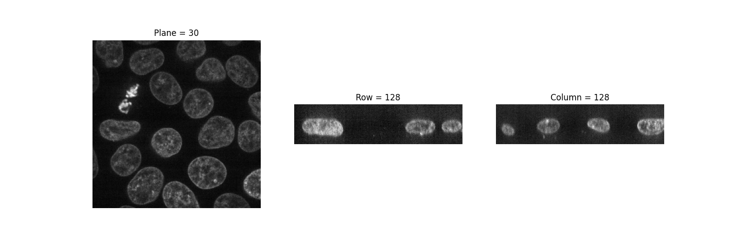
这个 io.imshow 函数只能显示灰度和RGB(A)2D图像。因此,我们可以使用它来可视化2D平面。通过固定一个轴,我们可以观察到图像的三种不同视图。
def show_plane(ax, plane, cmap="gray", title=None):
    ax.imshow(plane, cmap=cmap)
    ax.axis("off")

    if title:
        ax.set_title(title)


(n_plane, n_row, n_col) = data.shape
_, (a, b, c) = plt.subplots(ncols=3, figsize=(15, 5))

show_plane(a, data[n_plane // 2], title=f'Plane = {n_plane // 2}')
show_plane(b, data[:, n_row // 2, :], title=f'Row = {n_row // 2}')
show_plane(c, data[:, :, n_col // 2], title=f'Column = {n_col // 2}')
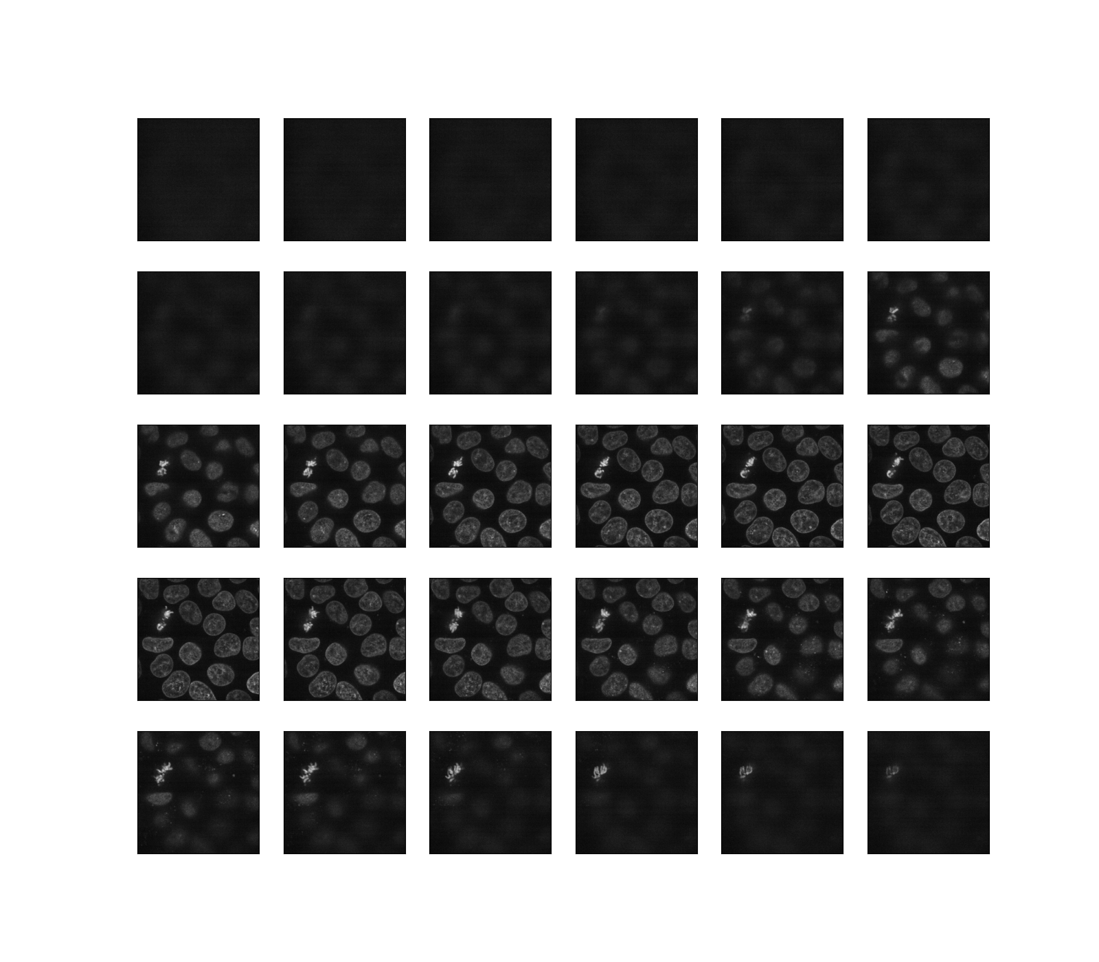
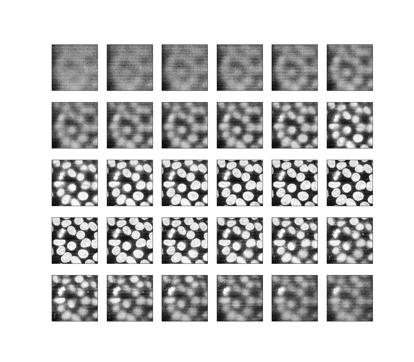
正如前面所暗示的,三维图像可以被看作是一系列二维平面。让我们编写一个帮助器函数, display ,以显示我们数据的30个平面。默认情况下,每隔一个平面显示一次。
def display(im3d, cmap="gray", step=2):
    _, axes = plt.subplots(nrows=5, ncols=6, figsize=(16, 14))

    vmin = im3d.min()
    vmax = im3d.max()

    for ax, image in zip(axes.flatten(), im3d[::step]):
        ax.imshow(image, cmap=cmap, vmin=vmin, vmax=vmax)
        ax.set_xticks([])
        ax.set_yticks([])


display(data)
或者,我们可以使用Jupyter小部件交互地浏览这些平面(切片)。让用户选择要显示的切片,并显示该切片在3D数据集中的位置。请注意,您不能在静态的HTML页面中看到正在工作的Jupyter小部件,就像SCRKIT-IMAGE库中的情况一样。要使以下代码工作,您需要在本地或云中运行一个Jupyter内核:请参阅本页面底部,下载Jupyter笔记本并在您的计算机上运行它,或者直接在Binder中打开它。
def slice_in_3D(ax, i):
    # From https://stackoverflow.com/questions/44881885/python-draw-3d-cube
    Z = np.array([[0, 0, 0],
                  [1, 0, 0],
                  [1, 1, 0],
                  [0, 1, 0],
                  [0, 0, 1],
                  [1, 0, 1],
                  [1, 1, 1],
                  [0, 1, 1]])

    Z = Z * data.shape
    r = [-1, 1]
    X, Y = np.meshgrid(r, r)

    # Plot vertices
    ax.scatter3D(Z[:, 0], Z[:, 1], Z[:, 2])

    # List sides' polygons of figure
    verts = [[Z[0], Z[1], Z[2], Z[3]],
             [Z[4], Z[5], Z[6], Z[7]],
             [Z[0], Z[1], Z[5], Z[4]],
             [Z[2], Z[3], Z[7], Z[6]],
             [Z[1], Z[2], Z[6], Z[5]],
             [Z[4], Z[7], Z[3], Z[0]],
             [Z[2], Z[3], Z[7], Z[6]]]

    # Plot sides
    ax.add_collection3d(
        Poly3DCollection(
            verts,
            facecolors=(0, 1, 1, 0.25),
            linewidths=1,
            edgecolors="darkblue"
        )
    )

    verts = np.array([[[0, 0, 0],
                       [0, 0, 1],
                       [0, 1, 1],
                       [0, 1, 0]]])
    verts = verts * (60, 256, 256)
    verts += [i, 0, 0]

    ax.add_collection3d(
        Poly3DCollection(
            verts,
            facecolors="magenta",
            linewidths=1,
            edgecolors="black"
        )
    )

    ax.set_xlabel("plane")
    ax.set_xlim(0, 100)
    ax.set_ylabel("row")
    ax.set_zlabel("col")

    # Autoscale plot axes
    scaling = np.array([getattr(ax,
                                f'get_{dim}lim')() for dim in "xyz"])
    ax.auto_scale_xyz(* [[np.min(scaling), np.max(scaling)]] * 3)


def explore_slices(data, cmap="gray"):
    from ipywidgets import interact
    N = len(data)

    @interact(plane=(0, N - 1))
    def display_slice(plane=34):
        fig, ax = plt.subplots(figsize=(20, 5))

        ax_3D = fig.add_subplot(133, projection="3d")

        show_plane(ax, data[plane], title="Plane {}".format(plane), cmap=cmap)
        slice_in_3D(ax_3D, plane)

        plt.show()

    return display_slice


explore_slices(data);
输出:
interactive(children=(IntSlider(value=34, description='plane', max=59), Output()), _dom_classes=('widget-interact',))

<function explore_slices.<locals>.display_slice at 0x7f2d93cdc5e0>
调整曝光
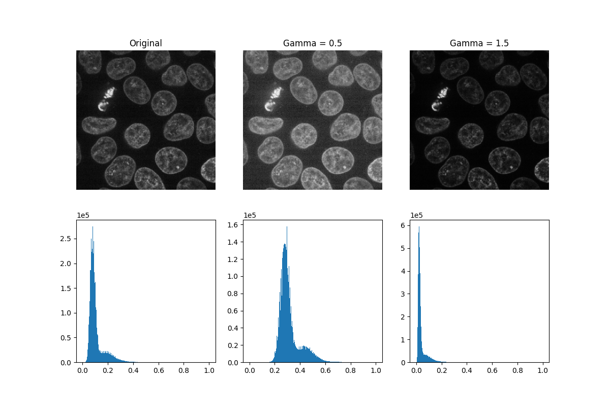
Scikit-IMAGE的 exposure 模块包含许多用于调整图像对比度的函数。这些函数对像素值进行操作。通常,不需要考虑图像的维度或像素间距。然而,在局部曝光校正中,人们可能希望调整窗口大小以确保在 real 沿每个轴的坐标。
Gamma correction 使图像变亮或变暗。一种幂定律变换,其中 gamma 表示应用于图像中每个像素的幂指数: gamma < 1 将使图像变亮,而 gamma > 1 会使图像变暗。
def plot_hist(ax, data, title=None):
    # Helper function for plotting histograms
    ax.hist(data.ravel(), bins=256)
    ax.ticklabel_format(axis="y", style="scientific", scilimits=(0, 0))

    if title:
        ax.set_title(title)


gamma_low_val = 0.5
gamma_low = exposure.adjust_gamma(data, gamma=gamma_low_val)

gamma_high_val = 1.5
gamma_high = exposure.adjust_gamma(data, gamma=gamma_high_val)

_, ((a, b, c), (d, e, f)) = plt.subplots(nrows=2, ncols=3, figsize=(12, 8))

show_plane(a, data[32], title='Original')
show_plane(b, gamma_low[32], title=f'Gamma = {gamma_low_val}')
show_plane(c, gamma_high[32], title=f'Gamma = {gamma_high_val}')

plot_hist(d, data)
plot_hist(e, gamma_low)
plot_hist(f, gamma_high)
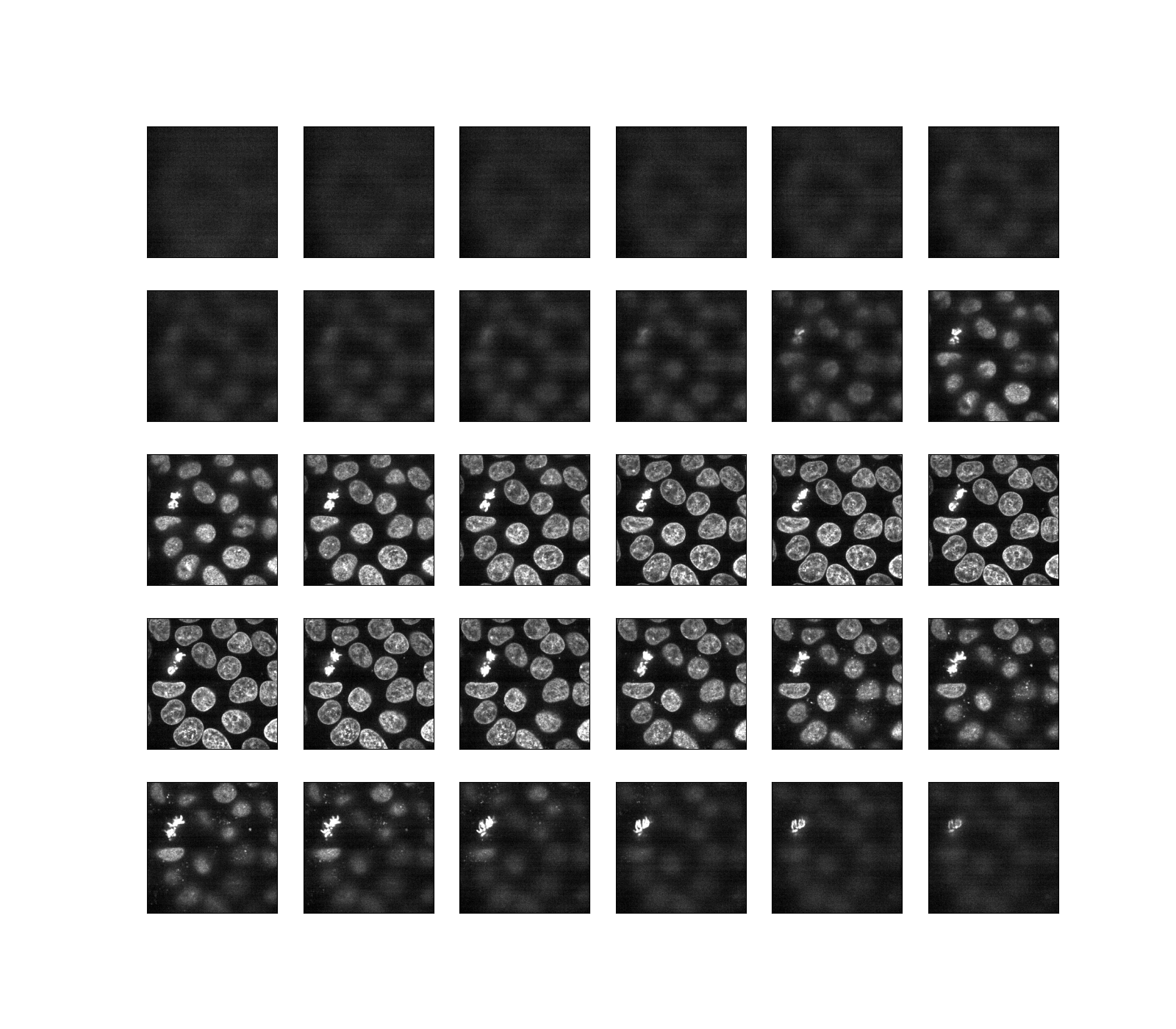
Histogram equalization 通过重新分布像素强度来提高图像的对比度。最常见的像素强度会分散开来,在对比度较低的区域增加对比度。这种方法的一个缺点是它可能会增强背景噪音。
equalized_data = exposure.equalize_hist(data)

display(equalized_data)
和以前一样,如果我们运行的是Jupyter内核,我们可以交互地浏览上面的片段。
explore_slices(equalized_data);
输出:
interactive(children=(IntSlider(value=34, description='plane', max=59), Output()), _dom_classes=('widget-interact',))

<function explore_slices.<locals>.display_slice at 0x7f2d902f2820>
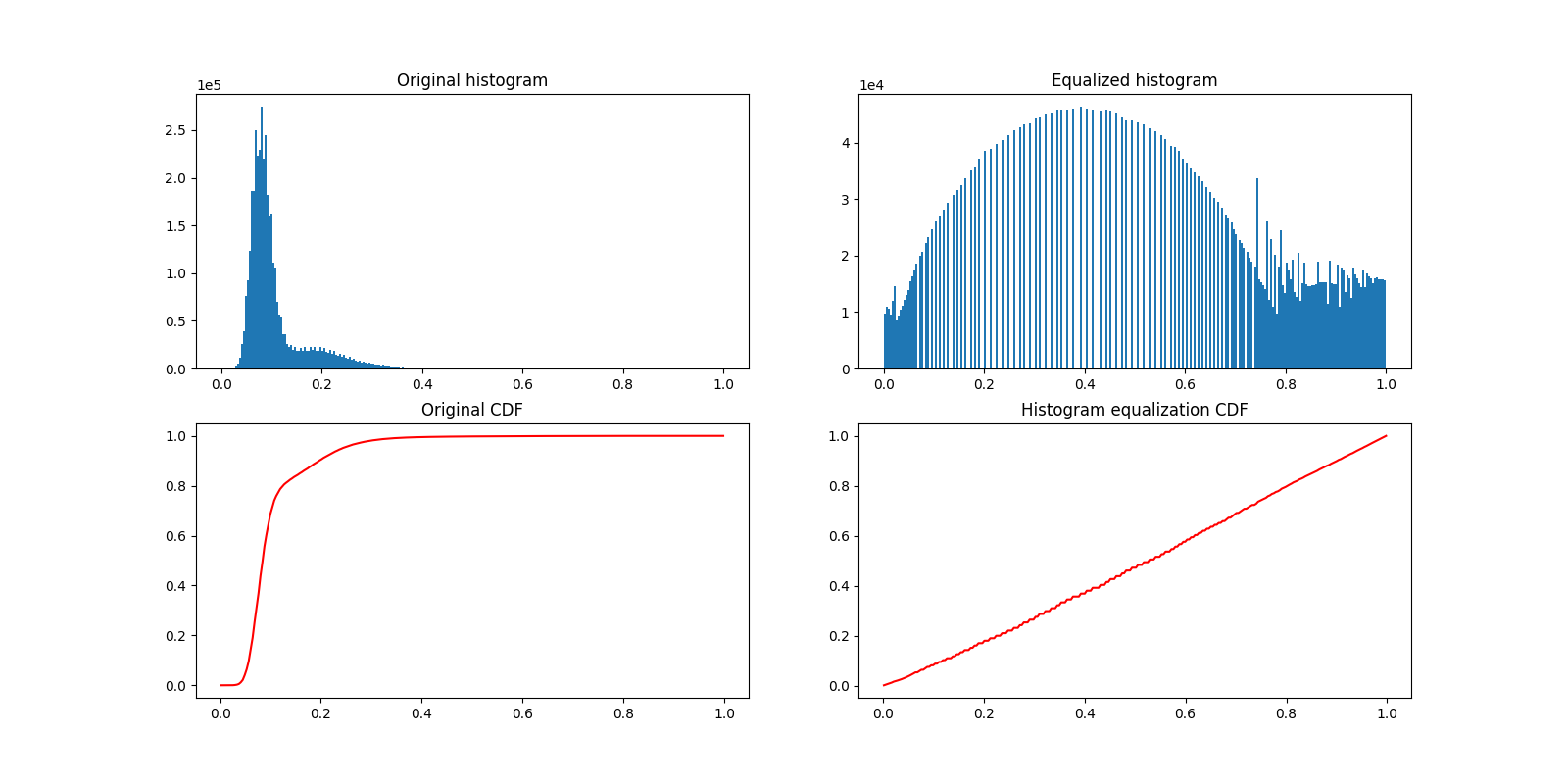
现在让我们绘制直方图均衡化前后的图像直方图。下面,我们绘制各自的累积分布函数(CDF)。
_, ((a, b), (c, d)) = plt.subplots(nrows=2, ncols=2, figsize=(16, 8))

plot_hist(a, data, title="Original histogram")
plot_hist(b, equalized_data, title="Equalized histogram")

cdf, bins = exposure.cumulative_distribution(data.ravel())
c.plot(bins, cdf, "r")
c.set_title("Original CDF")

cdf, bins = exposure.cumulative_distribution(equalized_data.ravel())
d.plot(bins, cdf, "r")
d.set_title("Histogram equalization CDF")
输出:
Text(0.5, 1.0, 'Histogram equalization CDF')
大多数实验图像都受到盐和胡椒噪声的影响。一些明亮的伪影可以降低感兴趣像素的相对强度。提高对比度的一种简单方法是剪裁最低和最高极值的像素值。剪裁最暗和最亮的0.5%的像素将增加图像的整体对比度。
vmin, vmax = np.percentile(data, q=(0.5, 99.5))

clipped_data = exposure.rescale_intensity(
    data,
    in_range=(vmin, vmax),
    out_range=np.float32
)

display(clipped_data)
脚本的总运行时间: (0分5.374秒)