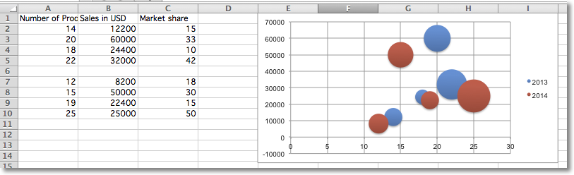
气泡图
气泡图类似于散点图,但使用第三维度来确定气泡的大小。图表可以包括多个系列。
"""
Sample bubble chart
"""

from openpyxl import Workbook
from openpyxl.chart import Series, Reference, BubbleChart

wb = Workbook()
ws = wb.active

rows = [
    ("Number of Products", "Sales in USD", "Market share"),
    (14, 12200, 15),
    (20, 60000, 33),
    (18, 24400, 10),
    (22, 32000, 42),
    (),
    (12, 8200, 18),
    (15, 50000, 30),
    (19, 22400, 15),
    (25, 25000, 50),
]

for row in rows:
    ws.append(row)

chart = BubbleChart()
chart.style = 18 # use a preset style

# add the first series of data
xvalues = Reference(ws, min_col=1, min_row=2, max_row=5)
yvalues = Reference(ws, min_col=2, min_row=2, max_row=5)
size = Reference(ws, min_col=3, min_row=2, max_row=5)
series = Series(values=yvalues, xvalues=xvalues, zvalues=size, title="2013")
chart.series.append(series)

# add the second
xvalues = Reference(ws, min_col=1, min_row=7, max_row=10)
yvalues = Reference(ws, min_col=2, min_row=7, max_row=10)
size = Reference(ws, min_col=3, min_row=7, max_row=10)
series = Series(values=yvalues, xvalues=xvalues, zvalues=size, title="2014")
chart.series.append(series)

# place the chart starting in cell E1
ws.add_chart(chart, "E1")
wb.save("bubble.xlsx")
这将生成一个包含两个系列的气泡图,应该如下所示: