注解
Click here 下载完整的示例代码
百分比作为水平条形图
条形图对于可视化计数或带有误差条的汇总统计非常有用。另请参见 带标签的分组条形图 或 水平条形图 这些功能的简单版本示例。
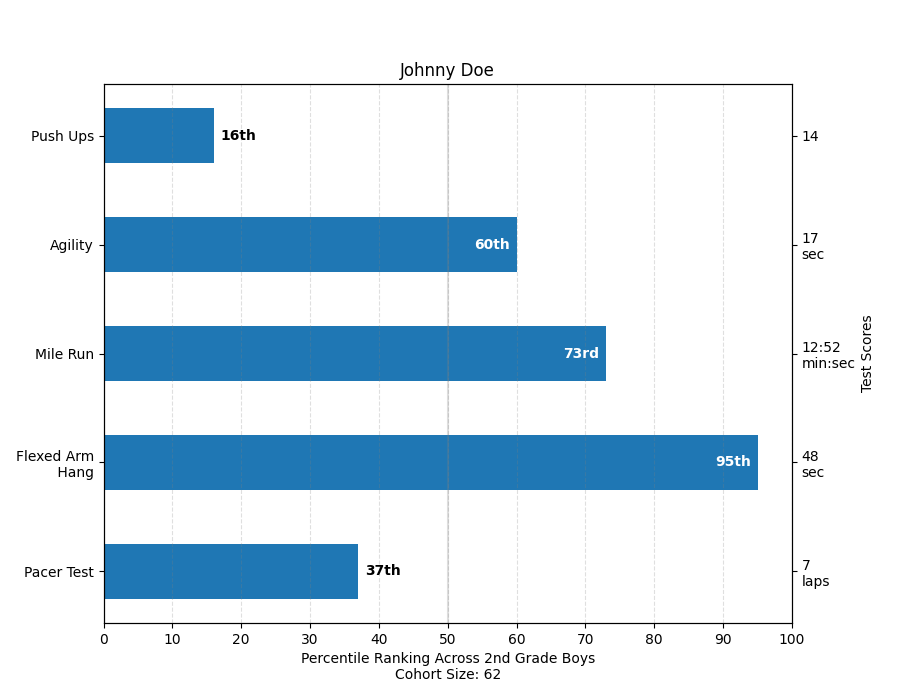
这个例子来自于一个应用程序,在这个应用程序中,小学体育老师希望能够向家长展示他们的孩子在一些体能测试中的表现,重要的是,与其他孩子相比。为了提取用于演示的绘图代码,我们将为小约翰尼·多伊编一些数据。
import numpy as np
import matplotlib
import matplotlib.pyplot as plt
from matplotlib.ticker import MaxNLocator
from collections import namedtuple

np.random.seed(42)

Student = namedtuple('Student', ['name', 'grade', 'gender'])
Score = namedtuple('Score', ['score', 'percentile'])

# GLOBAL CONSTANTS
test_names = ['Pacer Test', 'Flexed Arm\n Hang', 'Mile Run', 'Agility',
              'Push Ups']
test_units = dict(zip(test_names, ['laps', 'sec', 'min:sec', 'sec', '']))


def attach_ordinal(num):
    """Convert an integer to an ordinal string, e.g. 2 -> '2nd'."""
    suffixes = {str(i): v
                for i, v in enumerate(['th', 'st', 'nd', 'rd', 'th',
                                       'th', 'th', 'th', 'th', 'th'])}
    v = str(num)
    # special case early teens
    if v in {'11', '12', '13'}:
        return v + 'th'
    return v + suffixes[v[-1]]


def format_score(score, test):
    """
    Create score labels for the right y-axis as the test name followed by the
    measurement unit (if any), split over two lines.
    """
    unit = test_units[test]
    if unit:
        return f'{score}\n{unit}'
    else:  # If no unit, don't include a newline, so that label stays centered.
        return score


def format_ycursor(y):
    y = int(y)
    if y < 0 or y >= len(test_names):
        return ''
    else:
        return test_names[y]


def plot_student_results(student, scores, cohort_size):
    fig, ax1 = plt.subplots(figsize=(9, 7))  # Create the figure
    fig.subplots_adjust(left=0.115, right=0.88)
    fig.canvas.set_window_title('Eldorado K-8 Fitness Chart')

    pos = np.arange(len(test_names))

    rects = ax1.barh(pos, [scores[k].percentile for k in test_names],
                     align='center',
                     height=0.5,
                     tick_label=test_names)

    ax1.set_title(student.name)

    ax1.set_xlim([0, 100])
    ax1.xaxis.set_major_locator(MaxNLocator(11))
    ax1.xaxis.grid(True, linestyle='--', which='major',
                   color='grey', alpha=.25)

    # Plot a solid vertical gridline to highlight the median position
    ax1.axvline(50, color='grey', alpha=0.25)

    # Set the right-hand Y-axis ticks and labels
    ax2 = ax1.twinx()

    # Set the tick locations
    ax2.set_yticks(pos)
    # Set equal limits on both yaxis so that the ticks line up
    ax2.set_ylim(ax1.get_ylim())

    # Set the tick labels
    ax2.set_yticklabels([format_score(scores[k].score, k) for k in test_names])

    ax2.set_ylabel('Test Scores')

    xlabel = ('Percentile Ranking Across {grade} Grade {gender}s\n'
              'Cohort Size: {cohort_size}')
    ax1.set_xlabel(xlabel.format(grade=attach_ordinal(student.grade),
                                 gender=student.gender.title(),
                                 cohort_size=cohort_size))

    rect_labels = []
    # Lastly, write in the ranking inside each bar to aid in interpretation
    for rect in rects:
        # Rectangle widths are already integer-valued but are floating
        # type, so it helps to remove the trailing decimal point and 0 by
        # converting width to int type
        width = int(rect.get_width())

        rank_str = attach_ordinal(width)
        # The bars aren't wide enough to print the ranking inside
        if width < 40:
            # Shift the text to the right side of the right edge
            xloc = 5
            # Black against white background
            clr = 'black'
            align = 'left'
        else:
            # Shift the text to the left side of the right edge
            xloc = -5
            # White on magenta
            clr = 'white'
            align = 'right'

        # Center the text vertically in the bar
        yloc = rect.get_y() + rect.get_height() / 2
        label = ax1.annotate(
            rank_str, xy=(width, yloc), xytext=(xloc, 0),
            textcoords="offset points",
            horizontalalignment=align, verticalalignment='center',
            color=clr, weight='bold', clip_on=True)
        rect_labels.append(label)

    # Make the interactive mouse over give the bar title
    ax2.fmt_ydata = format_ycursor
    # Return all of the artists created
    return {'fig': fig,
            'ax': ax1,
            'ax_right': ax2,
            'bars': rects,
            'perc_labels': rect_labels}


student = Student('Johnny Doe', 2, 'boy')
scores = dict(zip(
    test_names,
    (Score(v, p) for v, p in
     zip(['7', '48', '12:52', '17', '14'],
         np.round(np.random.uniform(0, 100, len(test_names)), 0)))))
cohort_size = 62  # The number of other 2nd grade boys

arts = plot_student_results(student, scores, cohort_size)
plt.show()
工具书类
本例中显示了以下函数、方法和类的使用:
出:
<function _AxesBase.twinx at 0x7faa00da7e18>
关键词:matplotlib代码示例,codex,python plot,pyplot Gallery generated by Sphinx-Gallery